
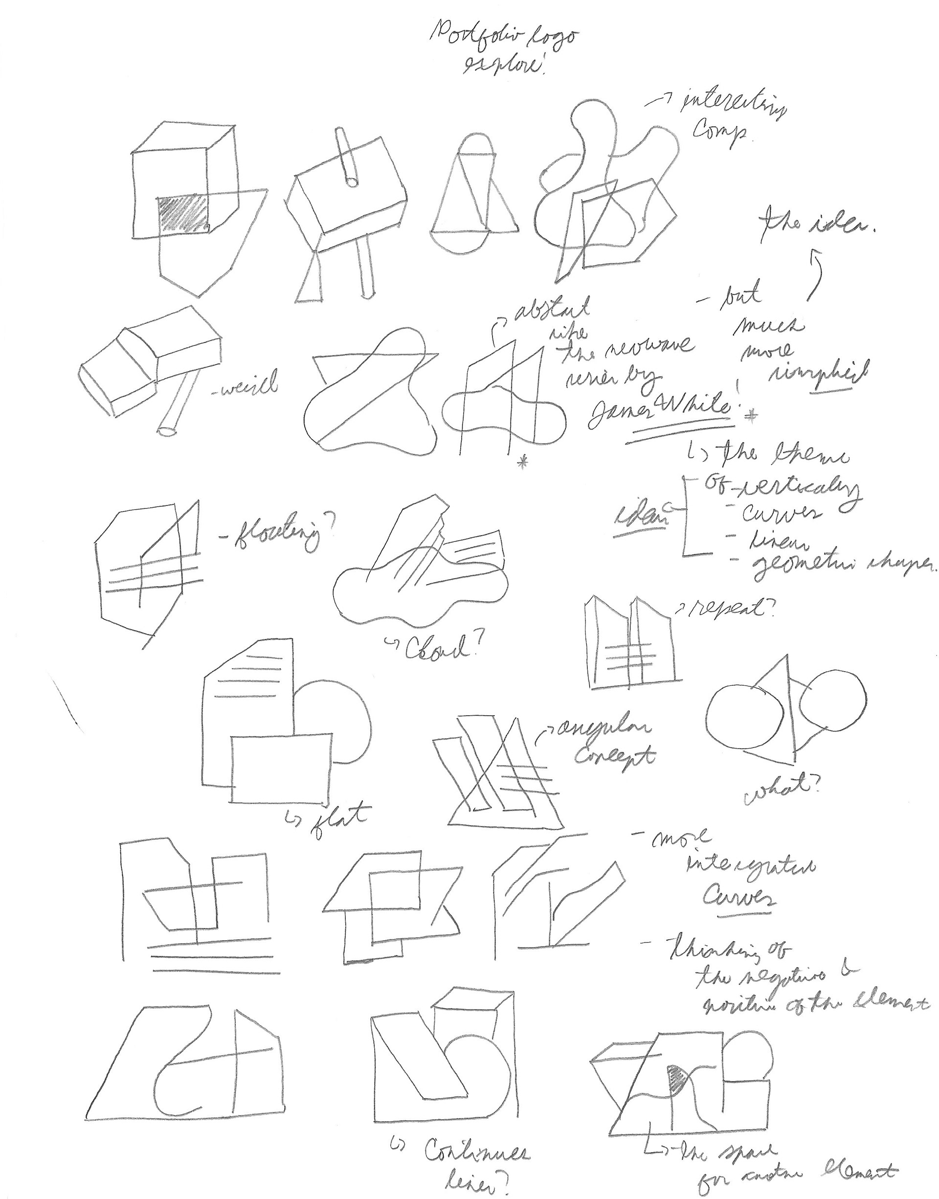
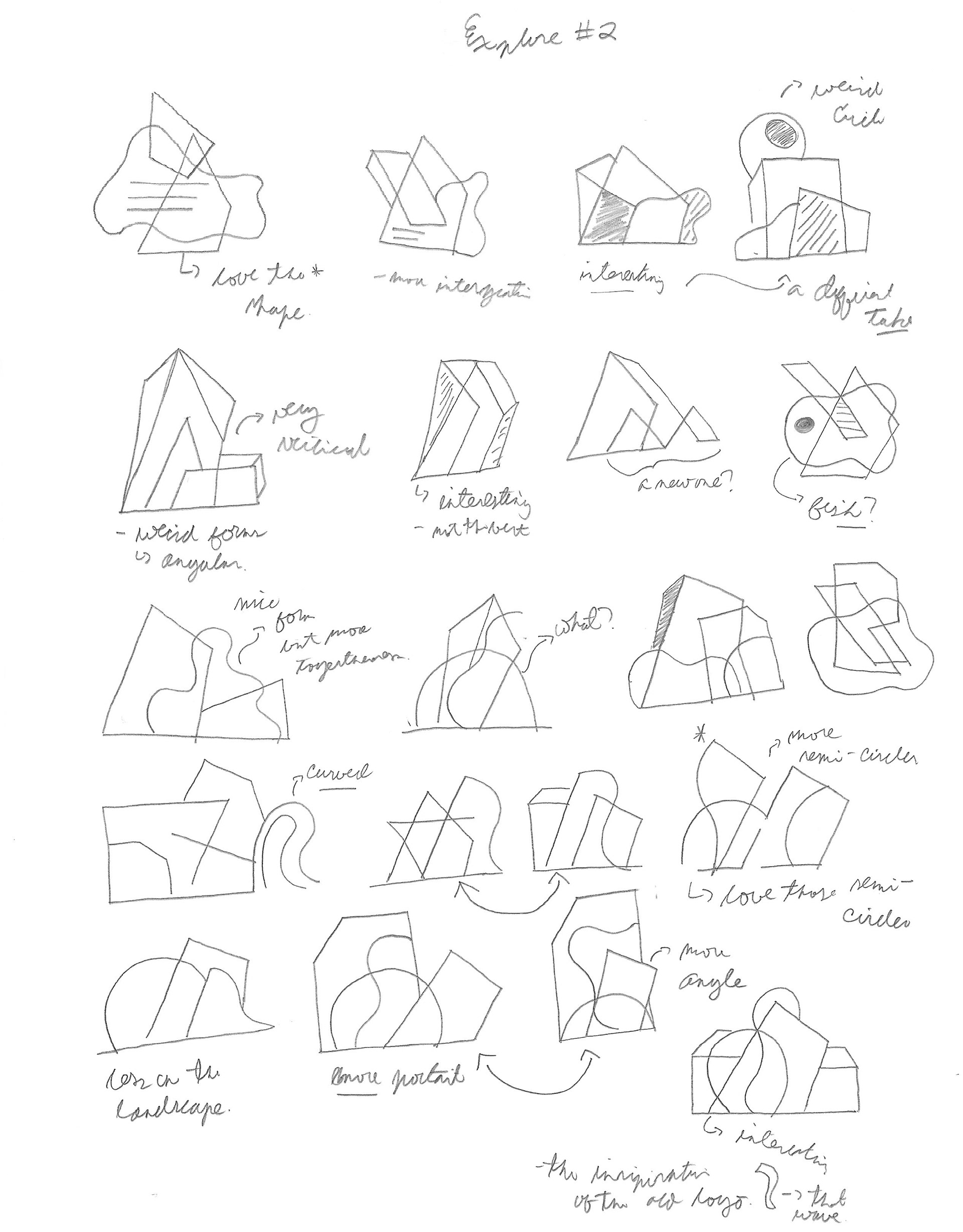
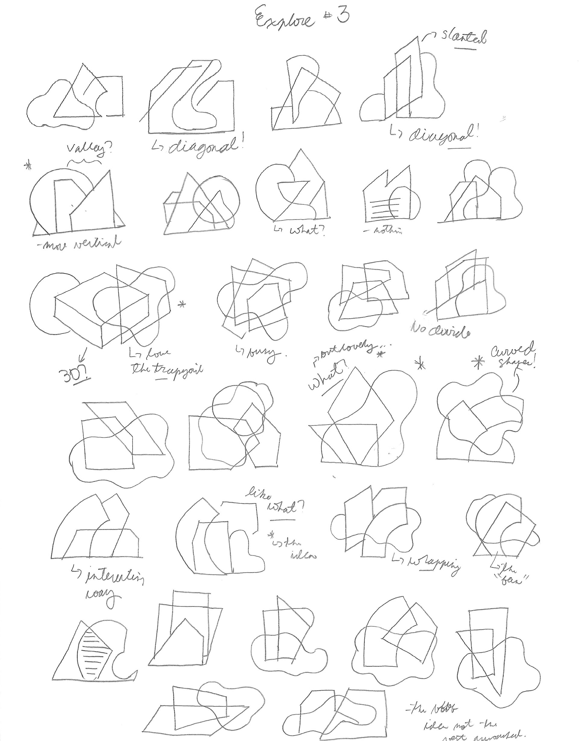
Initial Ideas/Sketches
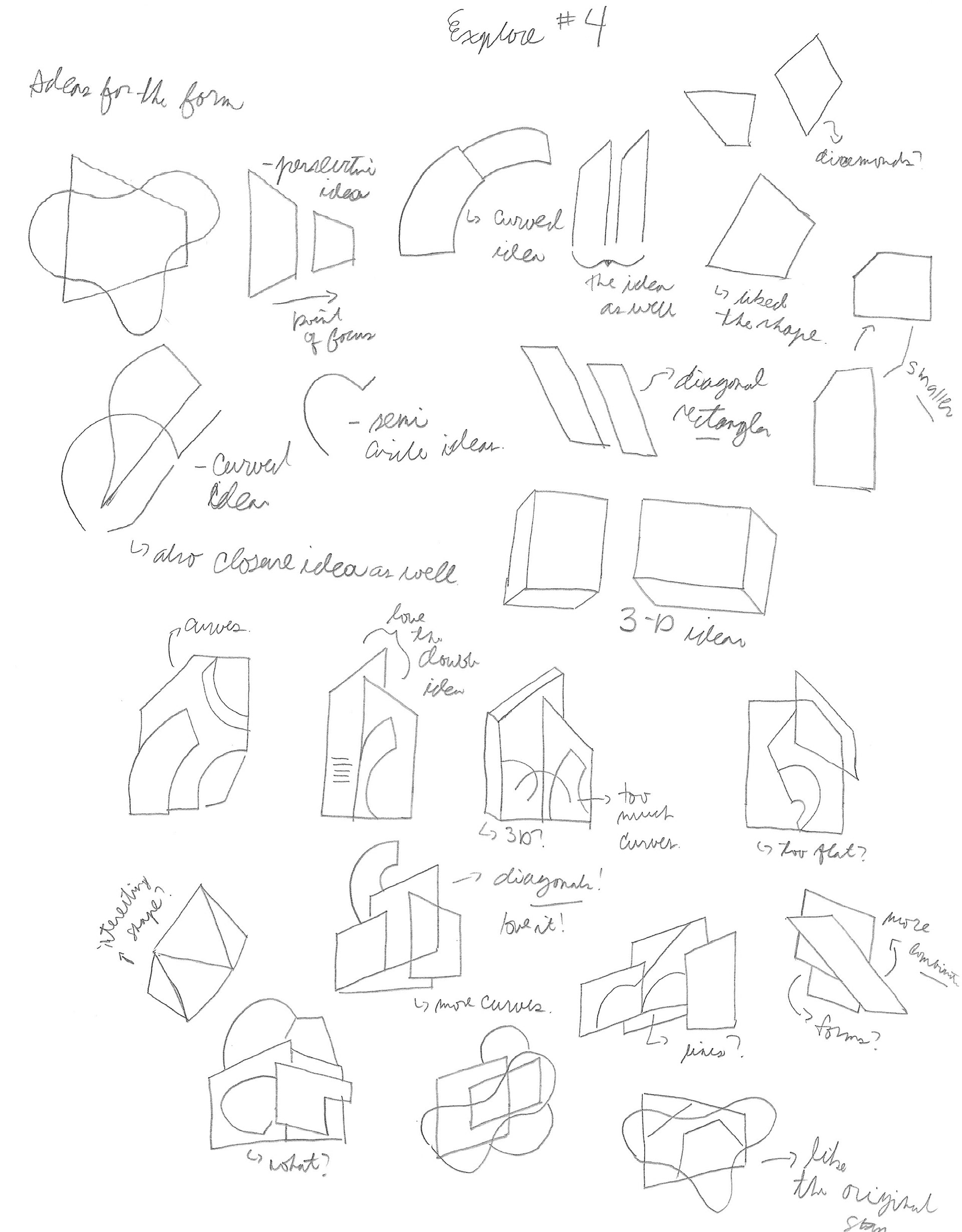
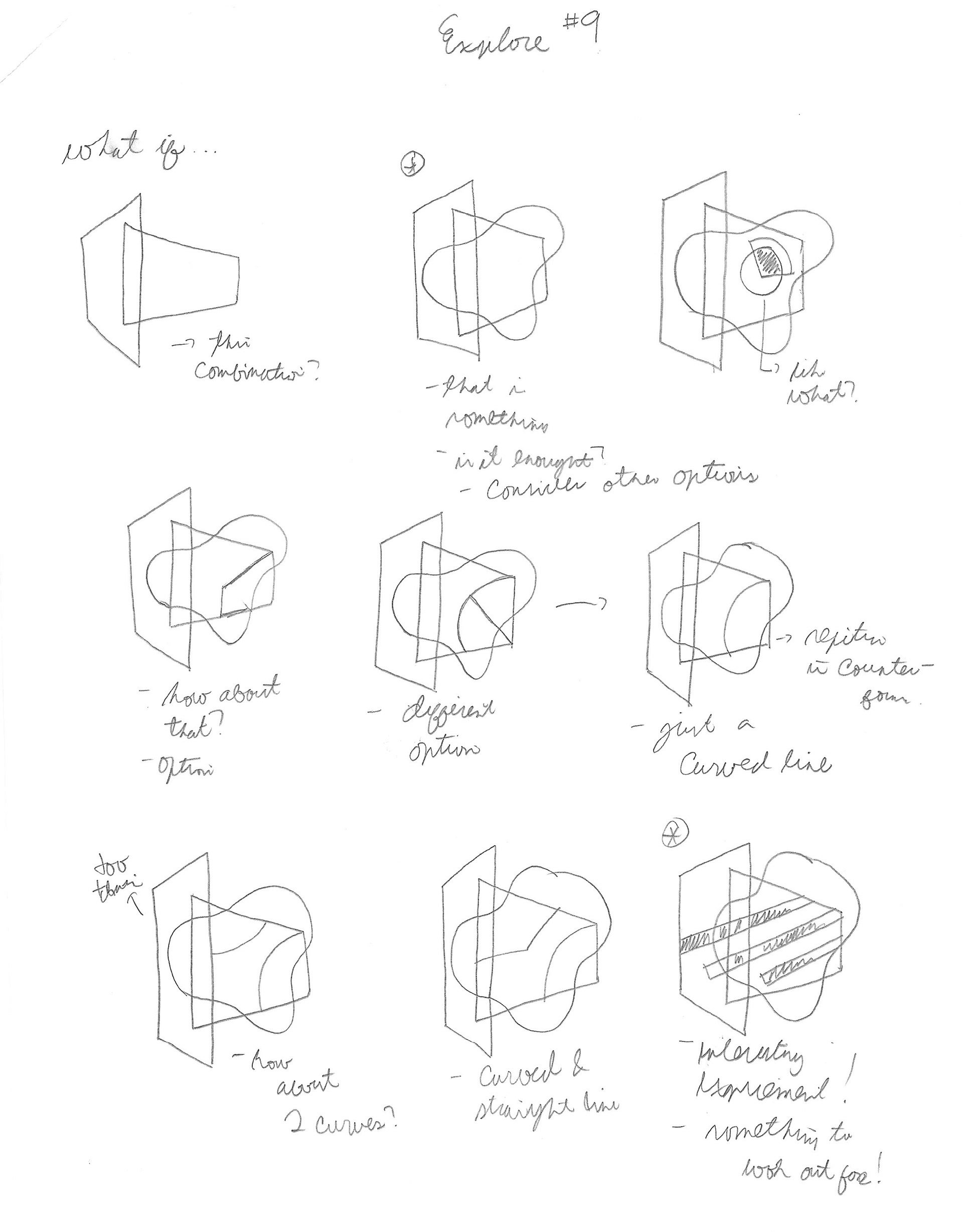
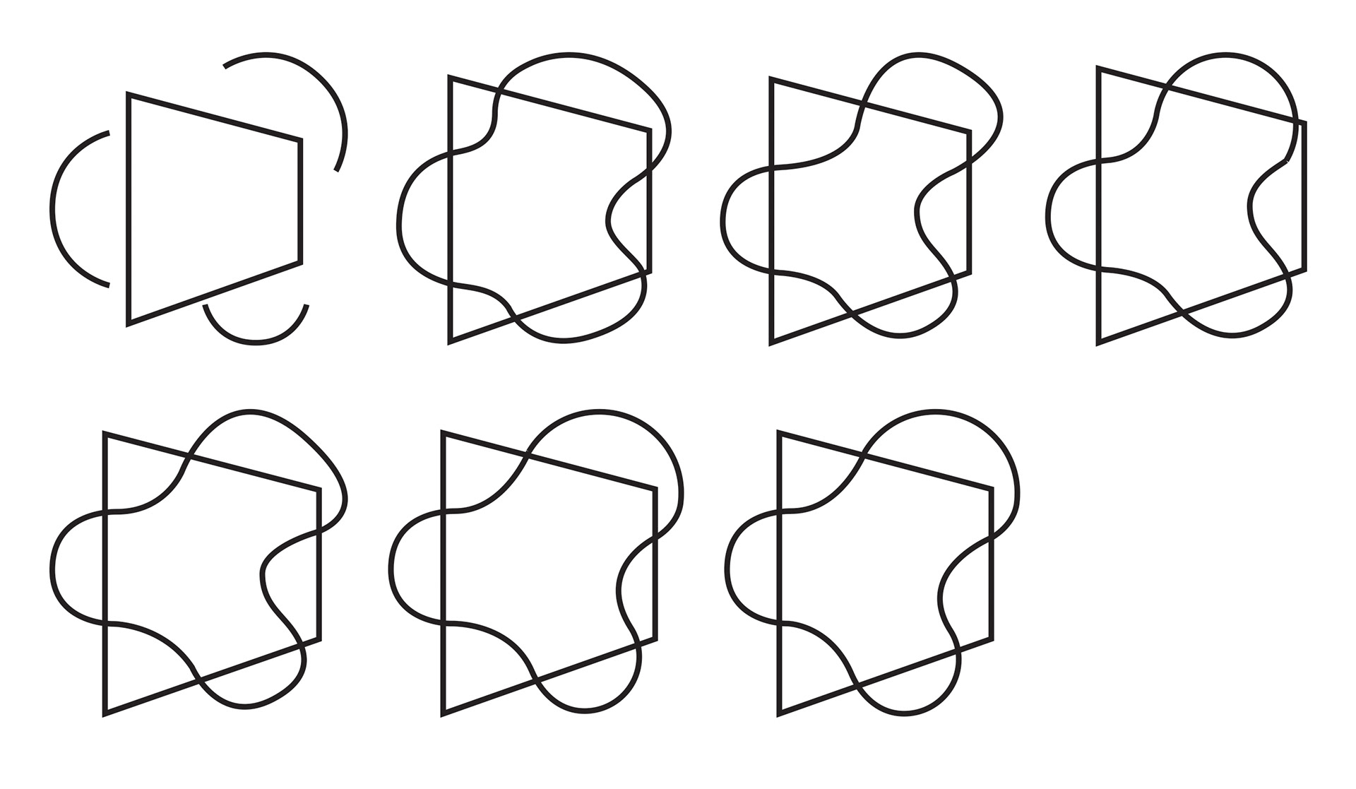
This project started with the intention of creating a mark that is uniquely symbol of my career as a graphic designer. The initial ideas where heavily inspired by my fascination of simple and geometric shapes. The initial ideas came from another project for a brand project and this ideas culminated to further investigate what will be the ideal logo that shows my style and designs. One of the ideas were influenced by many artists in Behance such as James White and his work called Neowave Series. His works fascinated me with large geometric shapes juxtaposed in a desert landscapes with a tactual look, which creates vintage look. Also, it introduces the theme of space because of the unfamiliarity of the location with the shapes and the figures look like they are wearing space suits from the distance. This further develop my interest in these elements and use it many ways and looking at the details such as the counterforms of the shapes. But, only using geometric shapes is bland and boring logos and compositions. So, decided to use curvy and organic shapes combined with geometric shapes incorporated in logos. Which presented many interesting and intriguing logos during the first sketches of the project. This lead me many combinations and ideas that would eventually lead me to the final logo solution.

Digital Exploration
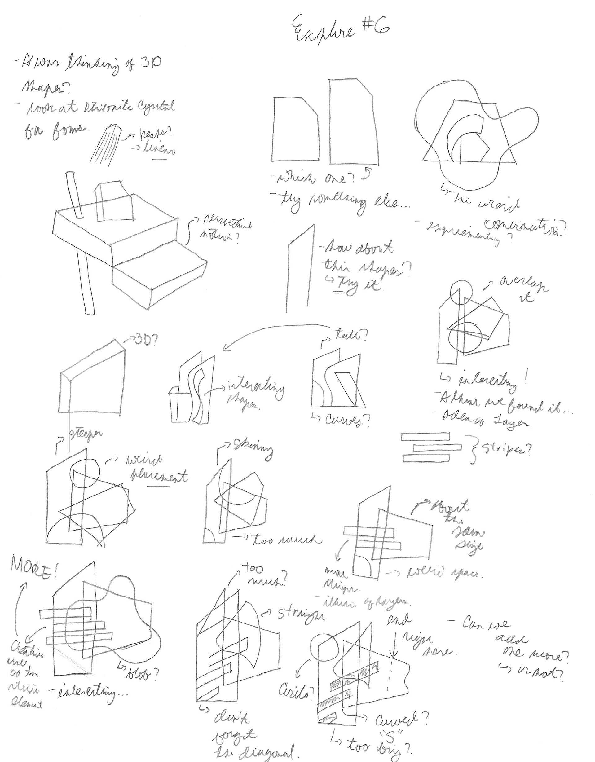
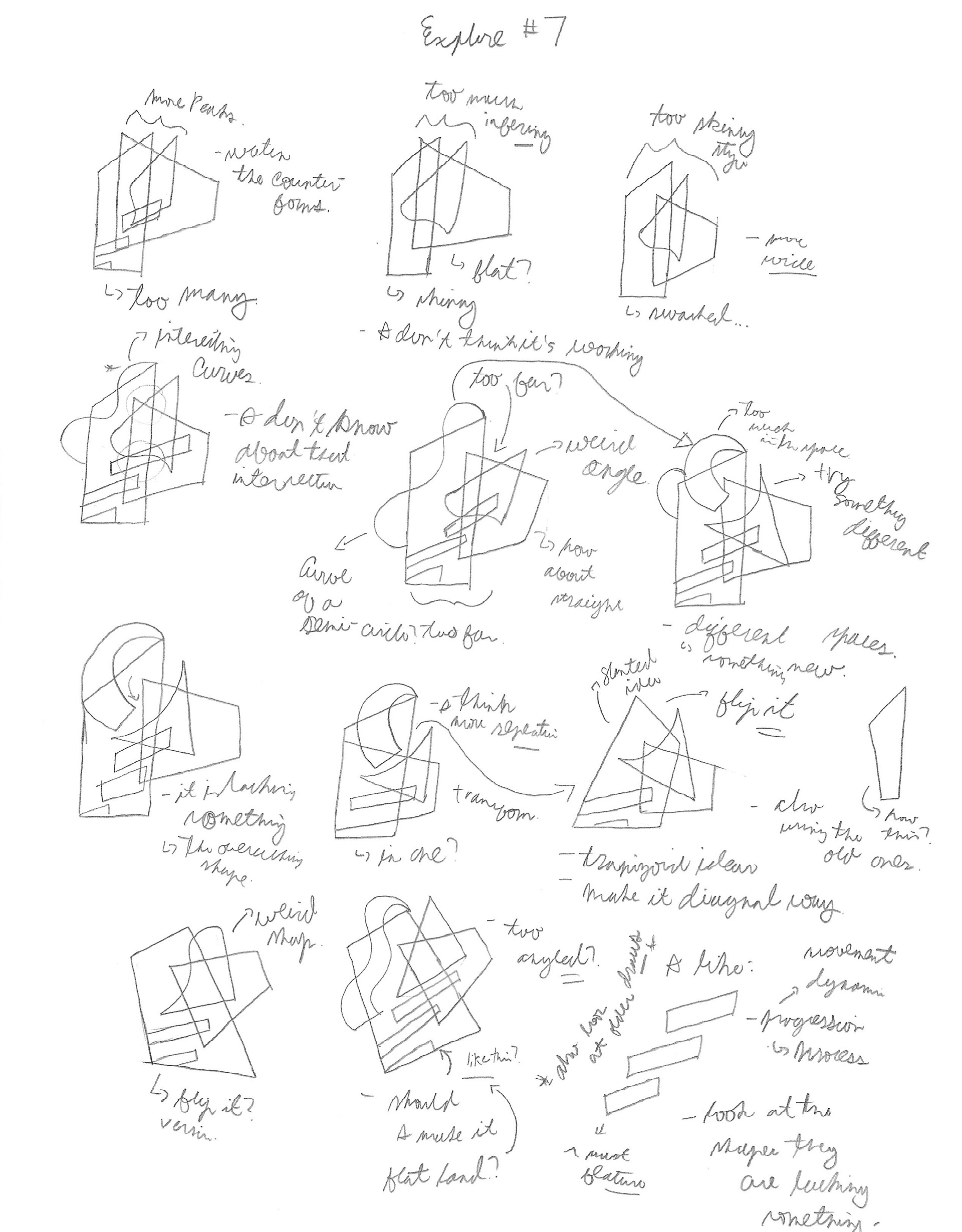
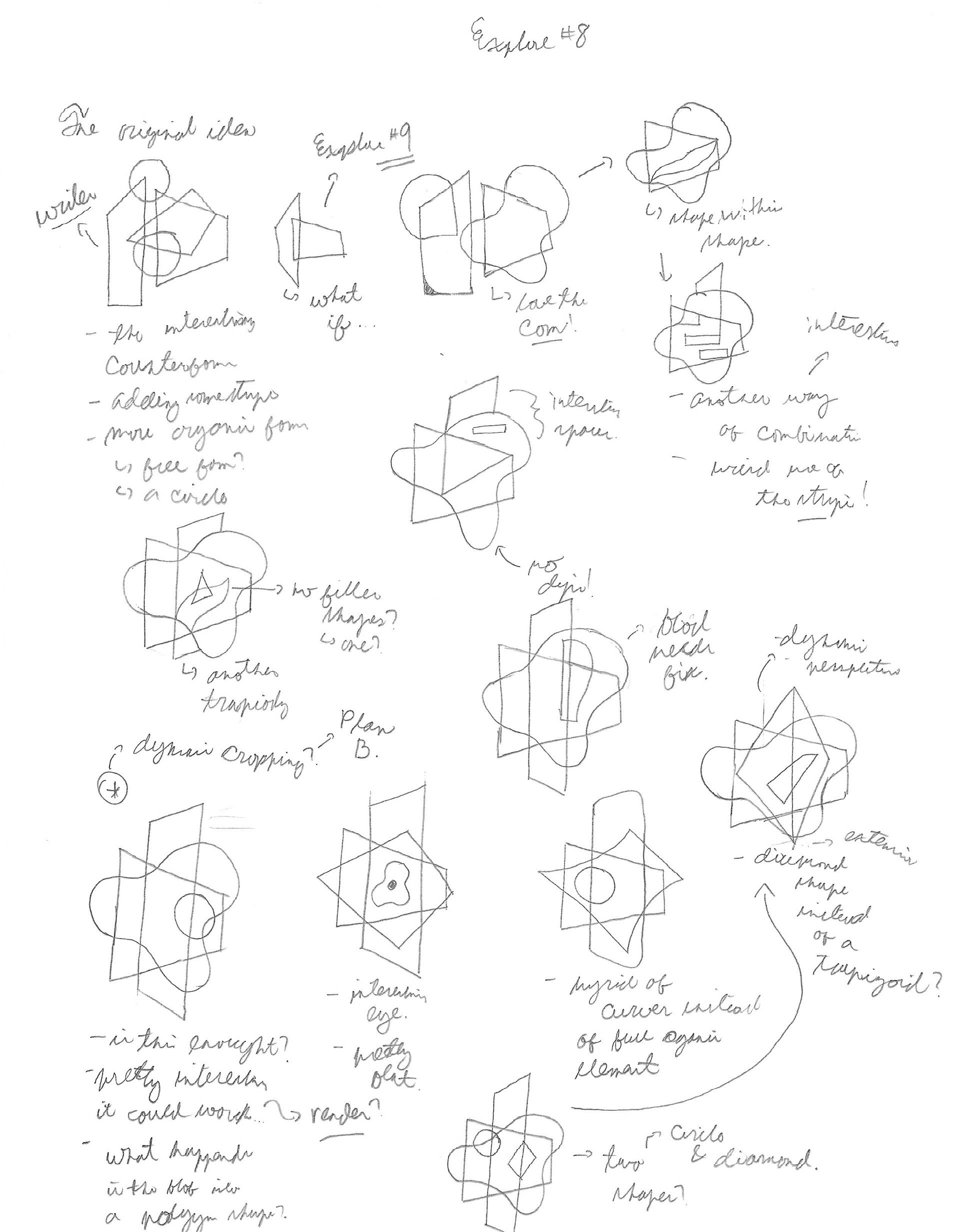
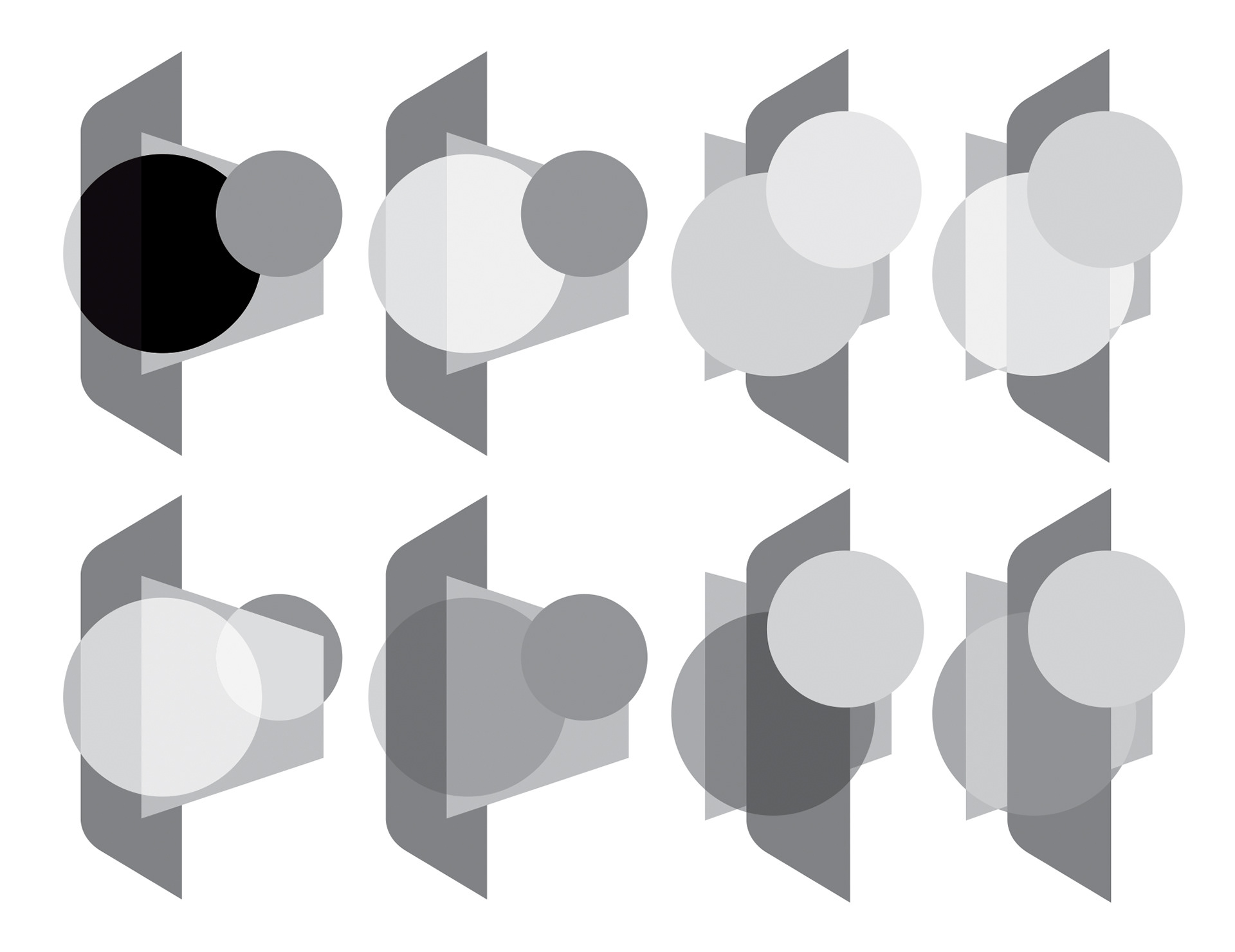
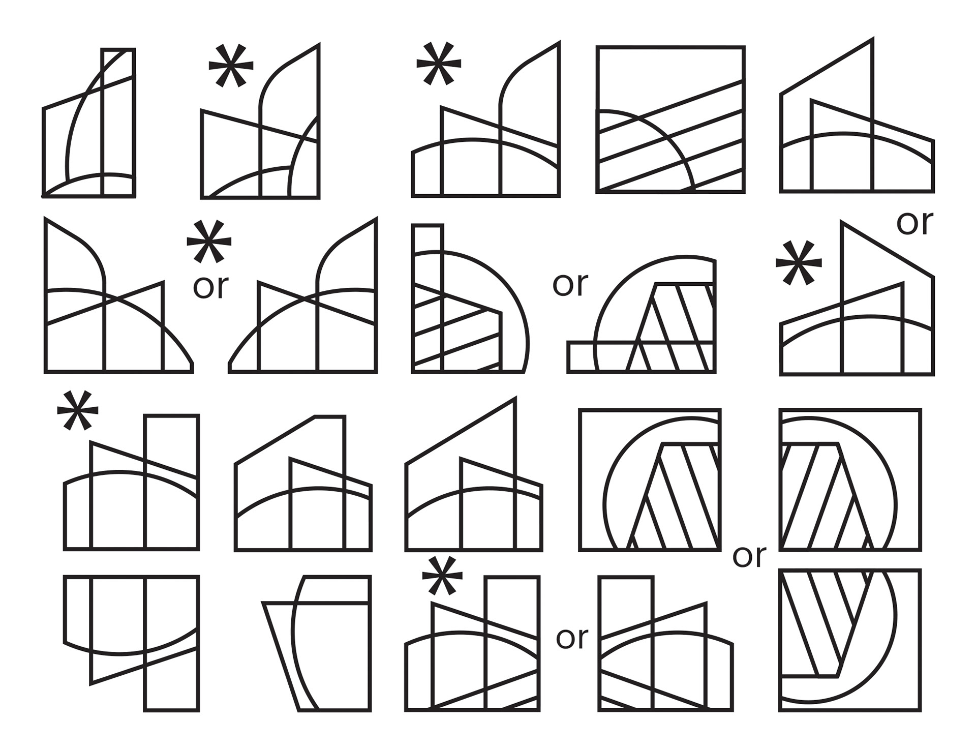
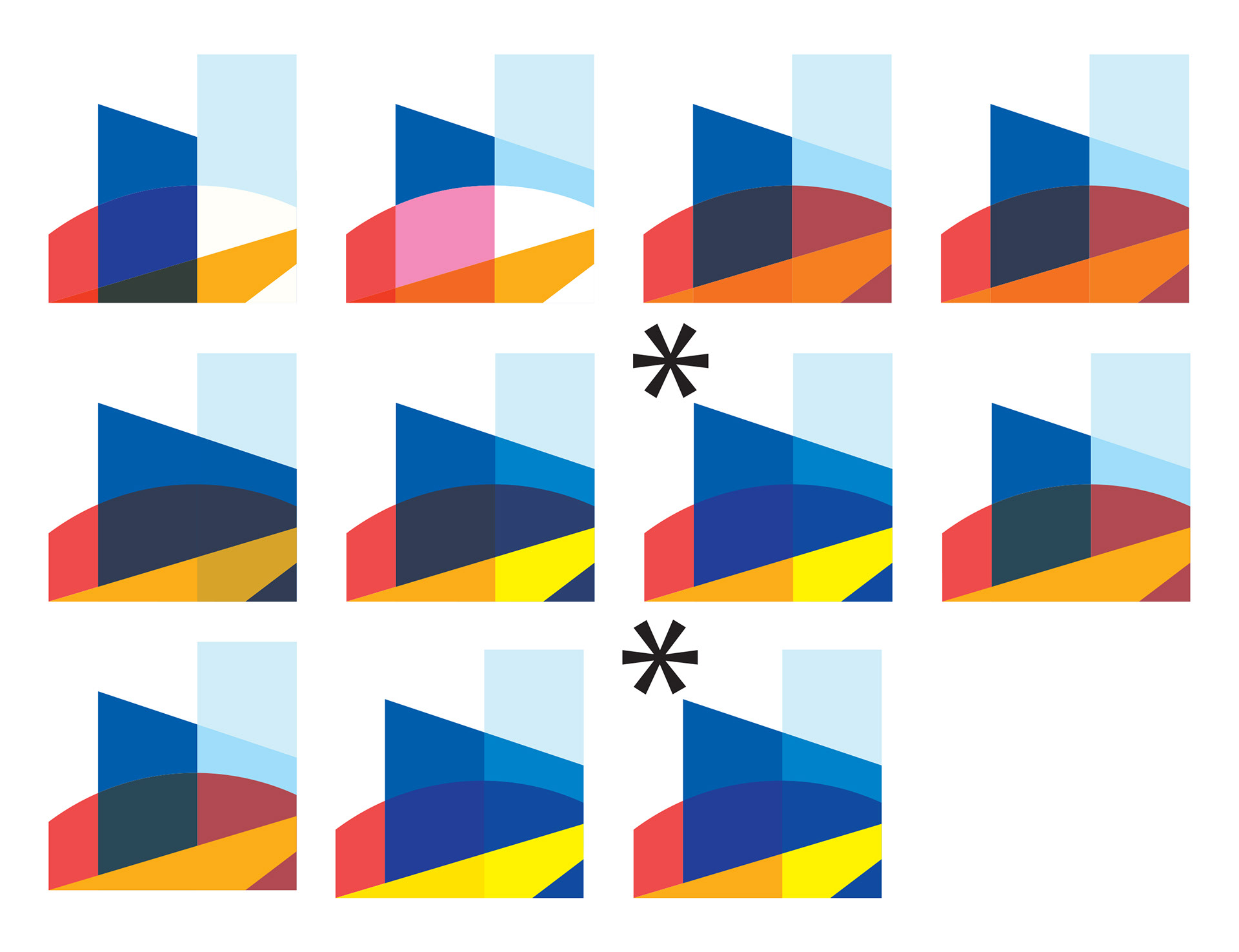
When the drawings translated to the digital versions faced many challenges such as the blob idea when creating these elements. This caused many alterations at this stage of the process such as using circles to replace the organic blob element in the logo to prevent looking like a random element in the logo. In the process, the circular element have many arrangements to interact with the geometric shape, which resulted into dozens of combinations. Also, some ideas from the sketches are used in this stage of the creation such as the stripped elements. This stage is the turning point of the logo because of the circles being used and not a random blob element.
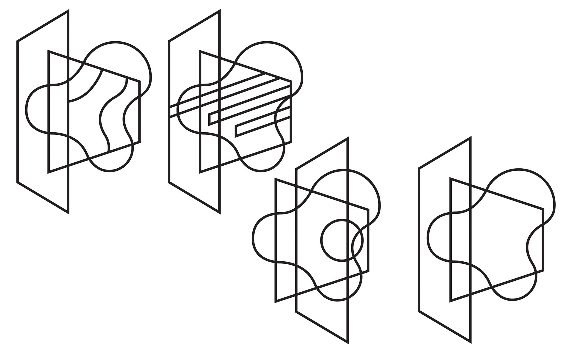

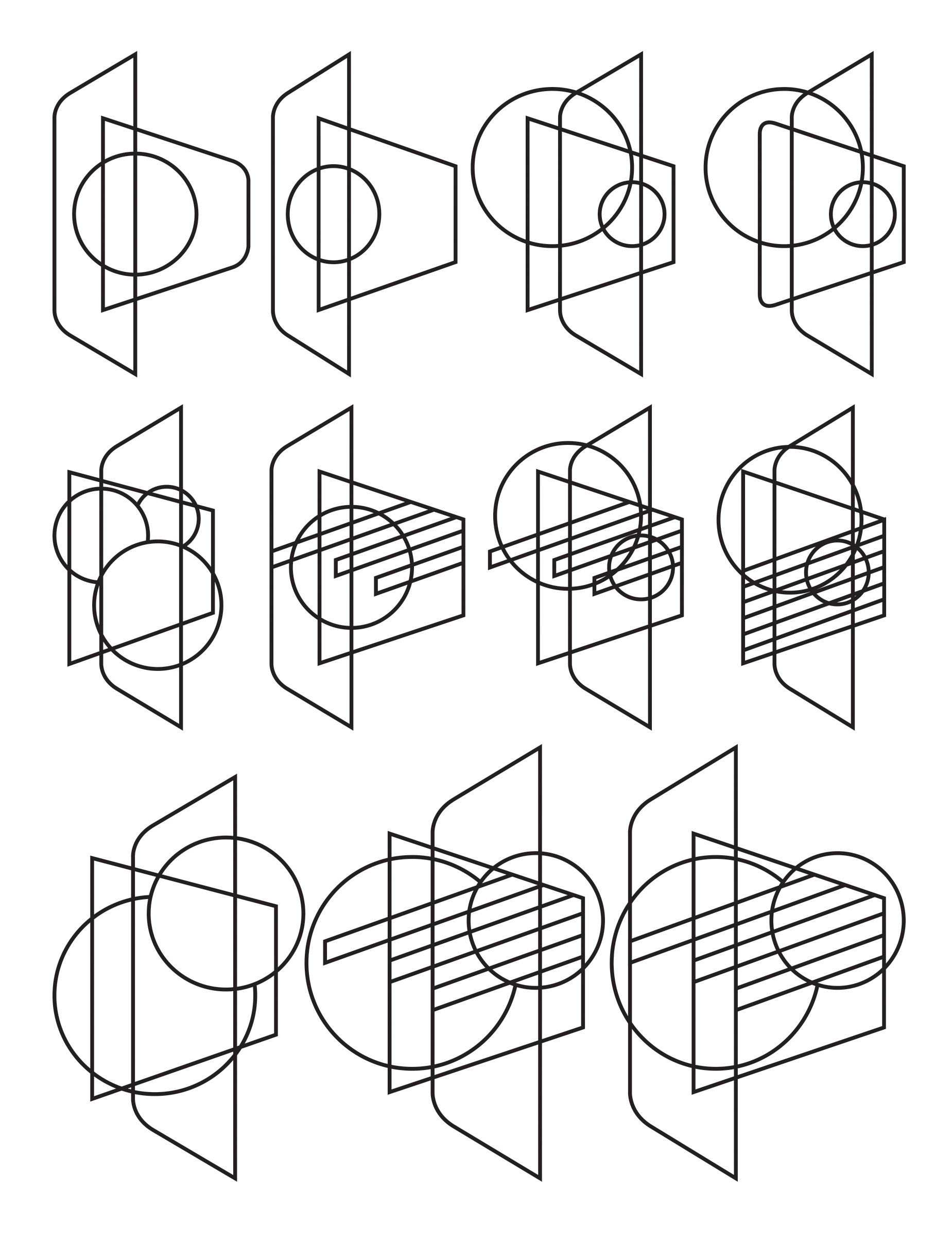

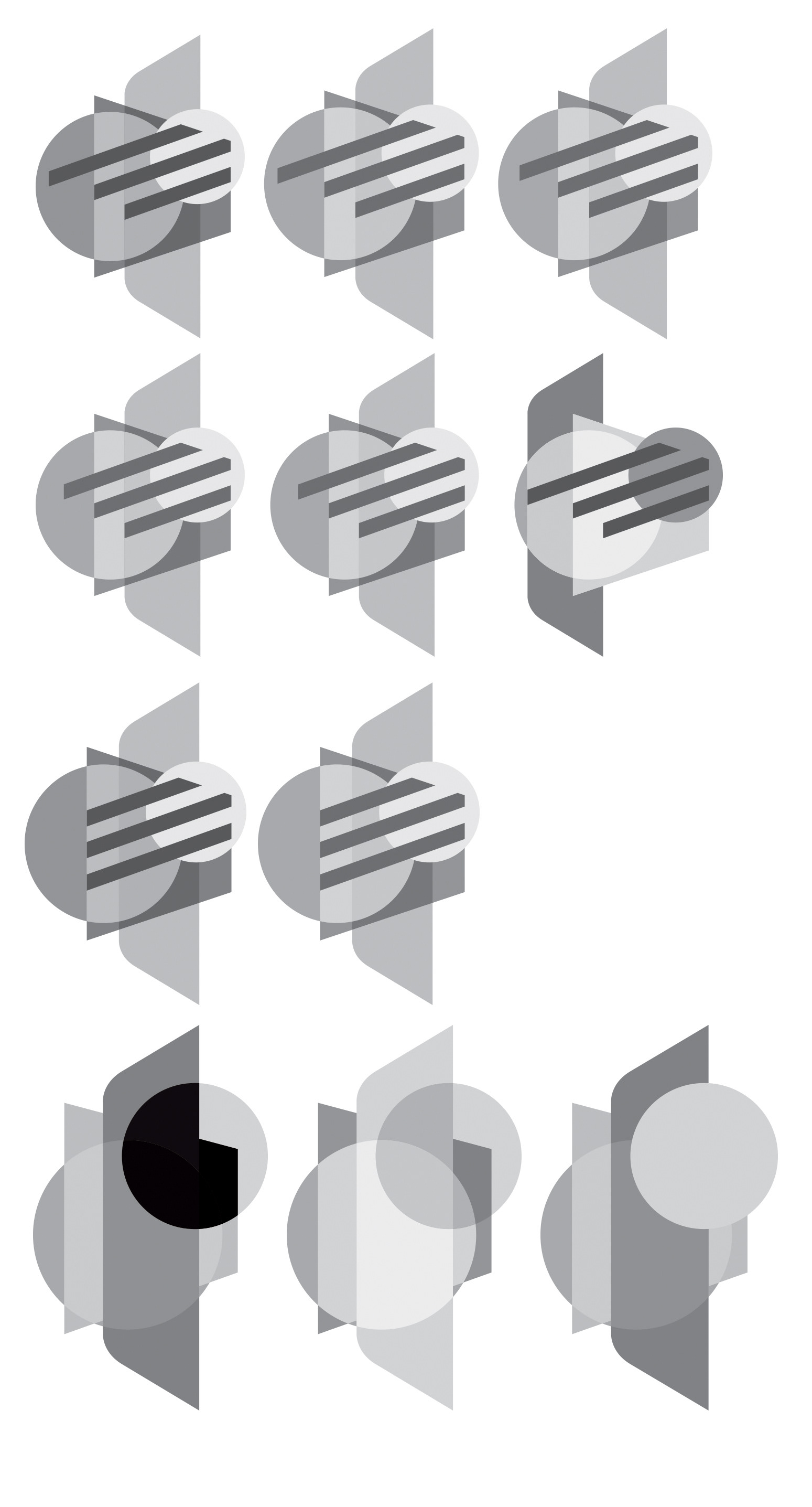

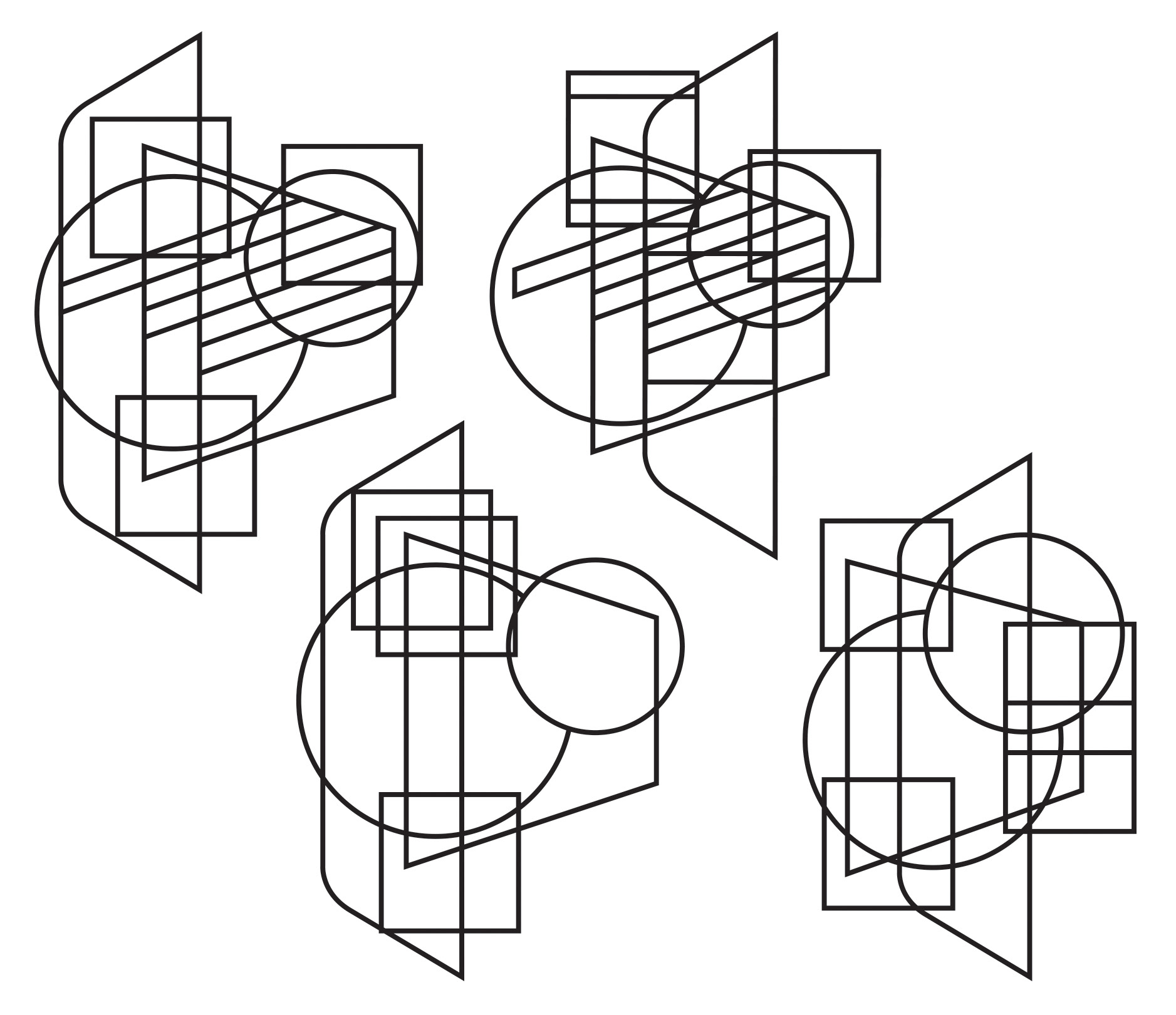
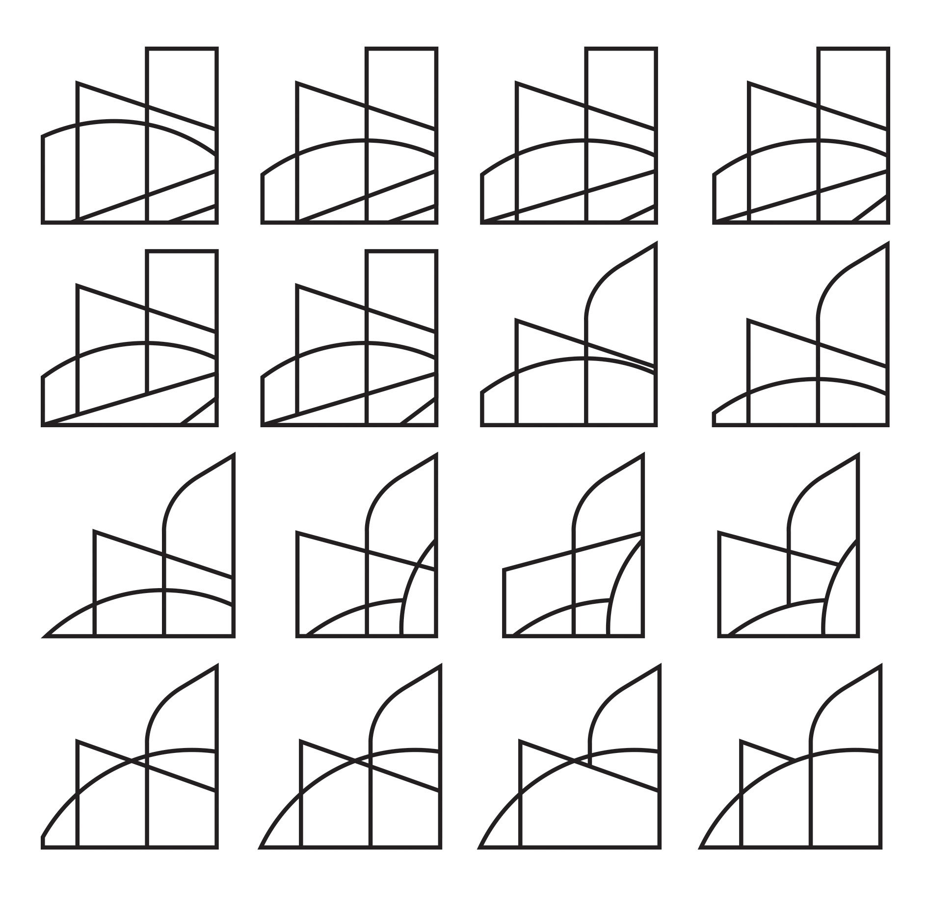
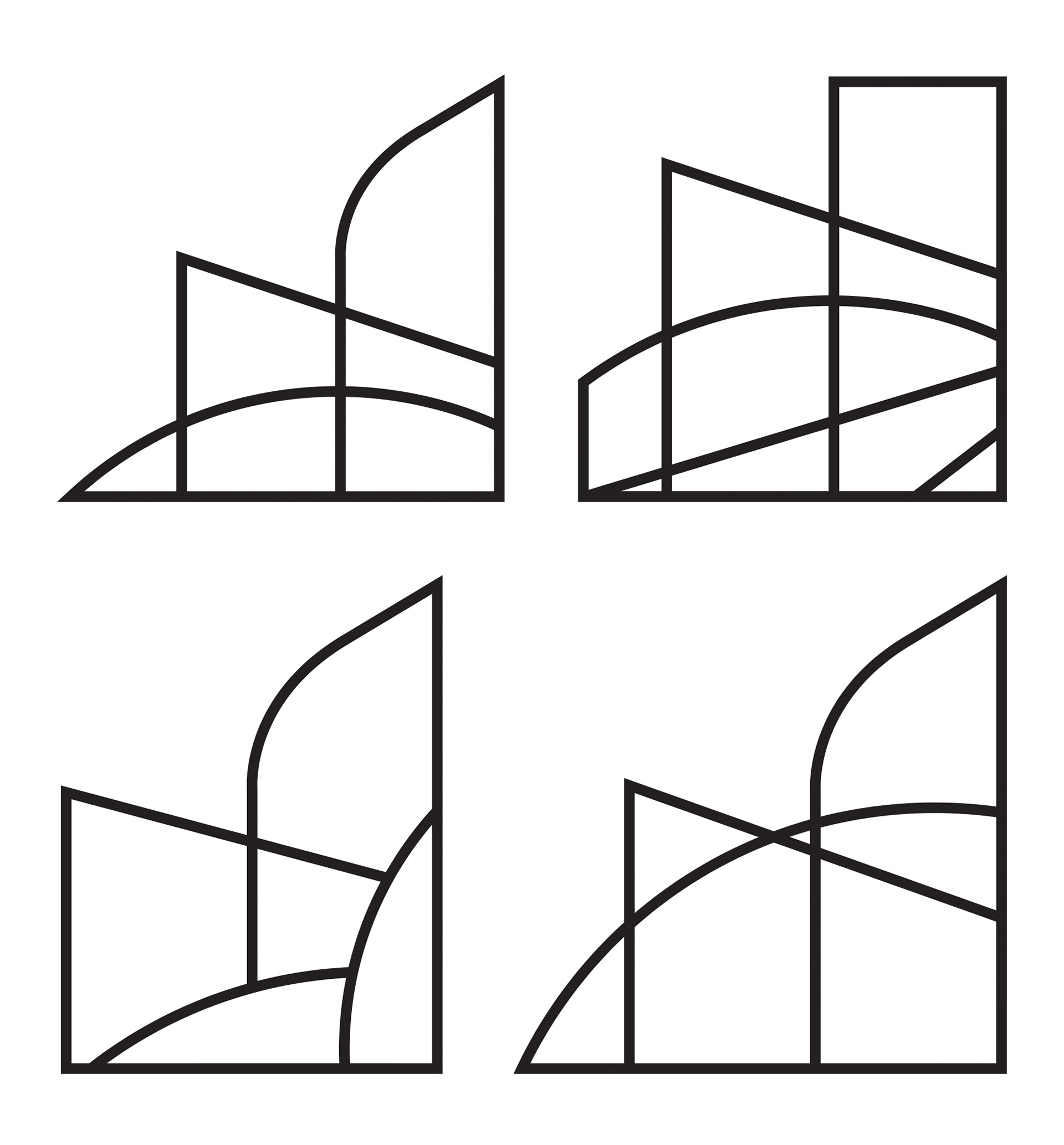
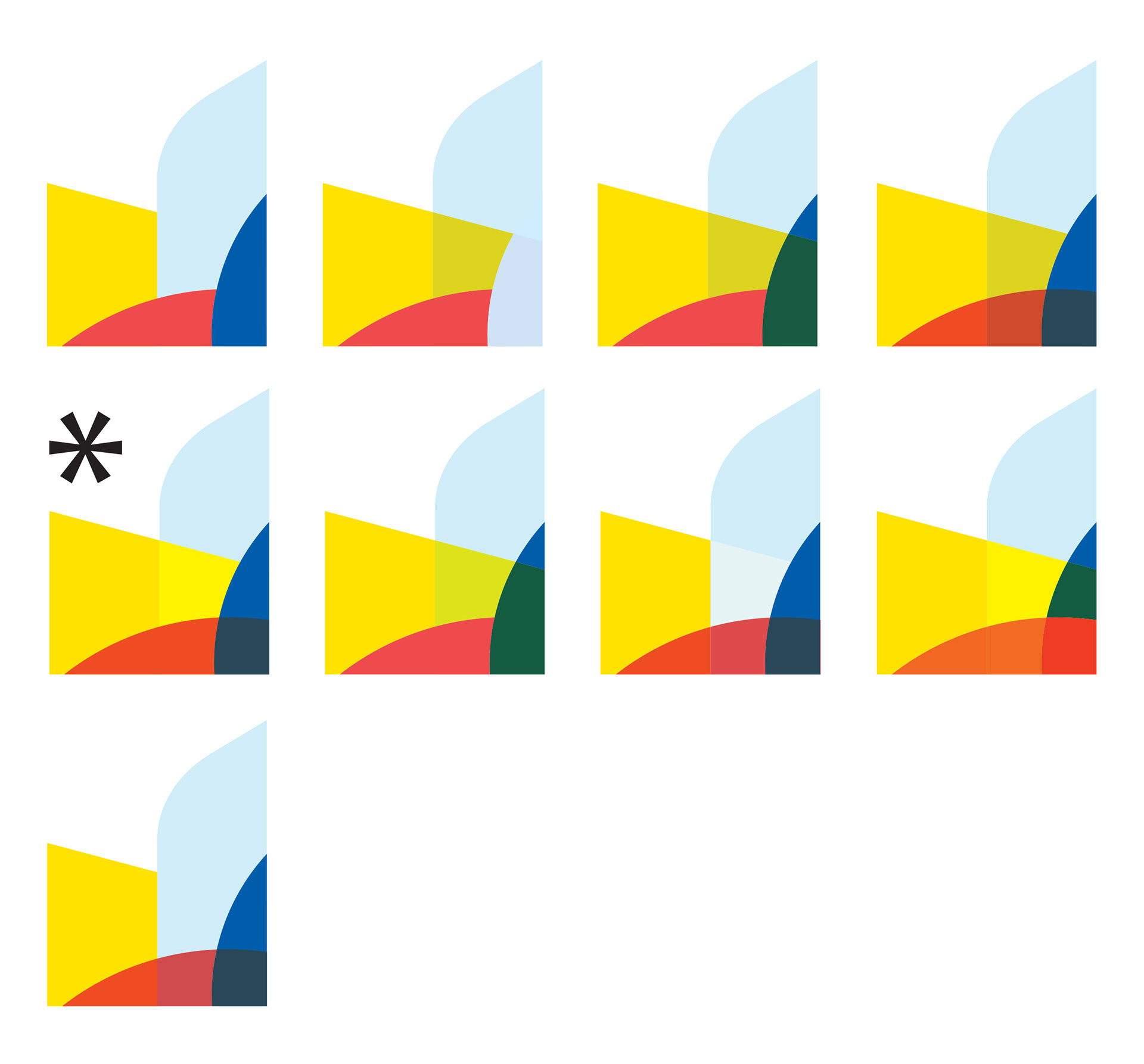
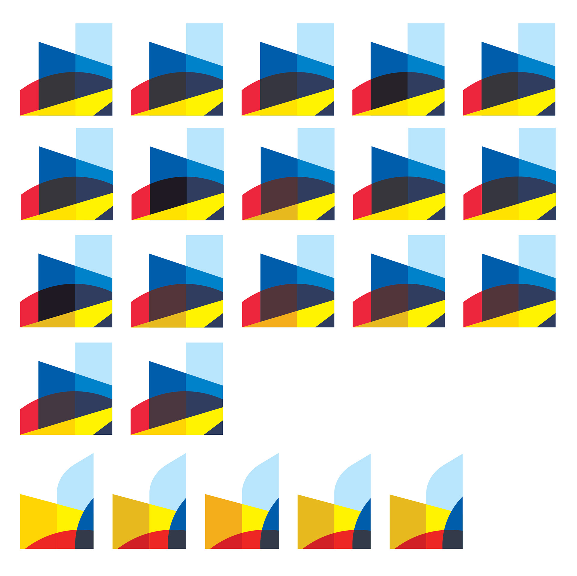
In this phase, I explore around how to crop specific parts of the existing logo and looking at the counterforms of the shapes of the logo and interesting connection to the other elements. The square shapes that overlap in the logos represents the cropped section that I took interest of explore for more logos and more simplified way of creating the logo. The bottom group is the result of the cropping of the logo from the top of this page. The stars are the one that I selected to be my logo and eventually made adjustment to give more interest and impact to the composition.

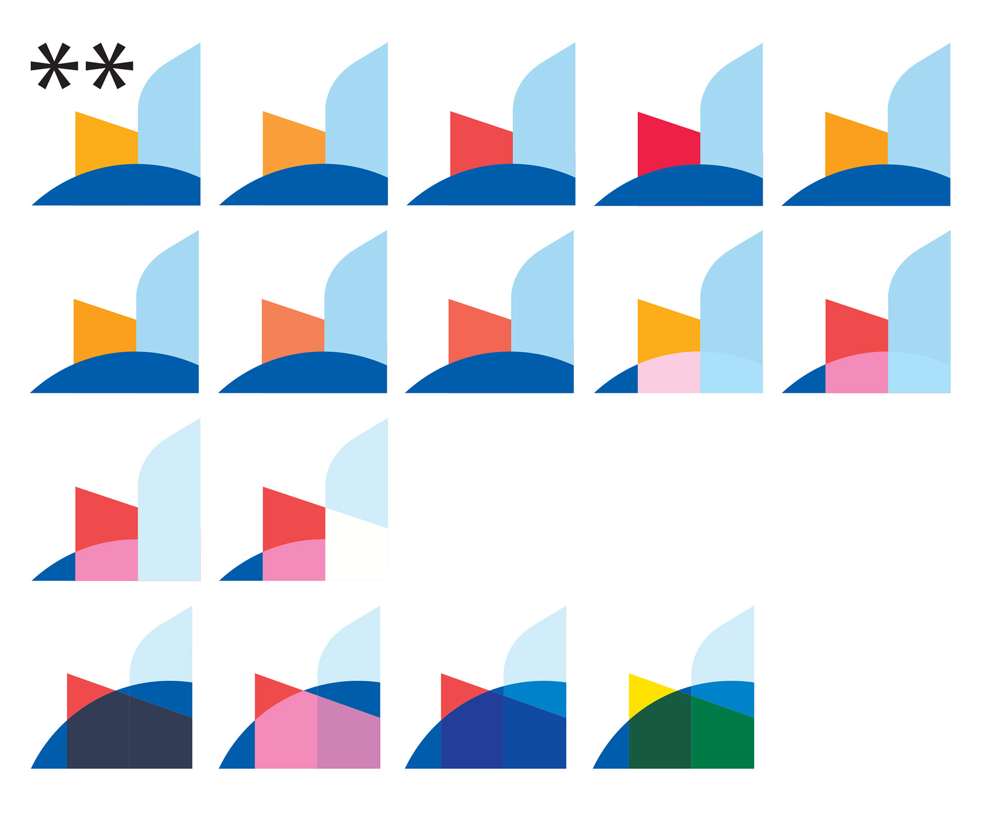
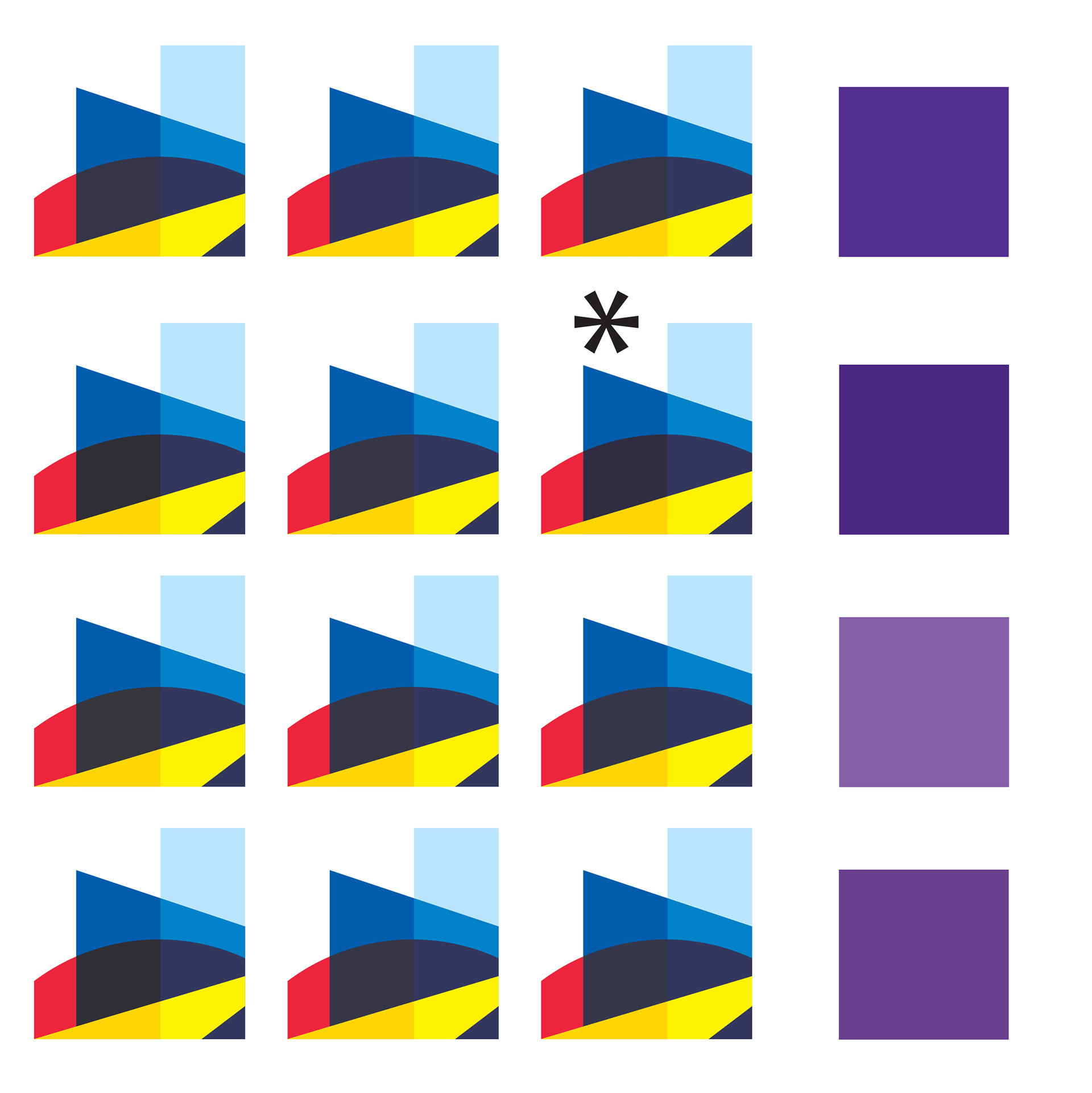
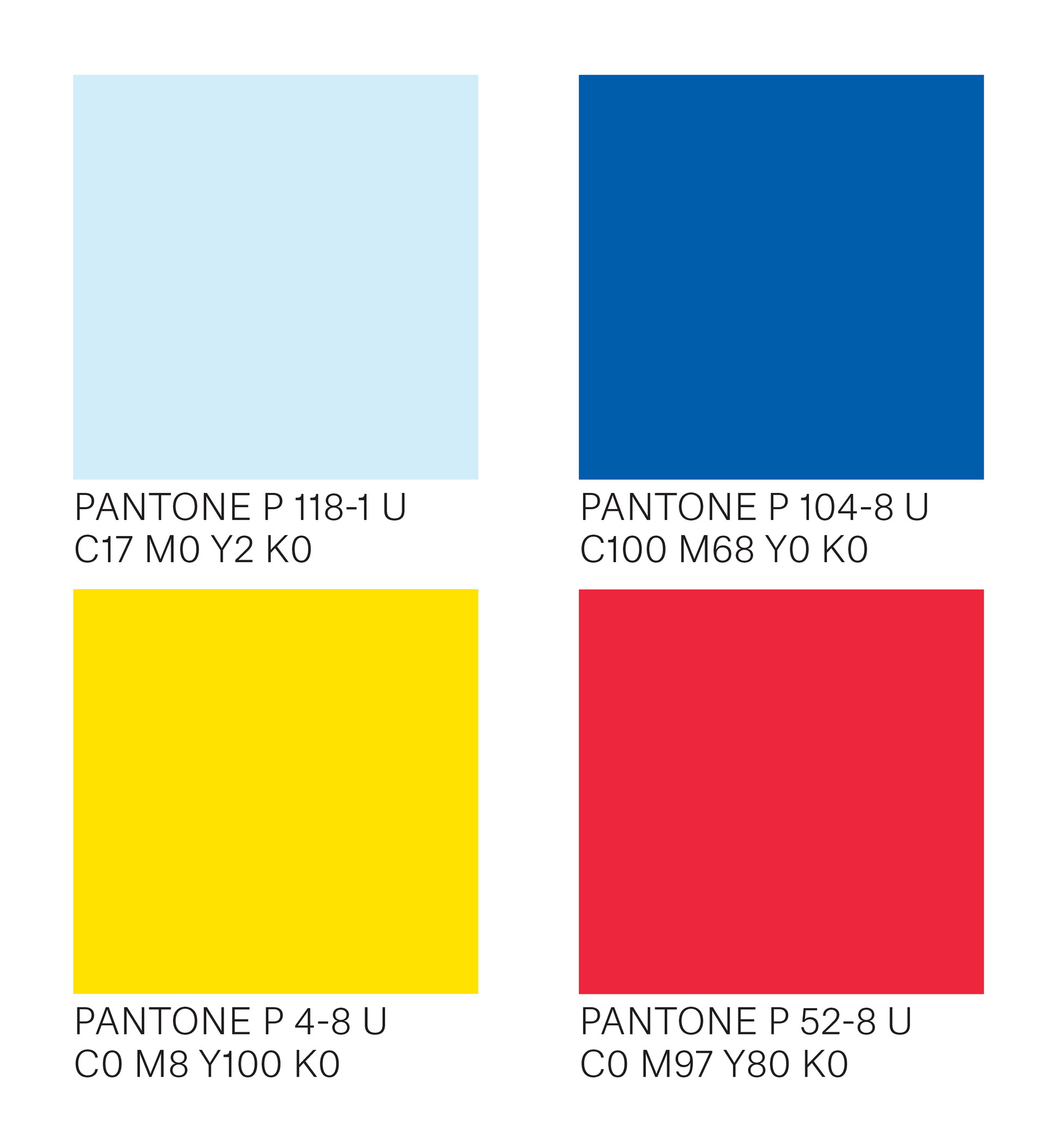
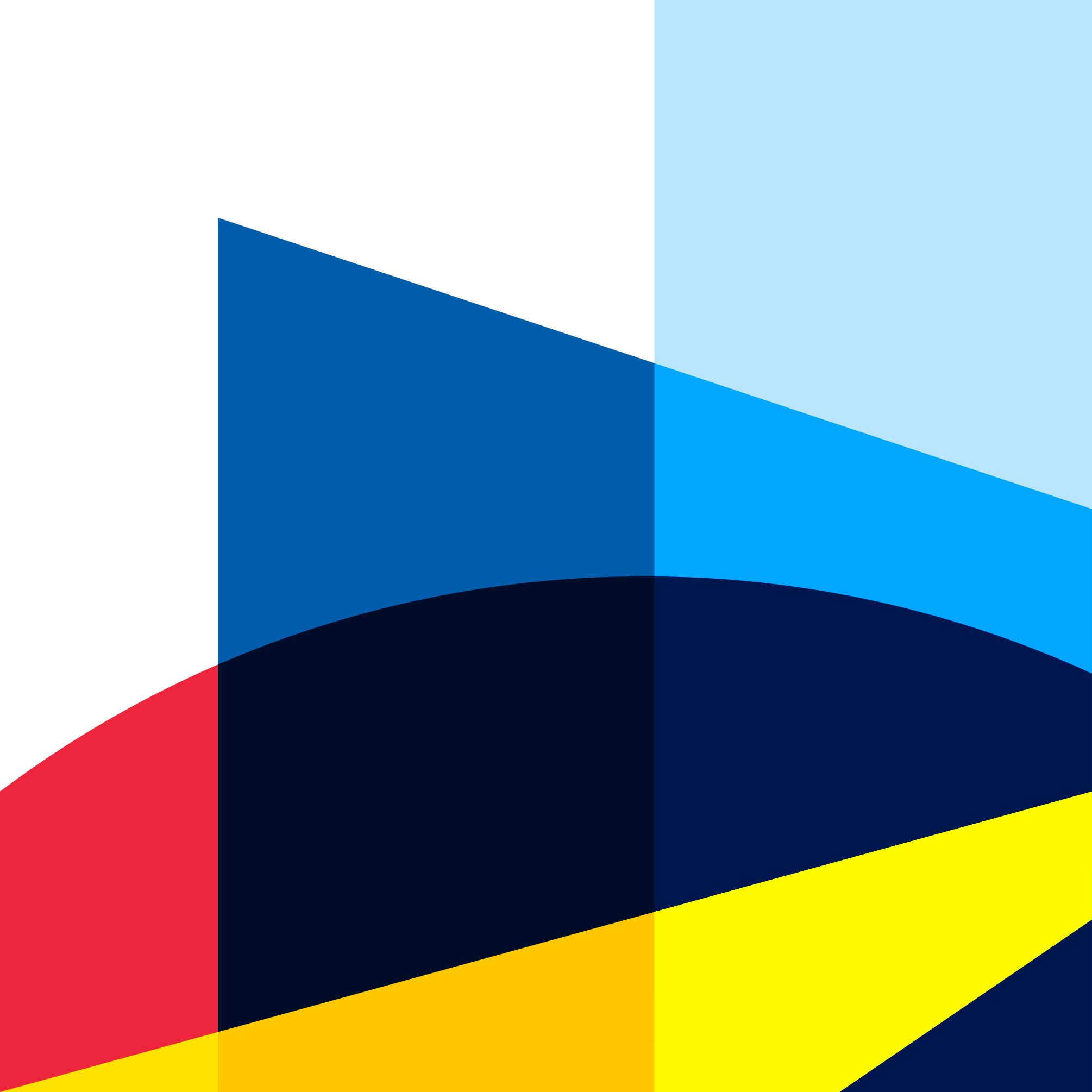
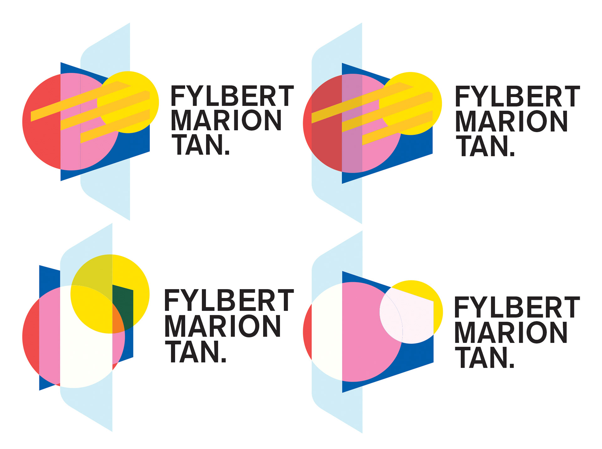
On the right side —This is the colour that I chose in the logo from the previous stage and this stage of the process. This palette represents the notion of my designs mixing the geometric cool clean lines to warm organic shapes that are found in nature. This is also reflection of my colour palette when I create and design composition with sense of balanced in the colour schemes
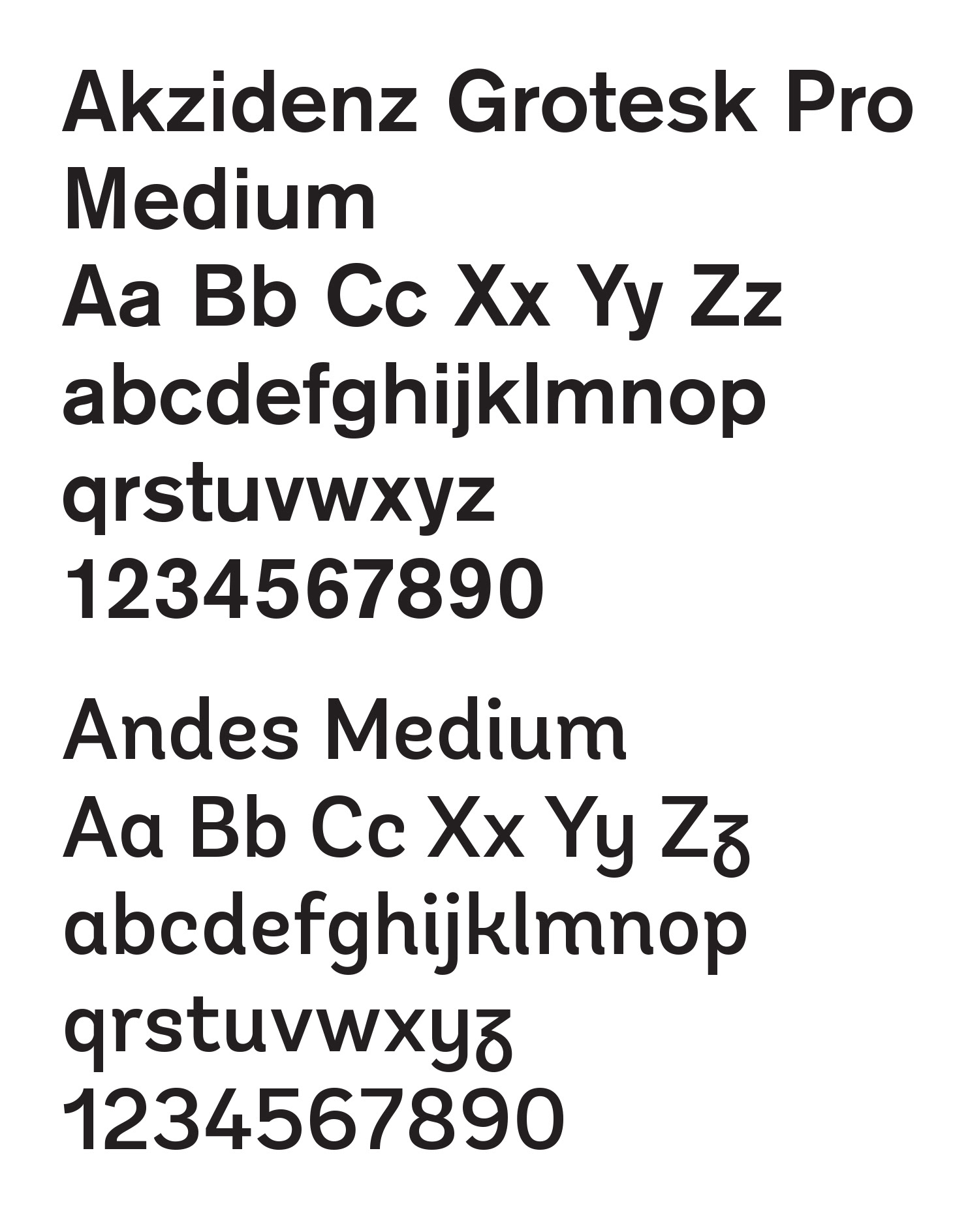
On the left side — The official typefaces that I chose between the logos are the reflection of the style and look of the two logos that I end up choosing at the final stages. The grotesk typeface reflects the geometric aspect that is present in the first logo and more a contemporary and modern feel. The second typeface represents more of the organic nature of the second alternate logo which gives it a more humanist aspect.
Final Designs
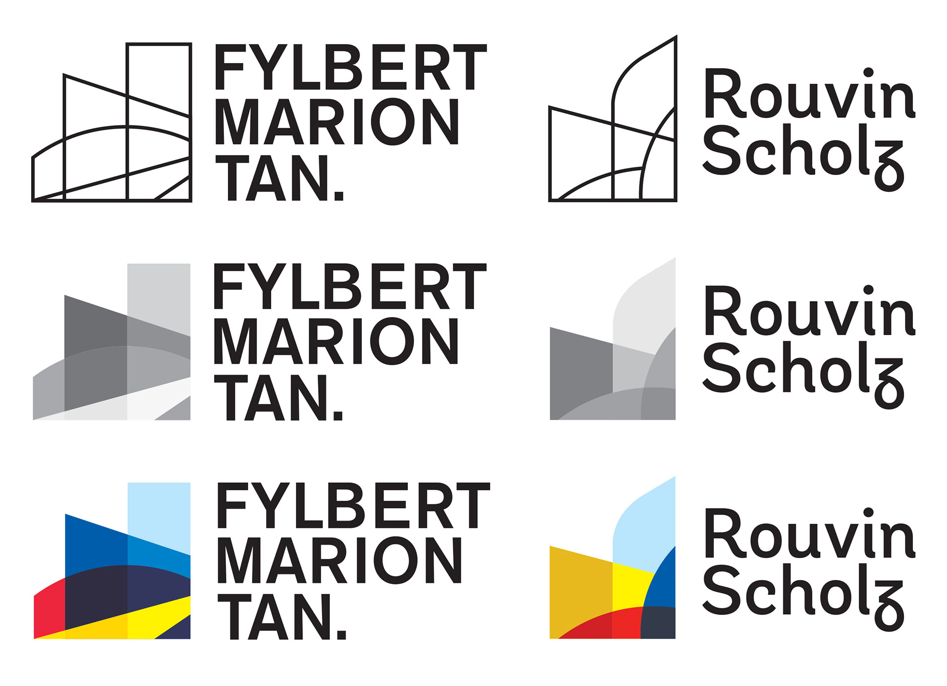
All of this, it culminated to this two official logos shown above. The first one is the real logo that I will use primarily in my works which reflects my iconic look of geometric style of design and a sense of order and cleanliness that I strive for when I creating compositions. Also, it echoes my desire of creating compositions to be dynamic, interesting and, unique designs with many inspiration from many creators from around the world as a further develop my style in design. The second logo is the alternate logo with alias name or a pen name for myself that I gave for this design. This composition represent another view of my designs that I lean towards to the idea of organic elements and my curiosity of using this elements to integrate throughout my future designs. In which, I aim to diversify my composition as evolve my design in the near future. Likewise, it represent the process of breaking away from the structured and ordered designs that I always relied on from the very beginning. This way, I can represent myself in many forms of my logos with distinct styles.
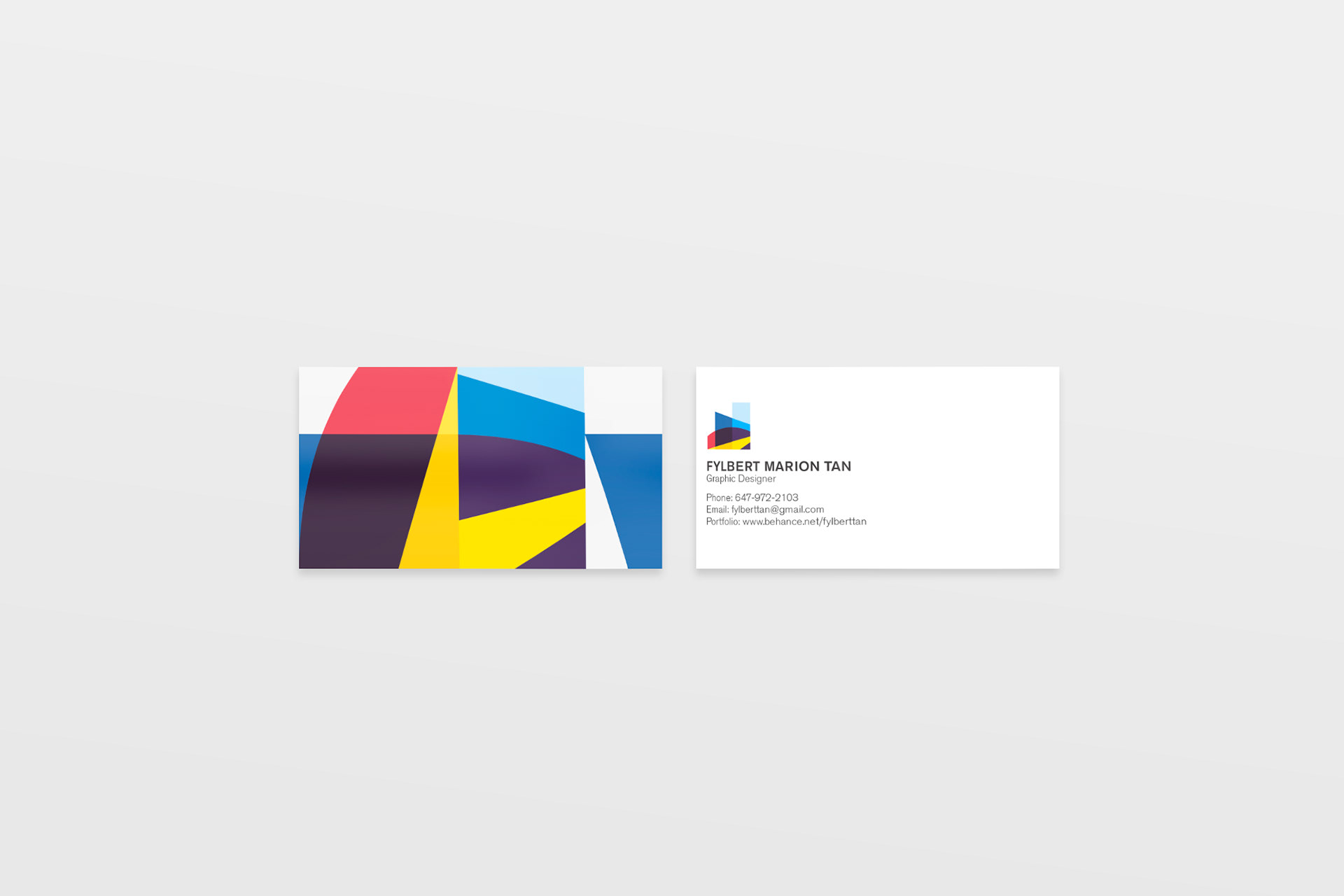
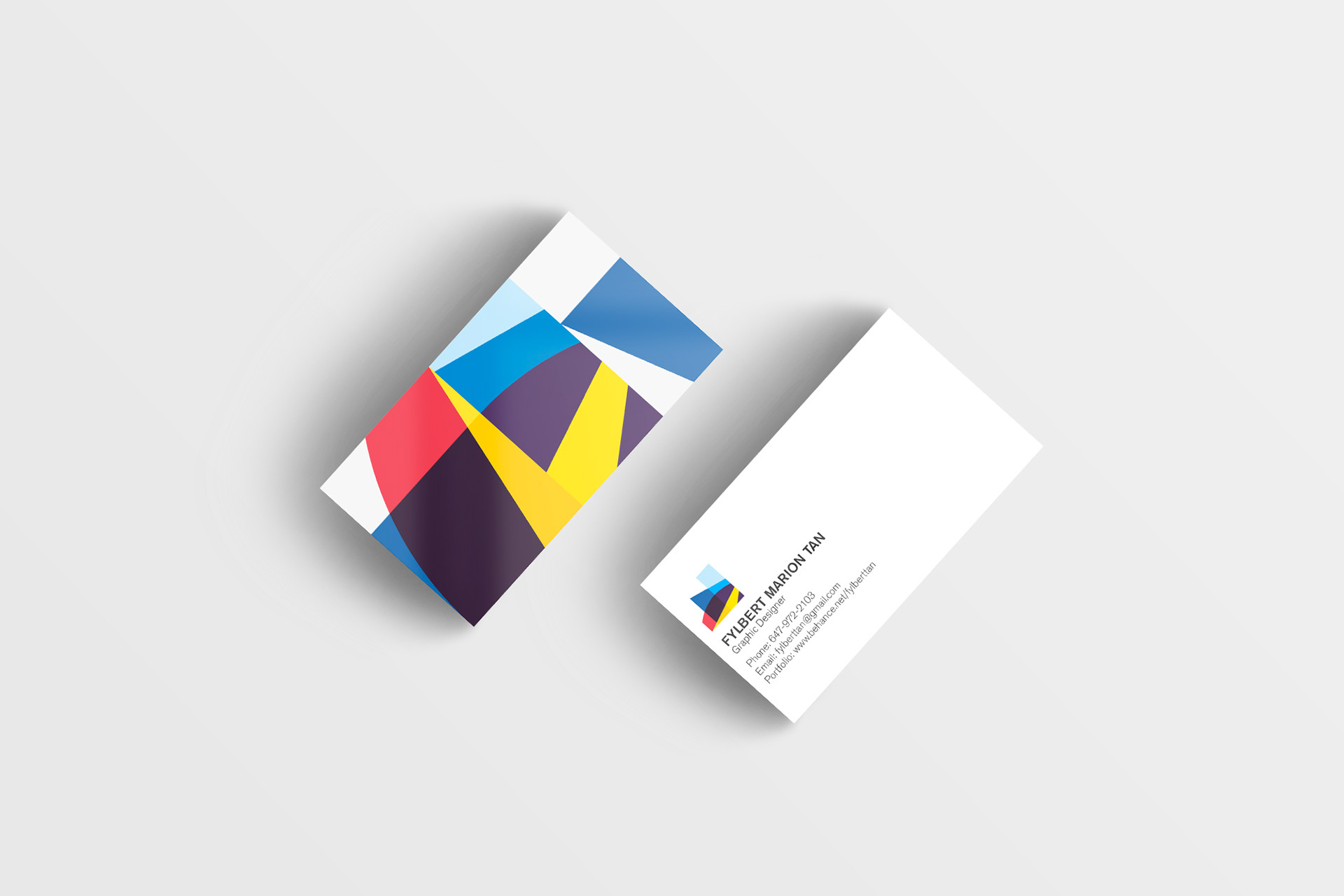
This is the series of business card using the primary logo.

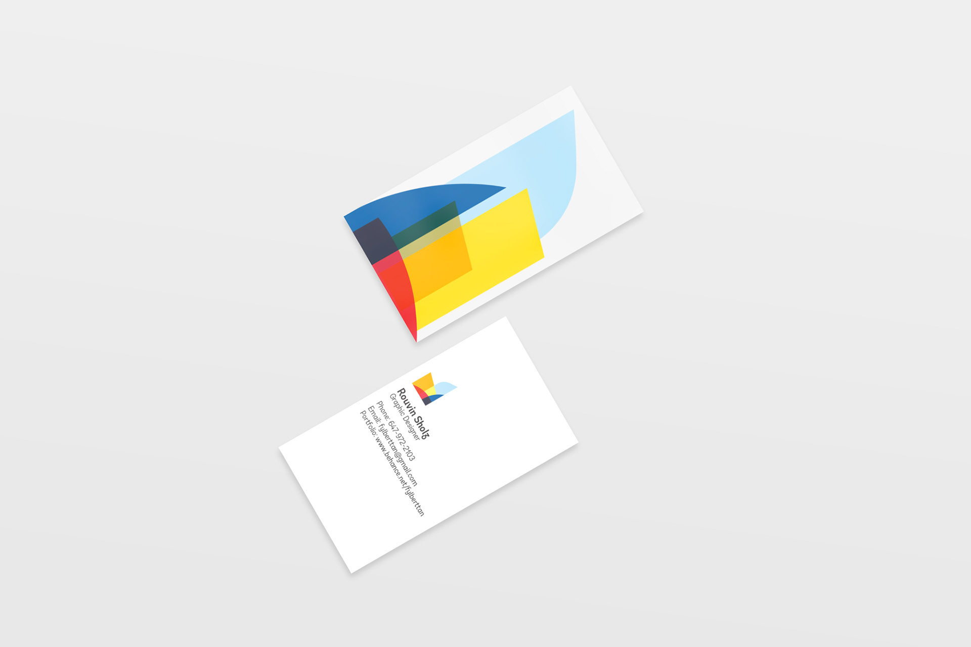
This is the series of business card using the alternative logo that I created.
