
A local bookstore with style
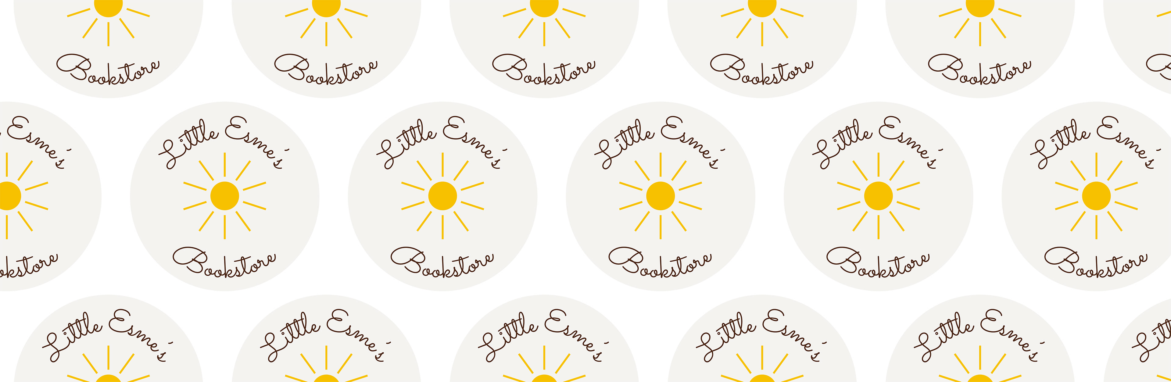
This design project for creating new brand for my sister's new store. The new store sells used children's book and toys. The creation of the logo is to represent a warm and cozy bookstore. This reminds the idea of a small children's book shelf in your grandparent's house.The colours are already chosen in the design process which informed of how the design of the logo should look like and the feeling that connects to the store's identity. This logo represents the warmth of reading books in delightful way.
The process begun with how my sister created hand written logo that comes with each orders of the store. The symbol of the sun represents the warm feeling and comfort of reading books to children and the style of the sun connects to how children draw the sun in drawings of natural scenes. From here, choosing the typography is matching the handwritten nature of the design and choose a close resembles of the handwritten type. The logo become a circular logo to reflect the circular nature of the sun and the type would encircle the whole sun.
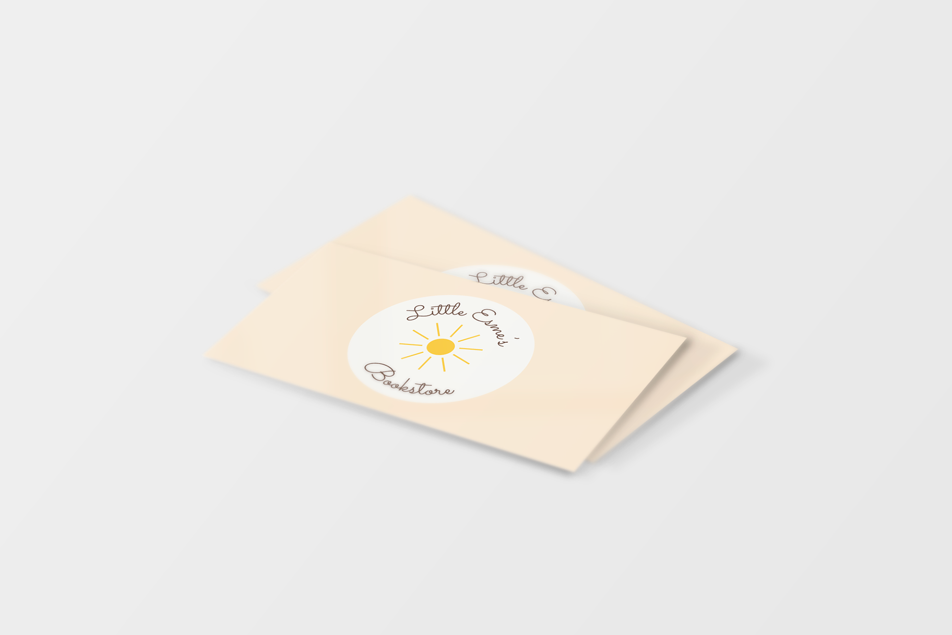
This is the business card for the bookstore
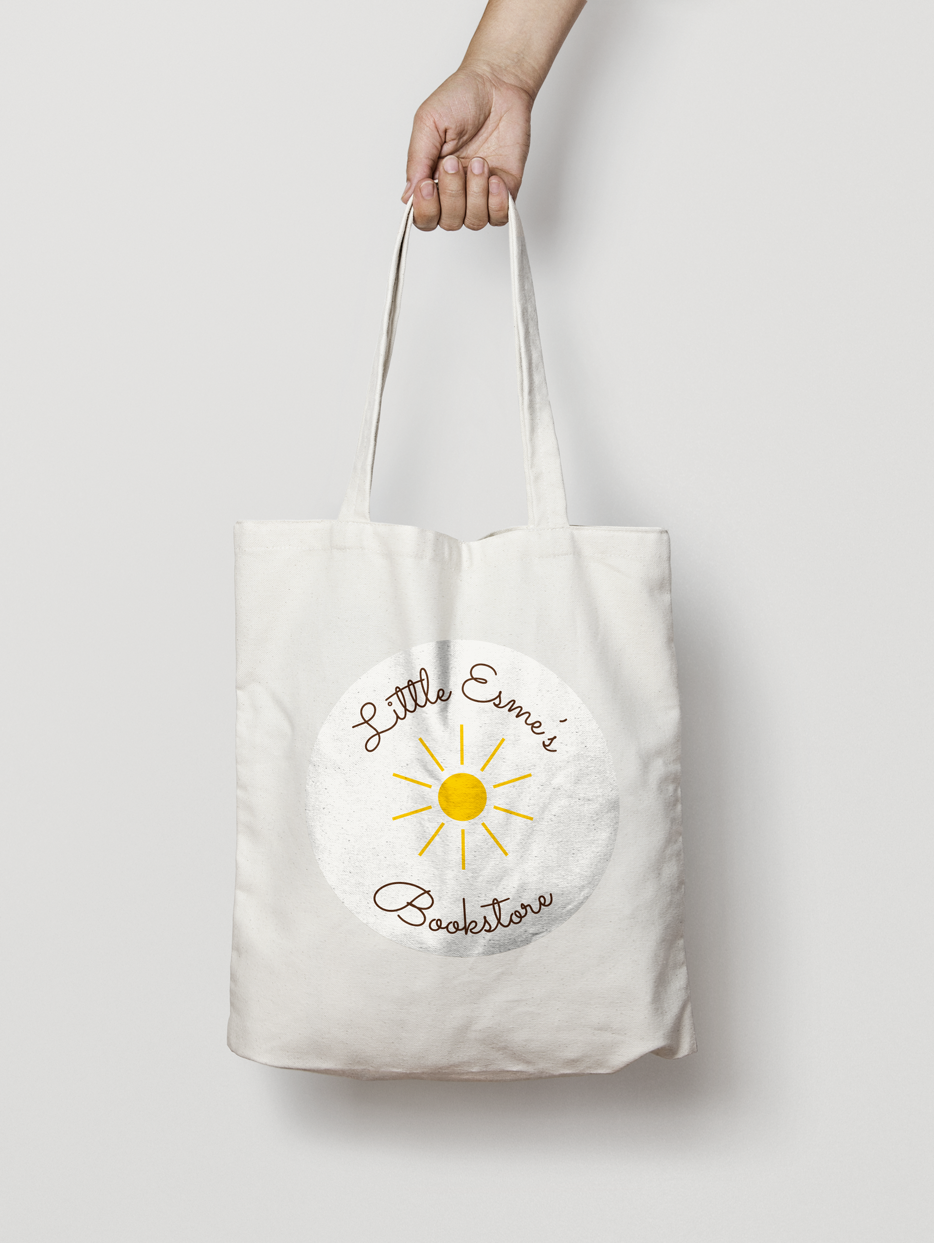
A simple tote bag for the bookstore
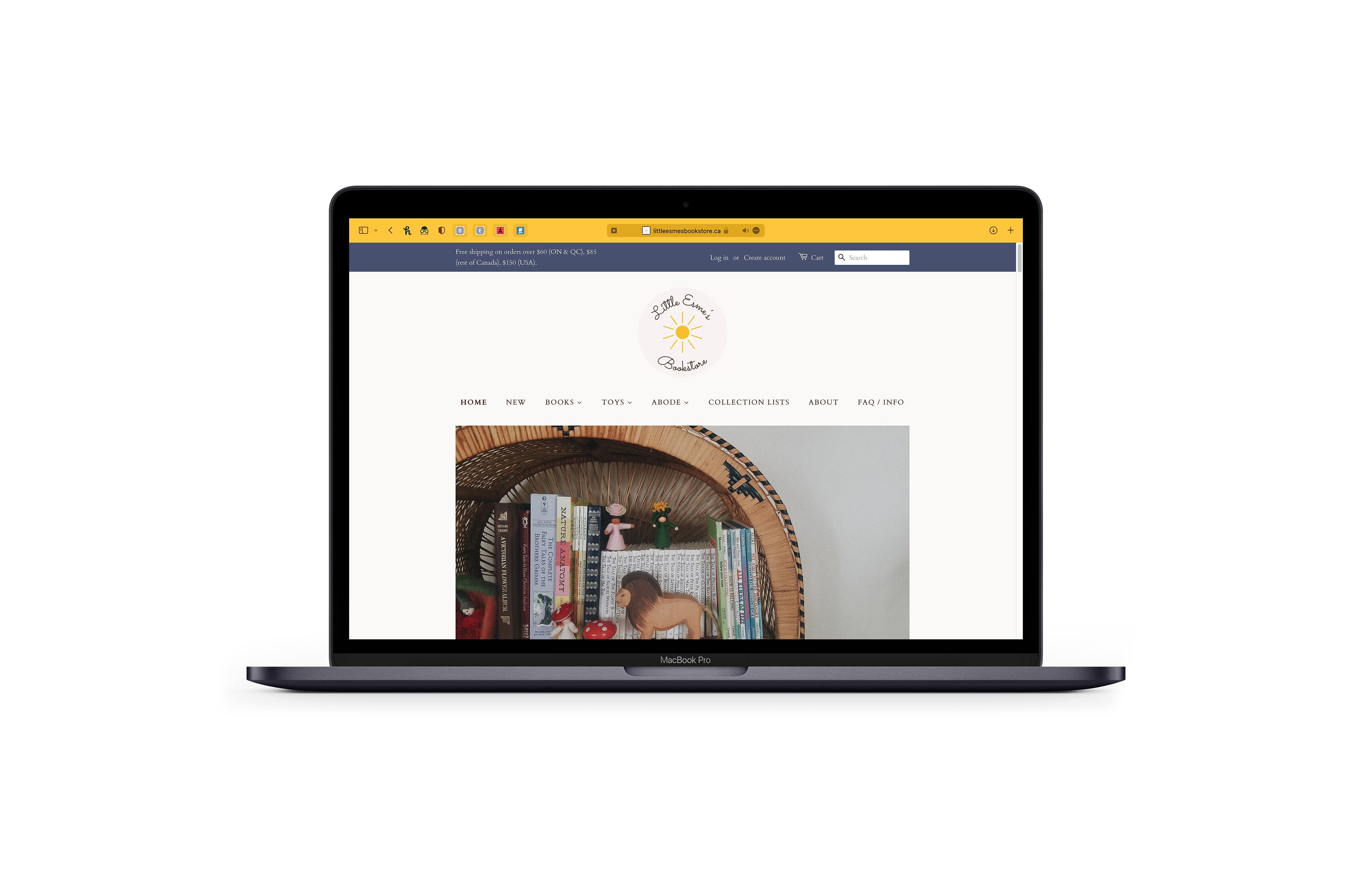
This is the actual online bookstore using the logo.
Thank you for checking it out!