
Initial Ideas/Sketches
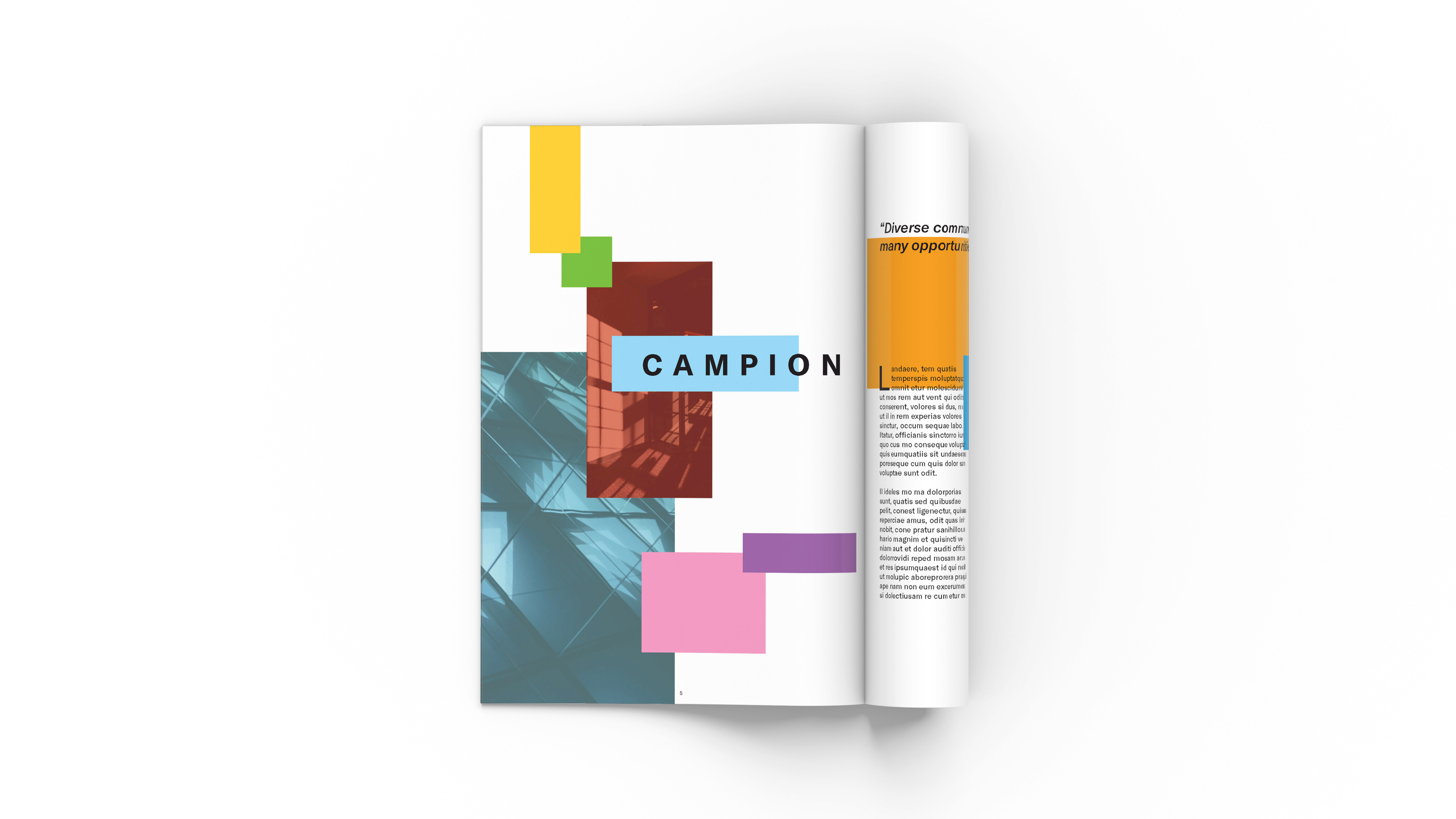
I started this project with a existing design of a booklet for my hight school to bring it with them to trips around the world for a social cause. The initial design was not the best design for a booklet and did not get enough time to create tinker around the design of the booklet as a whole. This project of redesign the whole booklet without any limitations on booklet. Plus, redefining the design of the booklet from the ground up making new interpretation of the school more fresh and forward thinking. The ideas that I started with this project was about how the community of the school defy the school reputation and the amazing program that it had hosted in the past. The use of the basic geometric forms and grid structure which makes a modular feel about the school and the idea of together being as a whole community. The colours are also influence with that notion to reflect the different background of the student body. This new design of the booklet breathes new life and energy that reflect the whole school as a whole. In this stage of the design, I thought about the editorial layout of the booklet. Honestly, the layouts of the stories and how the flow of the magazine was a jarring and felt like everything was thrown in the magazine. So, I started to reorganize the whole flow the of the booklet to be more appropriate with the content of the whole booklet. Also, I incorporated new ideas in the front cover of the booklet and the two page spread to get the right feeling and style of the whole booklet.
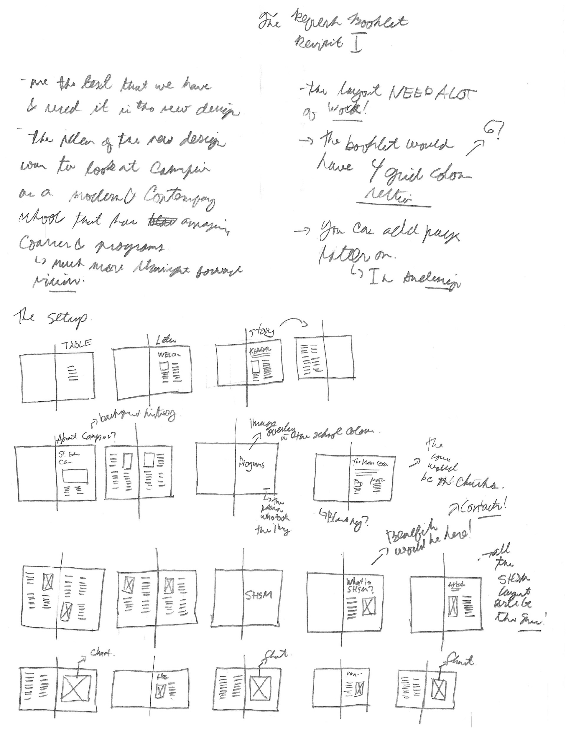
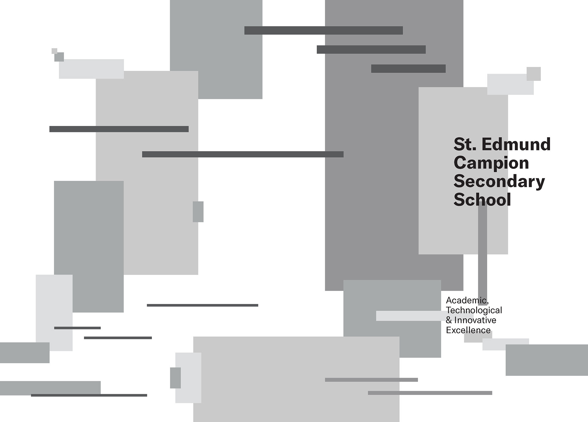
This sketches shows the process of organizing the flow of the booklet and creating a new theme across the whole booklet by focus on creating a new cover.

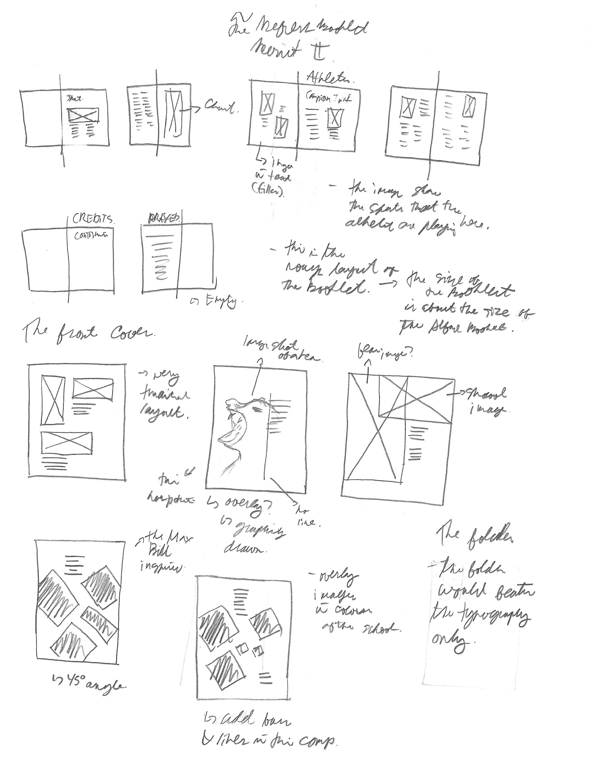
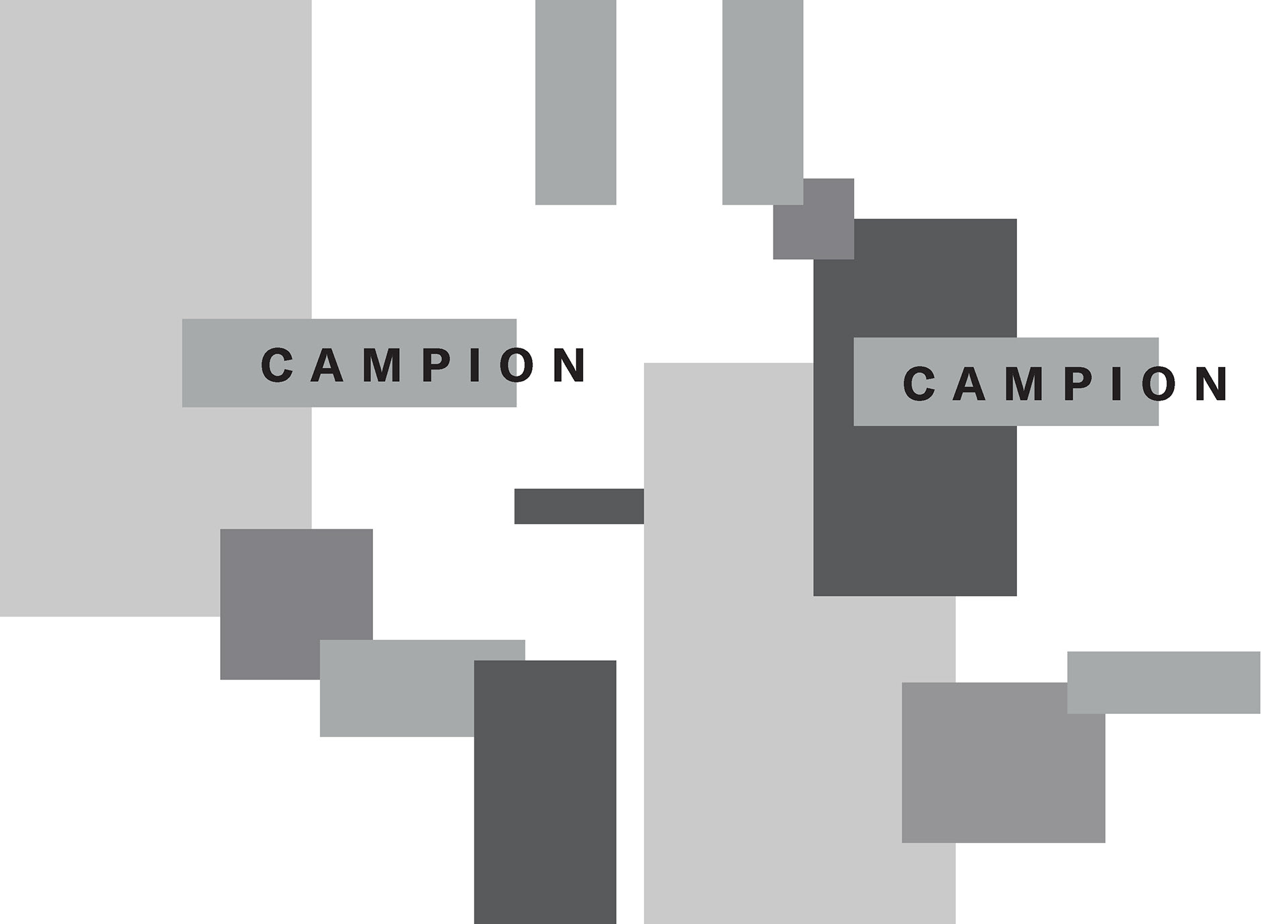
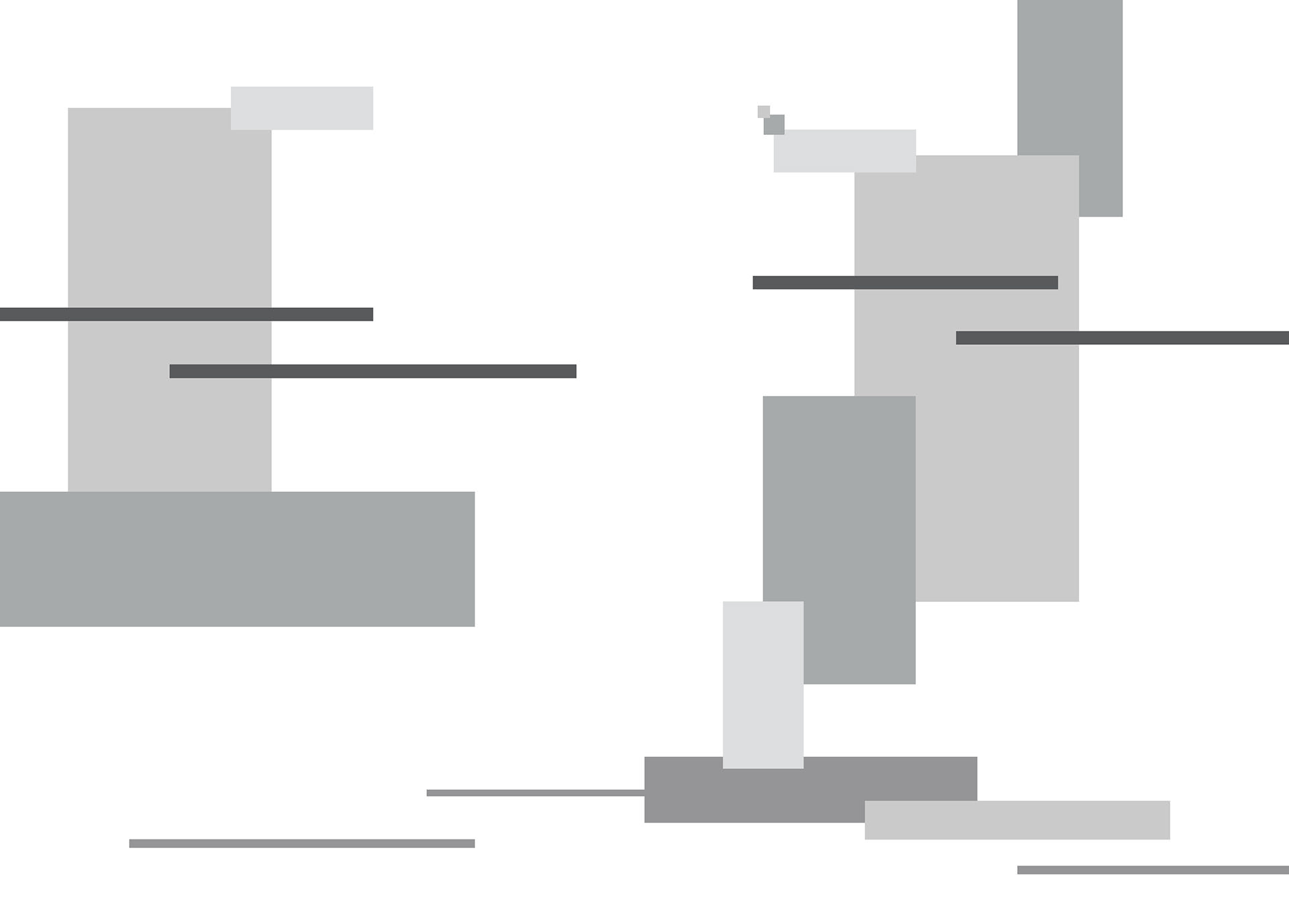
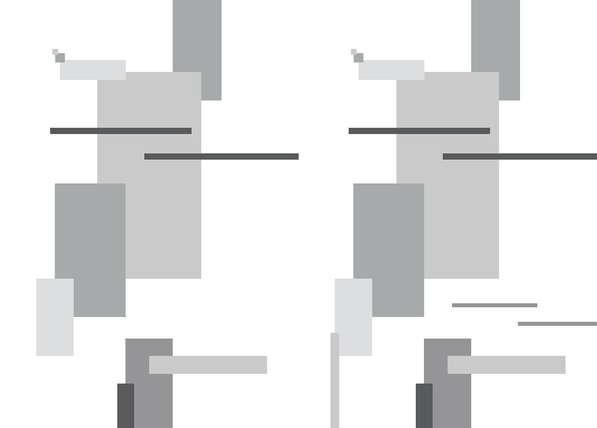
Further exploring composition inside the booklet with text and graphic elements added in the mix. Playing around with the modularity of the graphic forms that integrates other elements in the page.
Digital Exploration
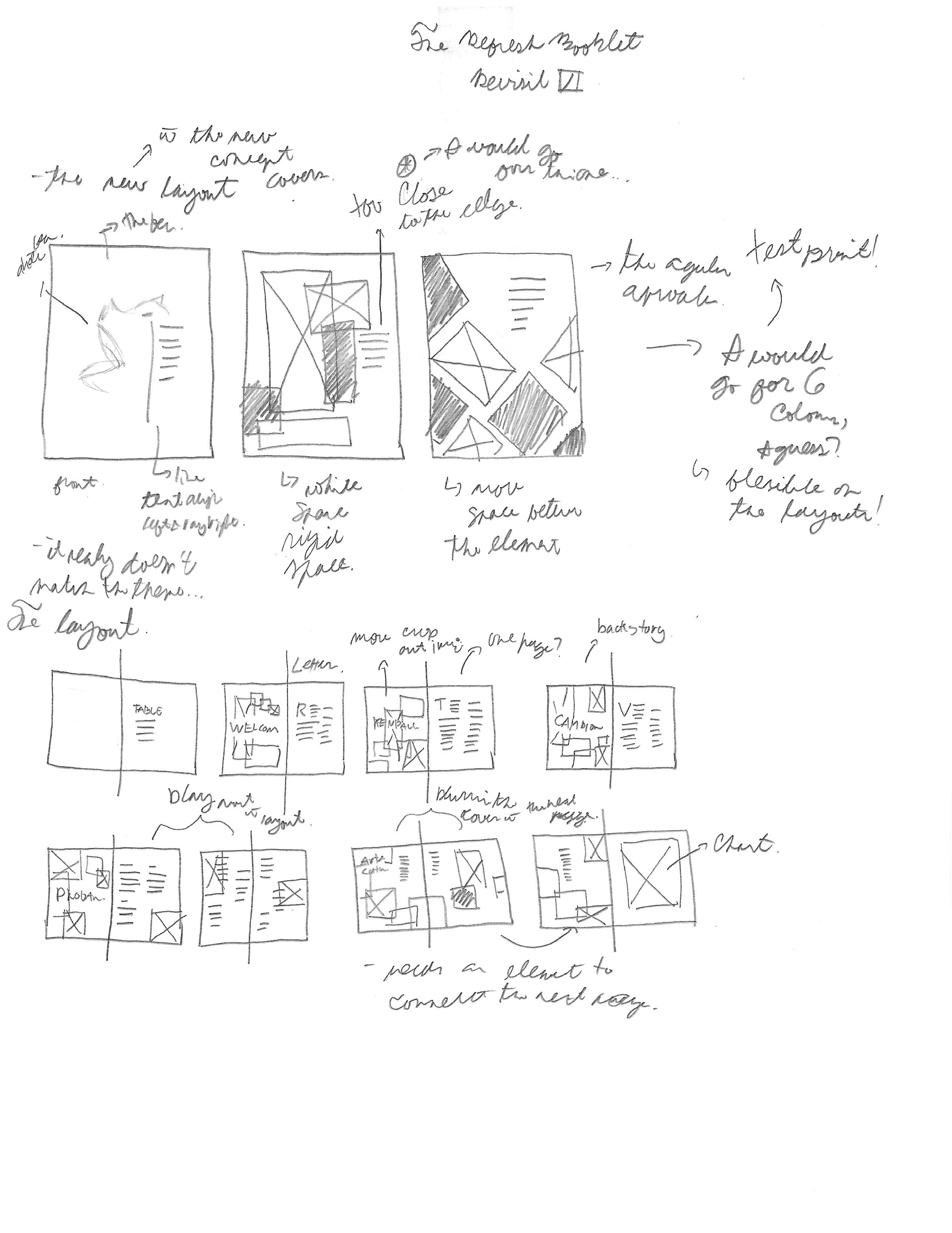
This process of the creating the whole design of the booklet started here. This is were I really explore and tinker around the concept of the whole project. Creating many compositions and possible layouts of the magazine. Also, looking at different style of typography to how I organize the text in the page. This defies how the final look design come to be and thoroughly examine and tested in booklet design.

This is the initial design from the sketches; it resulted in a very bland and lacking depth and movement. To solve this I try adding different sizes of shapes and adding more details in the design. This defy the overall design of the layouts.


Plain design into more detail and different sizes of the geometric shapes.


This process of the two page spreads influenced the of the whole booklet from the very plain to a right balance of dynamic and movement in the whole design. This explains the massive changes of the front cover and the whole aspect of the booklet.
The final result of the process

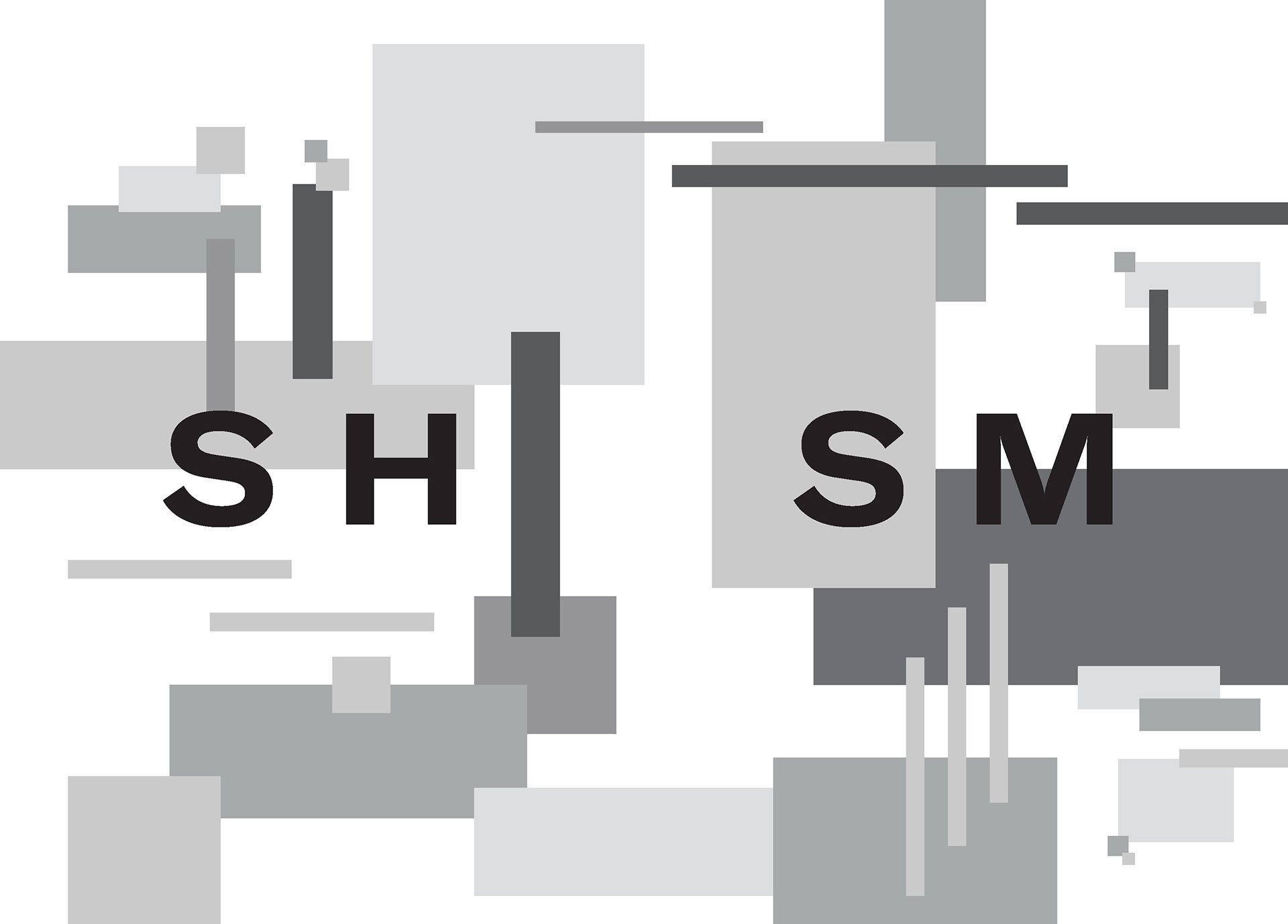
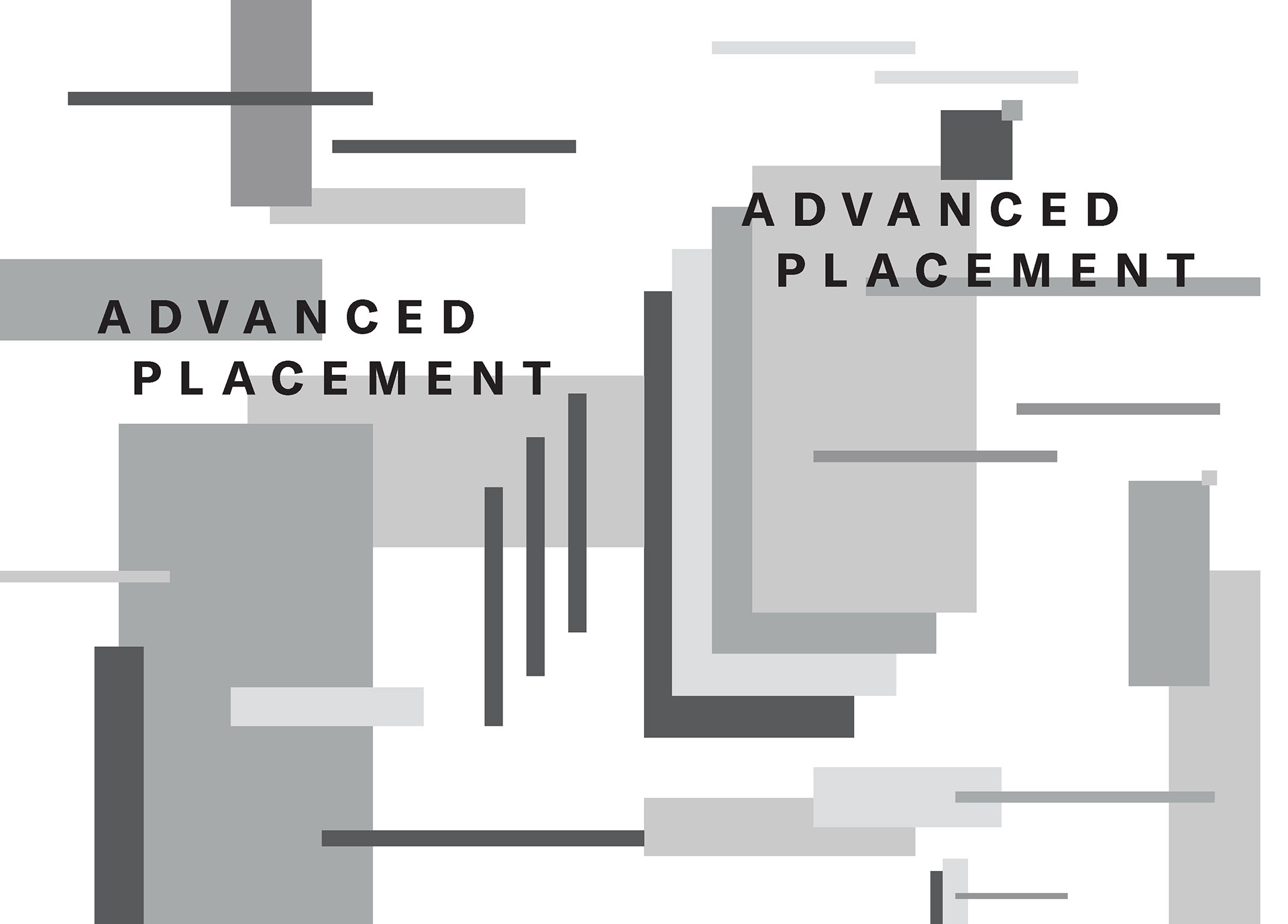
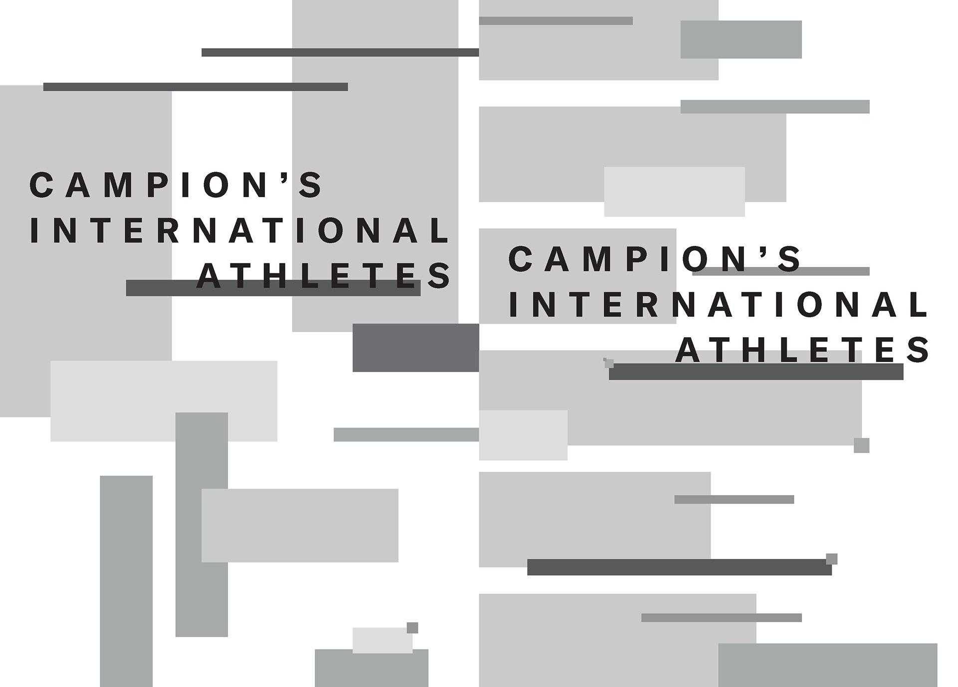
This four process of the title page is very simple design because I wanted to focus the viewer in typography doesn't get carry away with the graphic geometric forms

This concept is carried in this design process with the other title pages
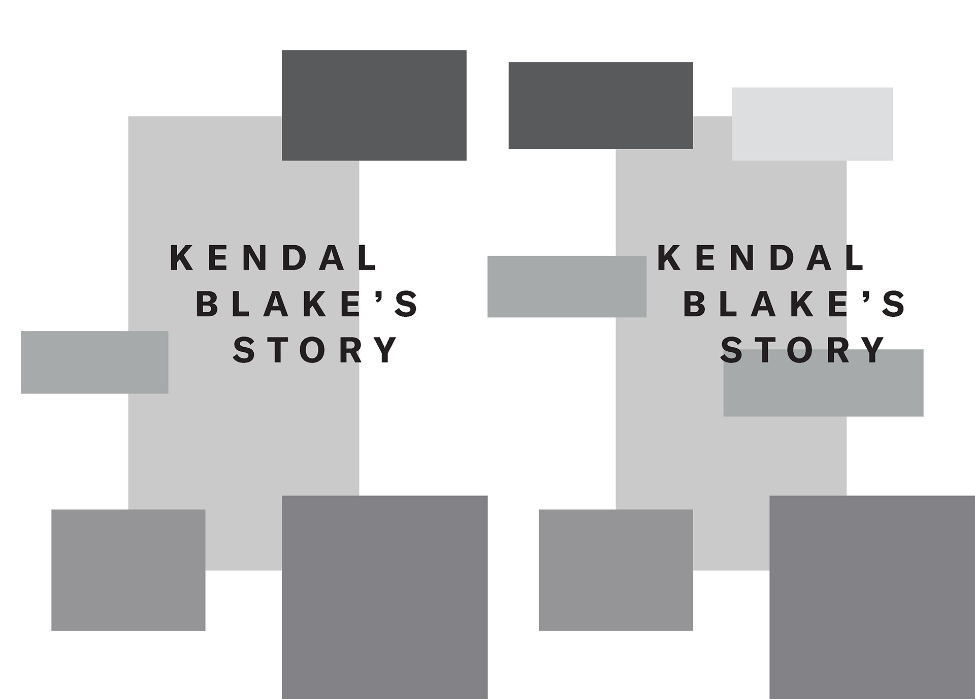
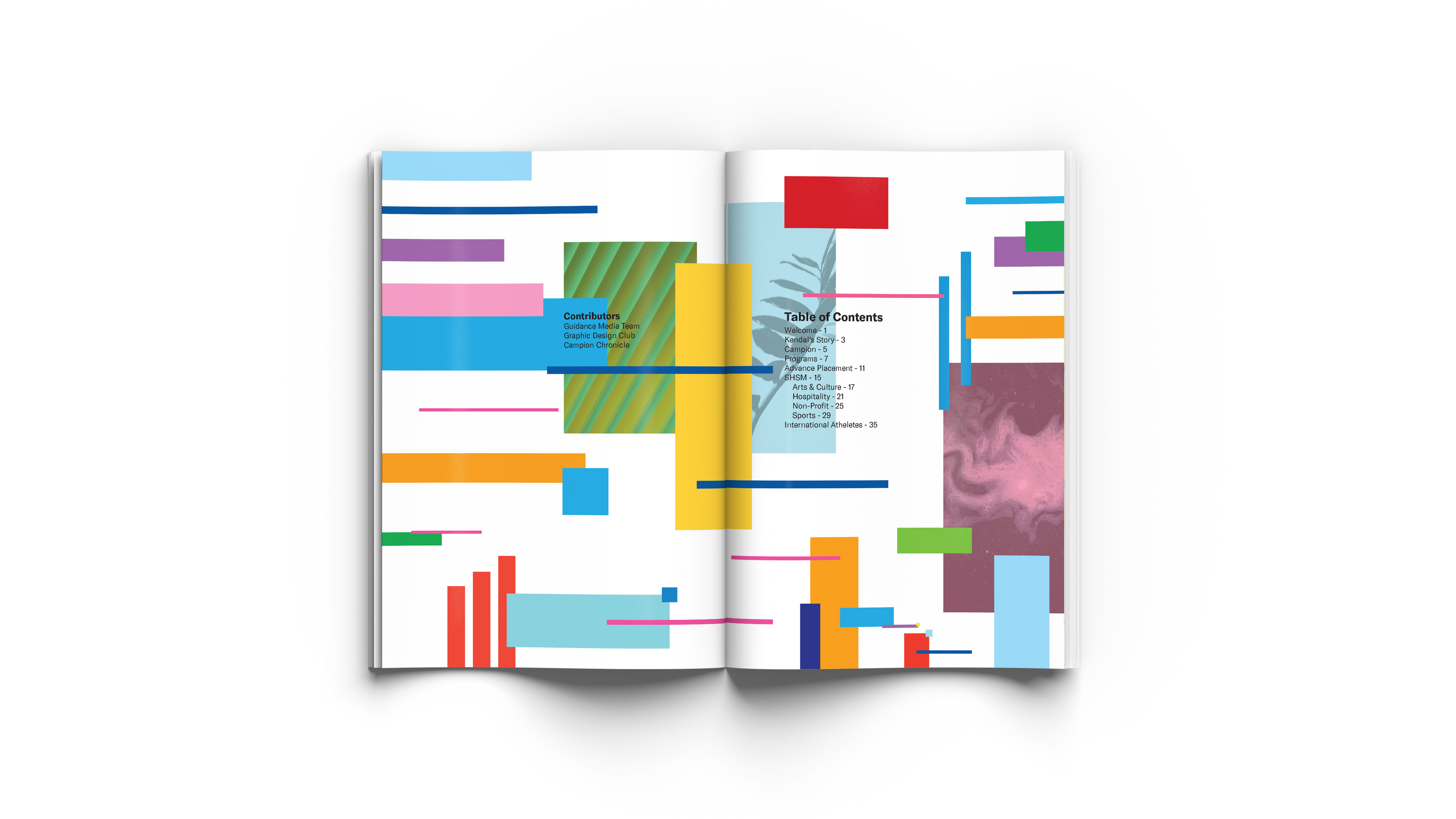
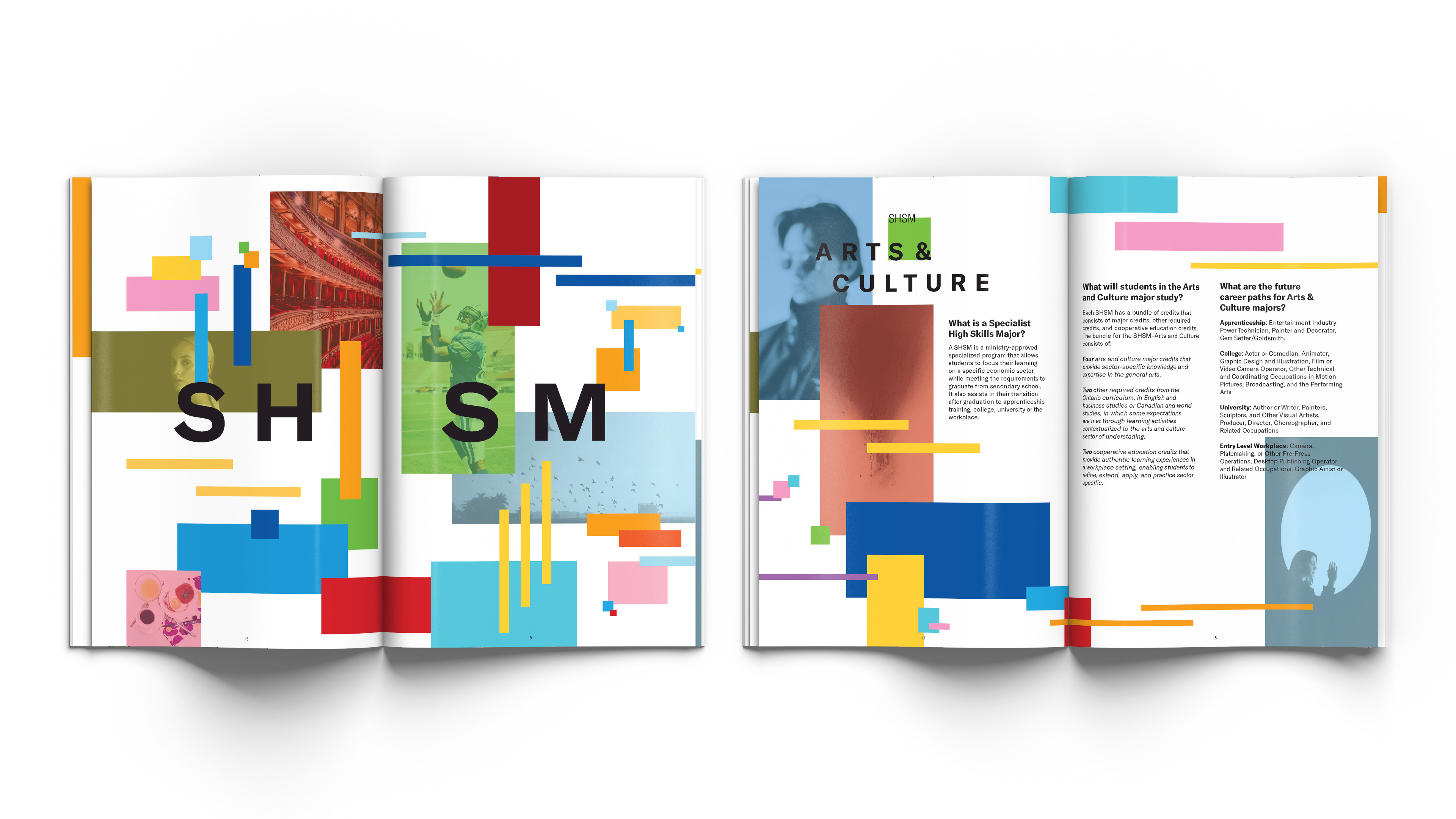
This pages here are far different because I wanted to make them different from the other sections of the booklet. This created a new sub theme inside the booklet that reflect the school goal's and focus on this success and the uniqueness.

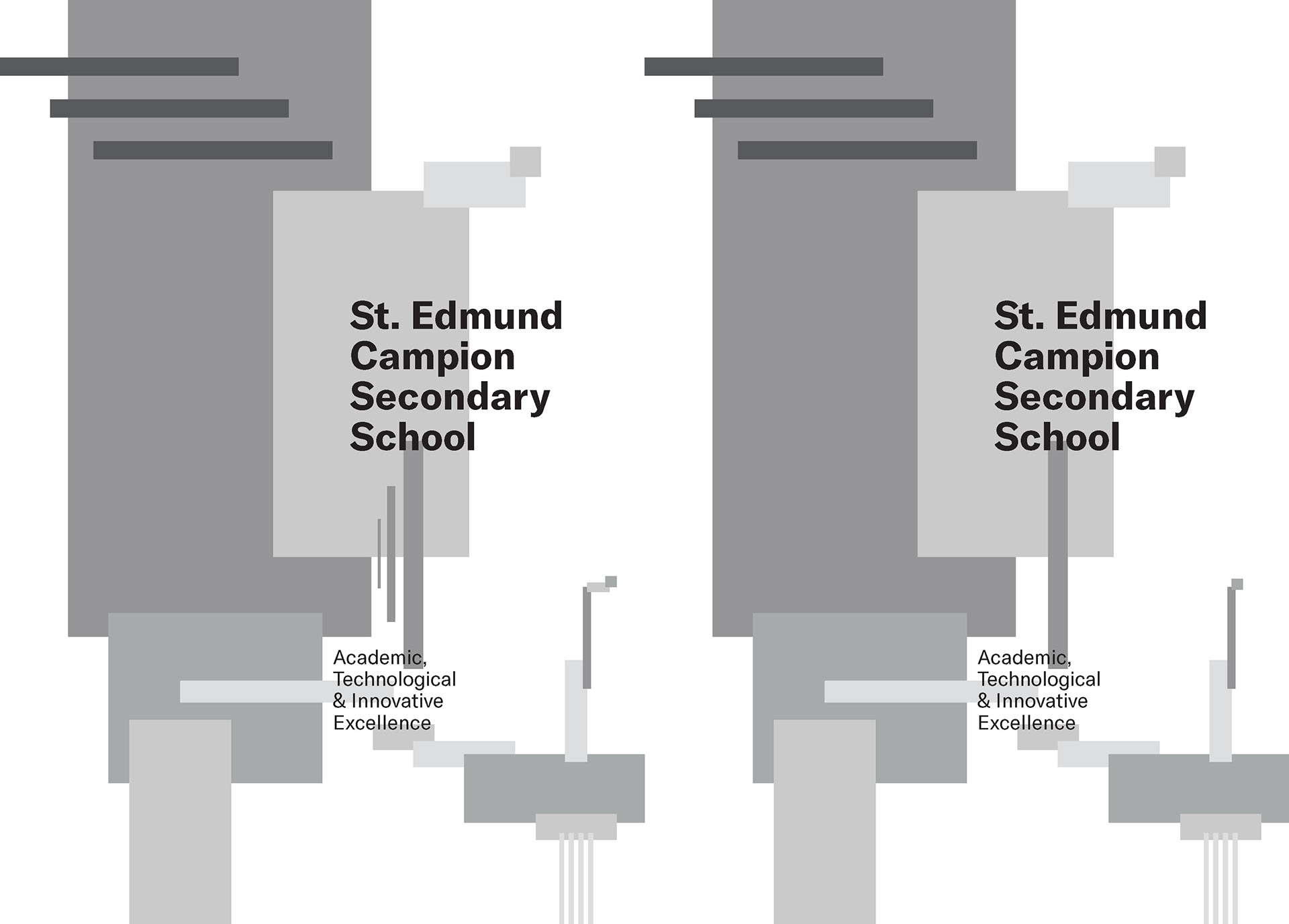
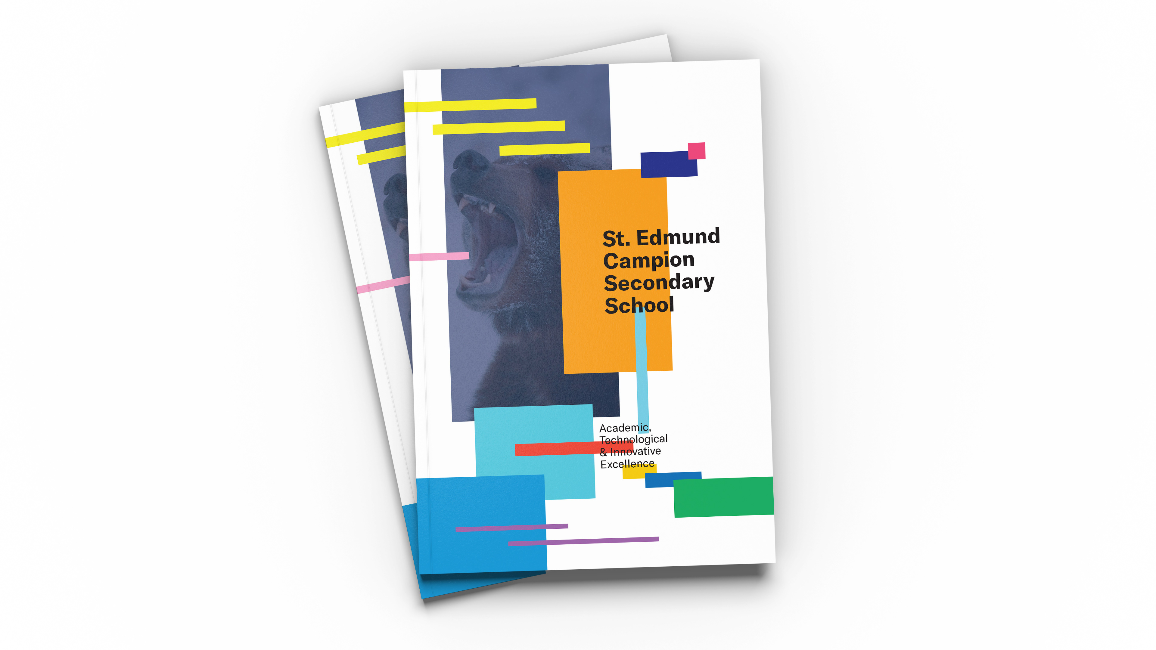
The back cover of the whole booklet. Initial design was designing separately but it did not work in the design. So, I decided to integrate with the back cover with the front cover to give a sense on context in the back cover design.

This are the final design with some refinement between the two covers.
Final Design
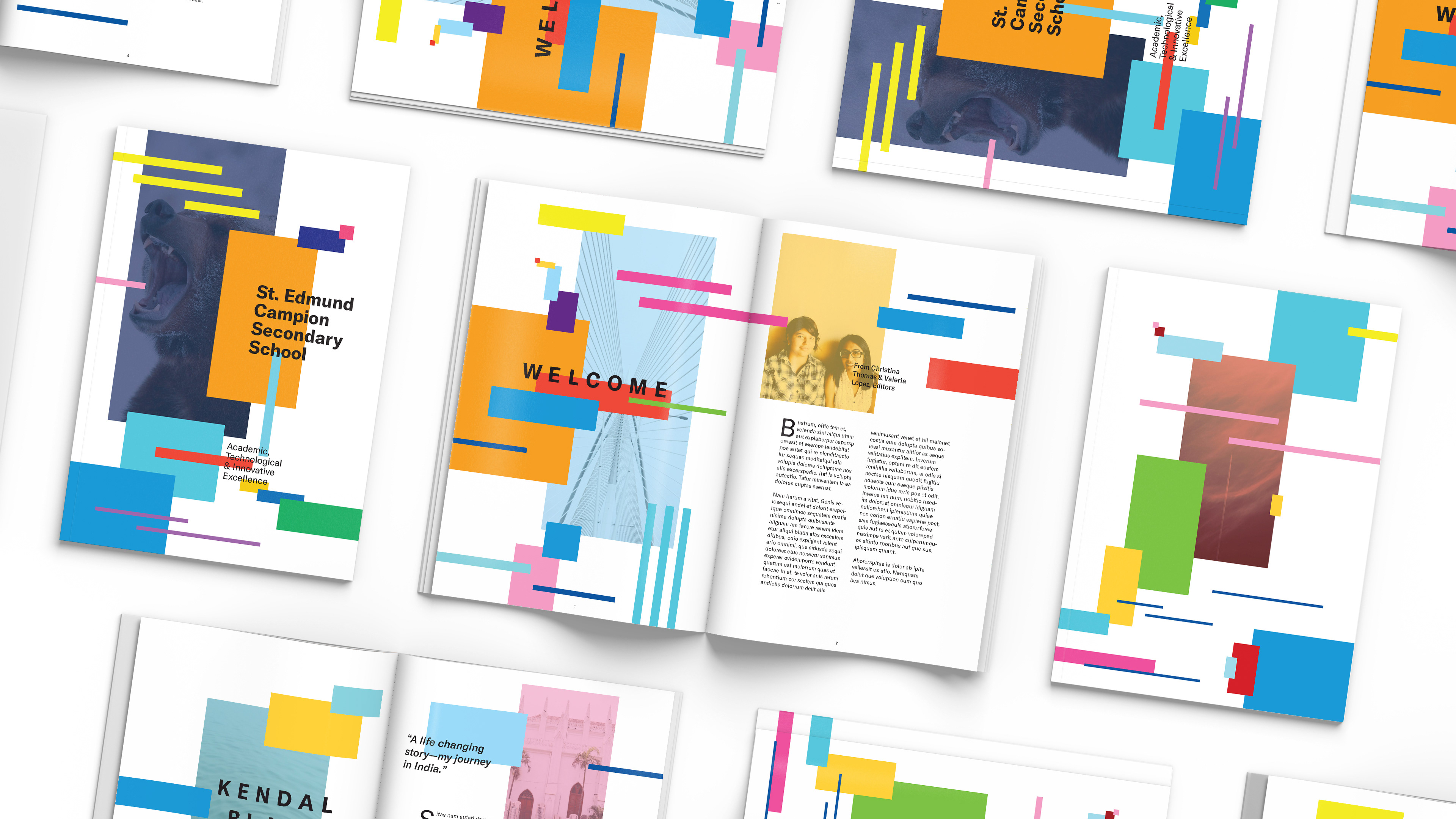
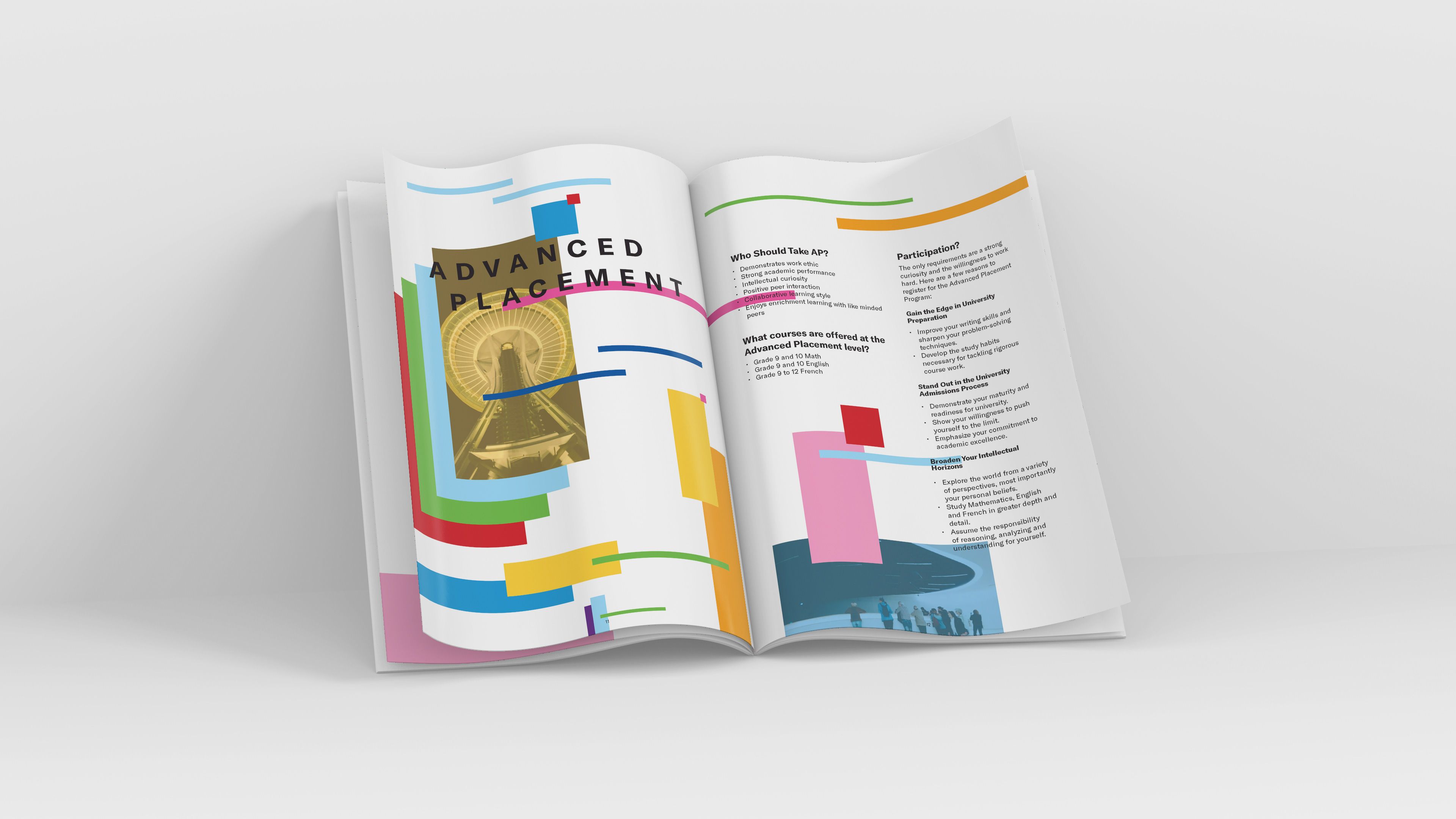
The final outcome of this project was amazing and stunning. I really love how the design represents the initial ideas for my first stage of the design. The colours that I chose was mostly vibrant because this reflects the school environment which approachable and joyous community of student and teachers. Plus, the smaller form factor of the booklet is design to be carry out and hand to people which can be easy be pass around from person to person. The most important improvement is the readability and the legibility because of the clean and precise typography throughout the whole booklet. All in all, this project was a success.


Credits of the photos use from the VSCO Community:
natelubben, ritwikmittal, soupmyeon, soulhadi, marianahaza, dmitrybarsov, iddavanmunster, owenleidner, ohconnor, keziadrl, vladimirmalyavko, wypy, grajeda, isabelmeireles, uevercook, that_field, whighfield, 1000worte, tarapomerantz, dianexg, moostaahmed, jordanjrandall, abheetanand, pacodelosmonteros, tamscvz, joel, jusssstin, saarzoo, aishanjali, tinypineconenyc, lexibuzz19, adaokaro, visolis, jemax, tymberlockheart, montilus, gmariephotography, faithmcmurray, dillonchang, spatialflow, carolineembrey, fjrndr, mairinmcglohon, avesb, kaitlinheri, uksfresh, and christianhein