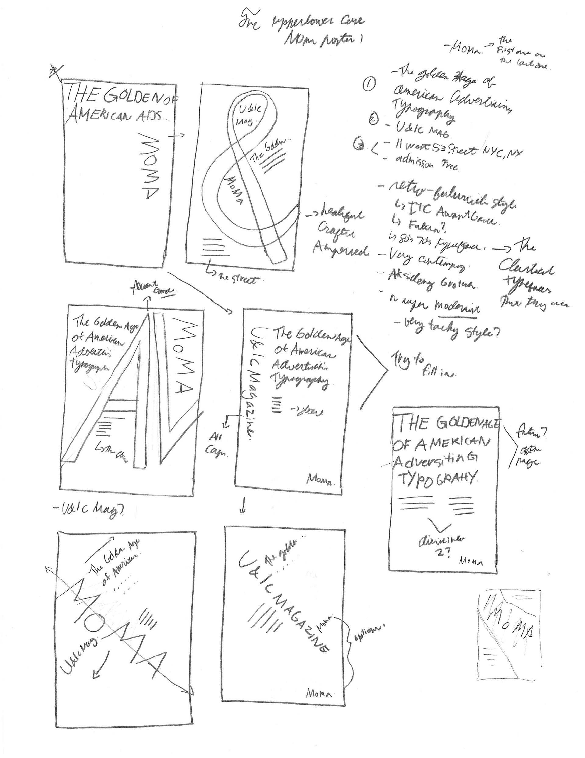
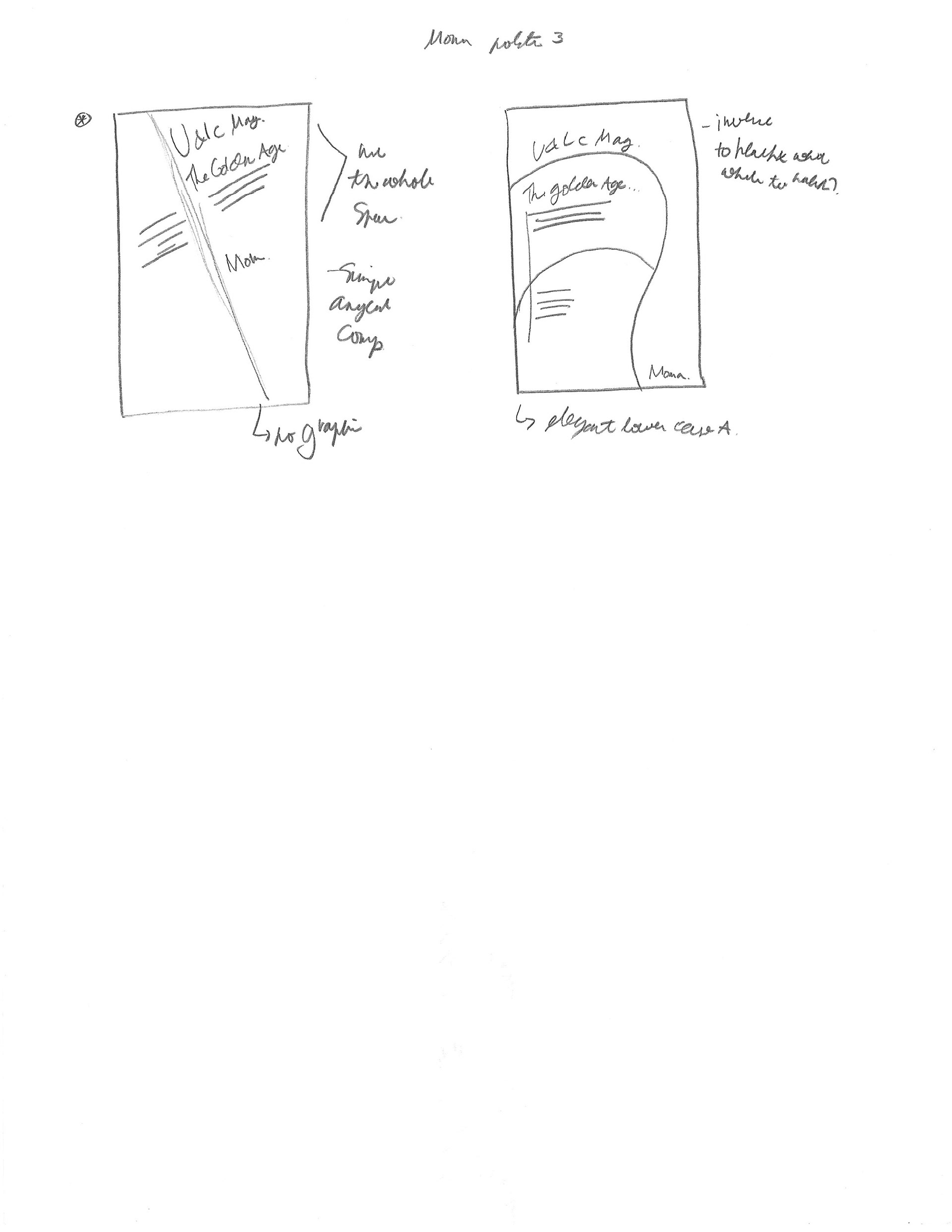
Initial Ideas/Sketches
This project was originally school project that I was passionate about. The assignment was about creating a poster for an typography exhibit about the Golden Age of American Advertising Typography featuring Upper and Lowercase for MoMA—this is fictitious event. There are certain guidelines that the poster needs to have such as date, location and etc. My idea was simply showcasing the typography during that period of time. This notion lead to researching about this age and creating an idea how typography was used to what is most commonly used at that time. From the beginning I wanted to create a very simple design fro the poster since it would be posted around New York City which is a fasted paced city and very crowded, this case I wanted it has straight forward as possible. The initial process was looking at possible composition of how the information should be presented and following the guidelines of the project. In this stage, I really pushed the idea of just exploring on the typography itself and looking it in a different way that attracted the attention to the viewer but not making it too abstract so the typeface would be still recognized but many people.

Digital Exploration
In this process, I explored a lot of ideas of possible composition of the poster with different style of typography that represent that specific time to different organization of information in the poster. This process was longer and I have more time to reflect and talk about each of the possible composition and further refine some of the successful designs.

This initial ideas are the exploration of different compositions with many combinations of the letterforms and hot the informations is organized in the poster

I also explored the orientation of the poster in landscape as well. But one issue arise from this small project is that the poster would be install in a bus shelter. Therefore, this ideas were not use in the final designs.
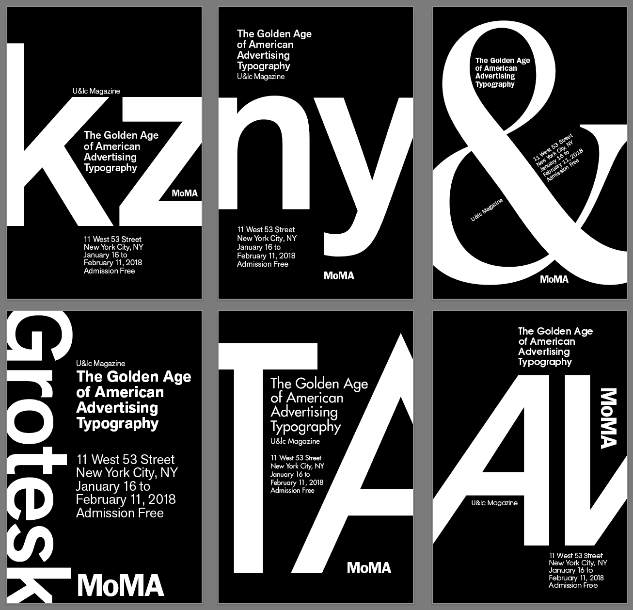
This section of the process work, I really wanted the poster to focus on the letterforms so, I decided to reverse the whole composition from white background into black background. This design worked because it essentiate the letterforms in graphic manner

I was really happy with the result of the design, I even try it in the landscape composition as well.

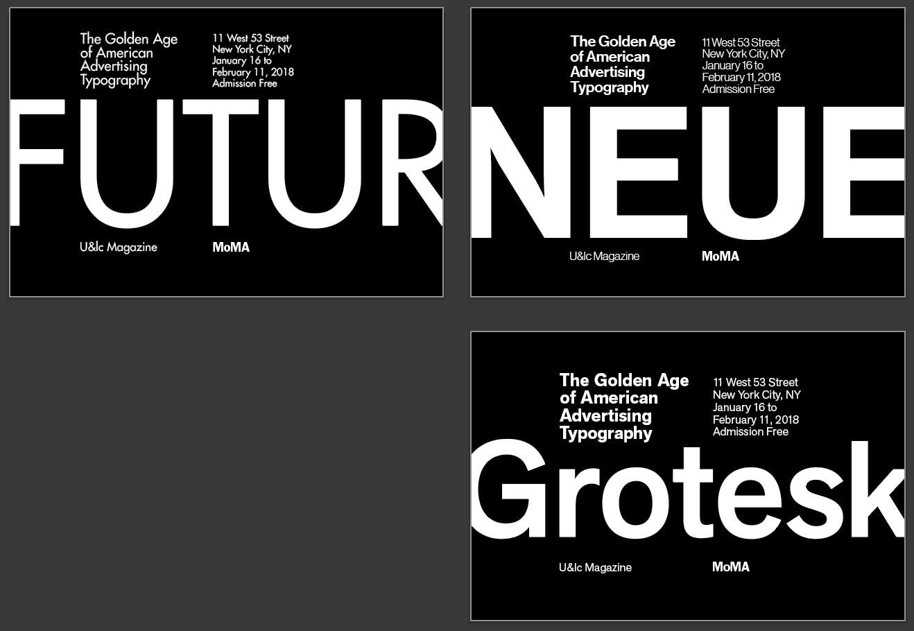
Some of the potential design of the poster with some refinement with some of the designs.
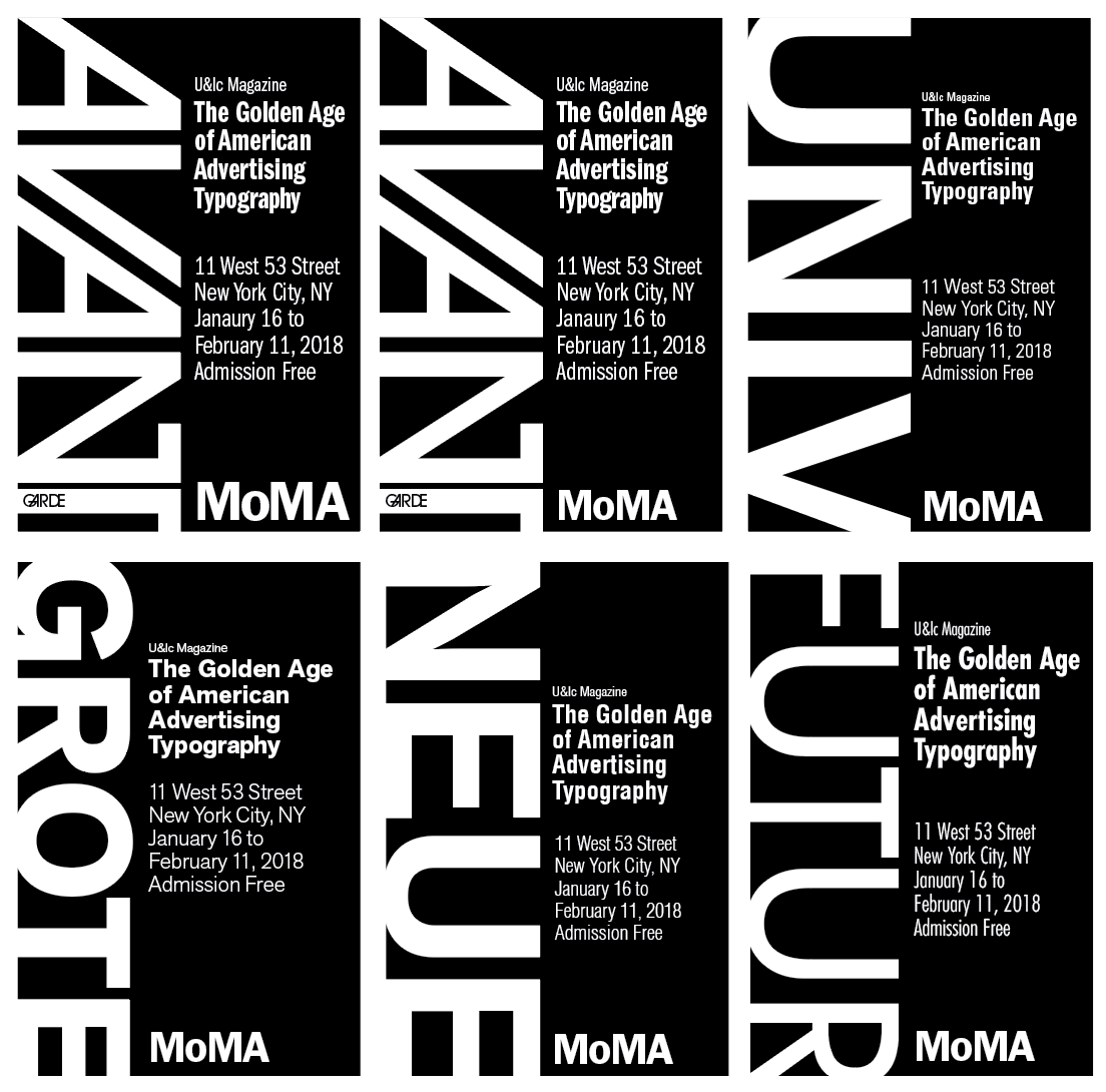
This process work is playing with the letterforms in the vertical composition with a specific typefaces used using that era of design. The top two where chosen and added some refinement in the final designs
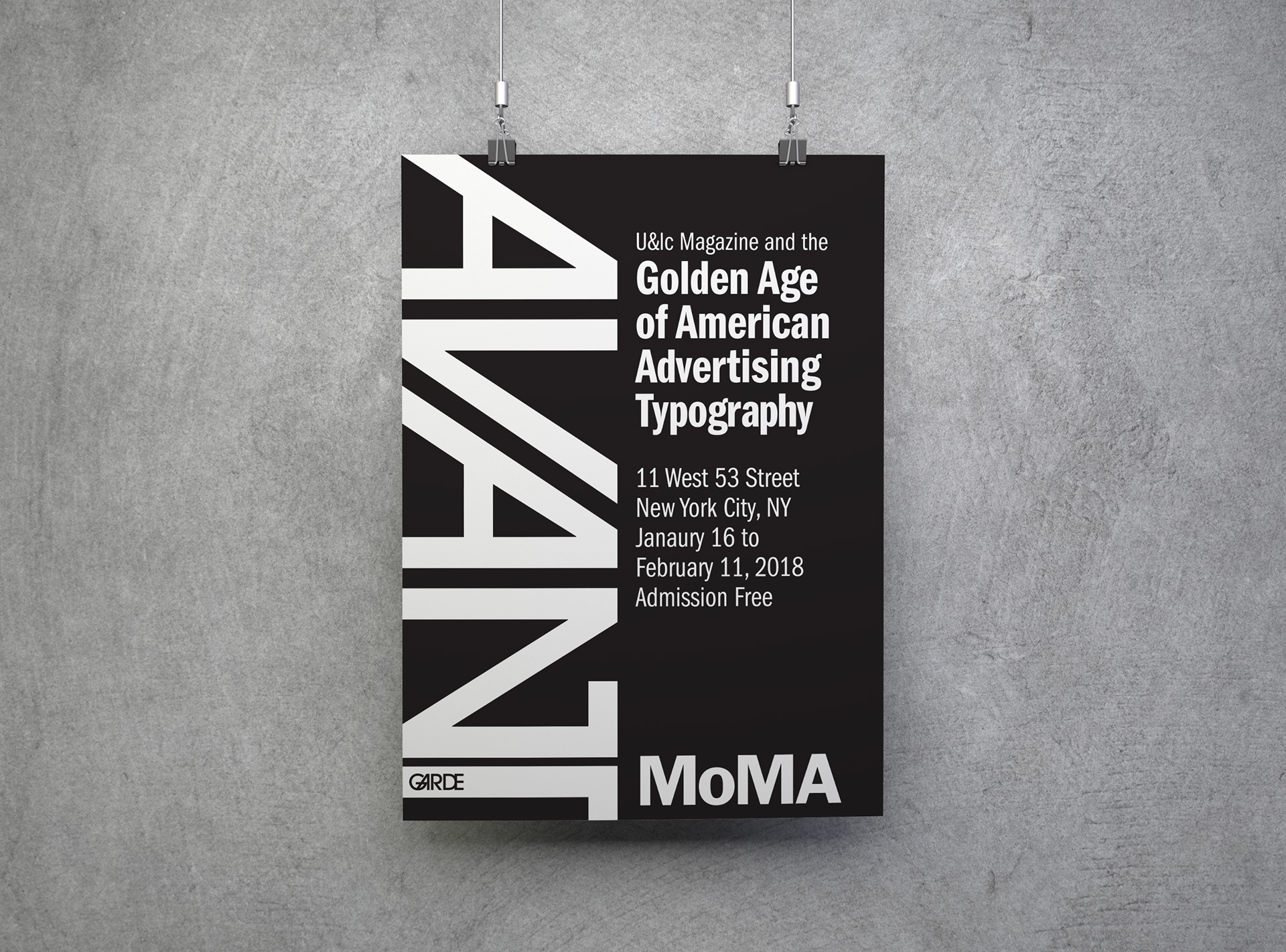
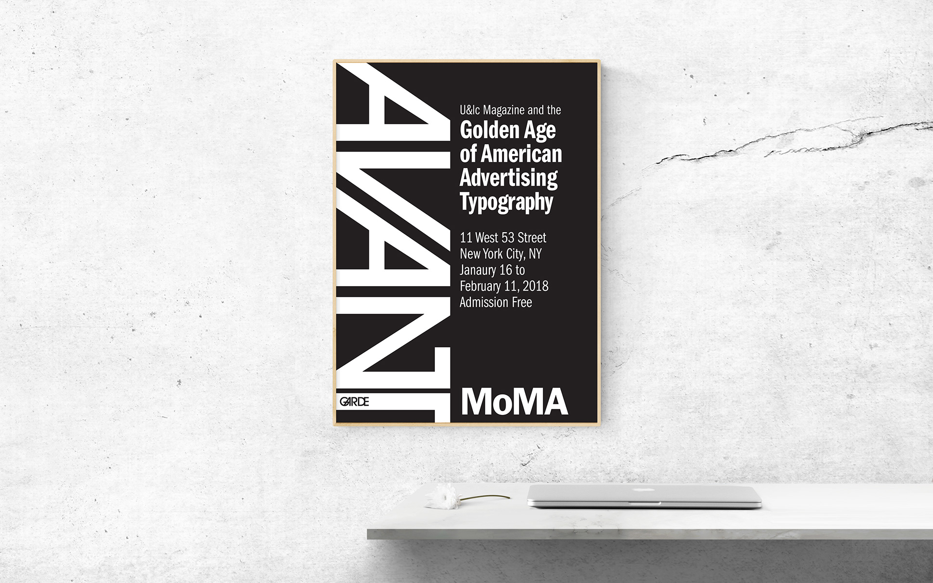
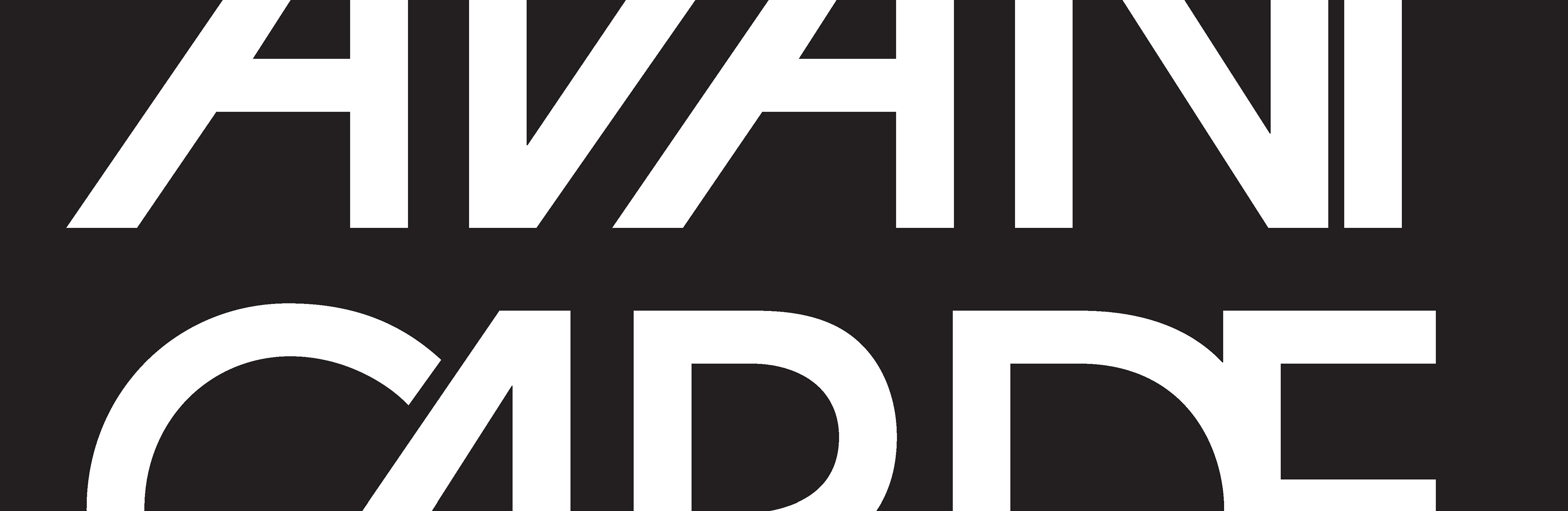
Final Design
This design that I chose from a variety of compositions is best representation of the golden age of typography. This poster is functionally which is very simple and straight forward and very impactful. The large size of type in poster makes it easier to read from the far distance which is very suitable for a fast paced environment like New York City. At the end this project was very interesting and insightful to look things different and how further can you push a simple idea and make it work in the design.