
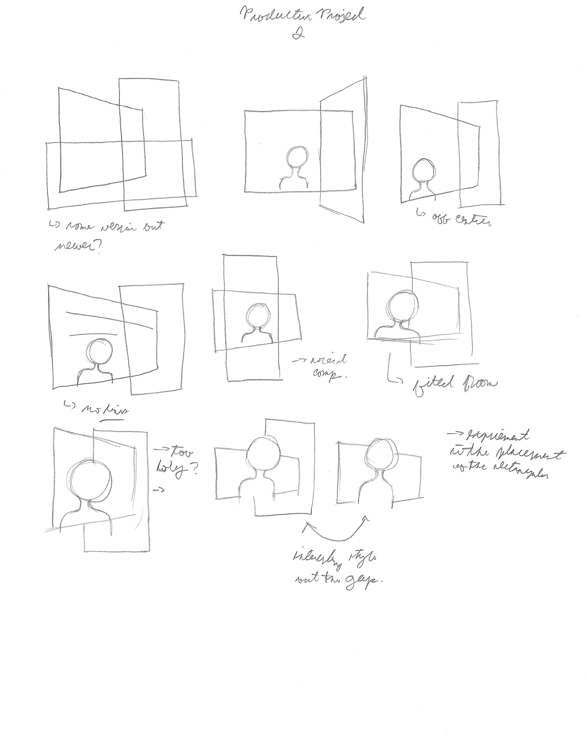
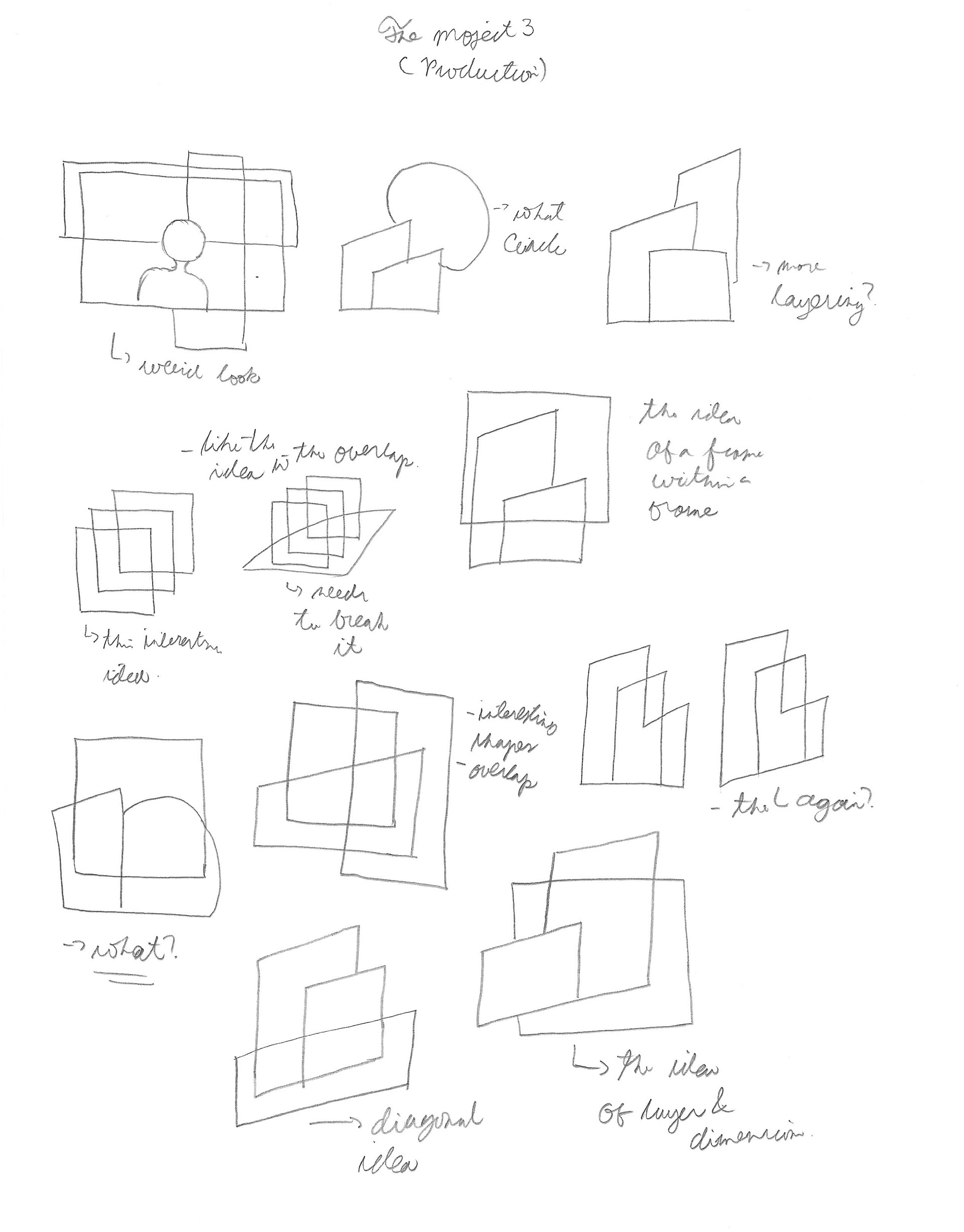
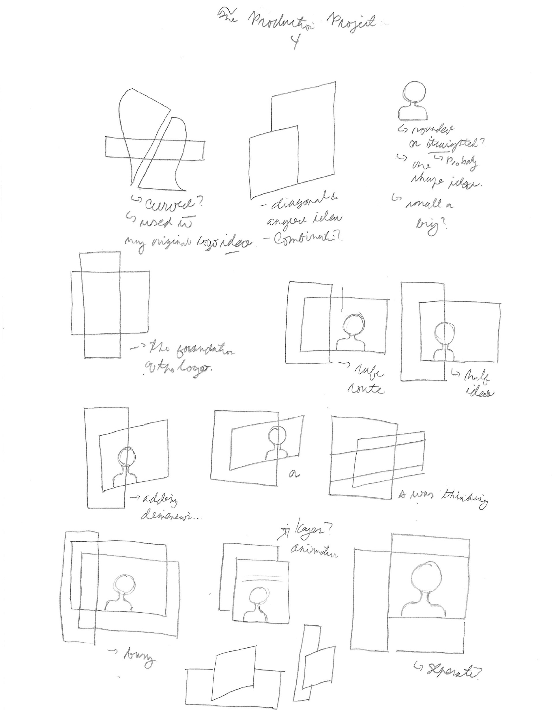
Initial Ideas/SKETCHES
The concepts when I stared this project is heavily inspired of the ideas of movies such as how characters moves in the frame, the placement and how the screen size, screen ratio when movies are played. I also try to add some element of three dimensional elements to show dimensionally of the nature of films, giving as a glimpse of the world of the film. The elements that I mostly work is rectangular shape because it represents the screens/frames of the movies are played at and I want to show the idea of flexibility of the shape being used in many scenarios. Another element that I used in the logo is the use of a figure to represents the audience watching the moving, since the company is about creating movies. The figure is mostly stylized but recognize of the person. Also, I realized that only using rectangular element creates a boring and not interesting logo, so I added the element of perspective to the rectangular to create a dynamic element and reflects the company’s uniques ability to create films.

This is are my initial ideation for the company. This is my first time creating a design solution for film related company. My inspirations was how movies are created and framed and the notion that the viewers are transported to the world of the movie. The notion that I add a figure as a part of the logo is the communicate a clear idea of the company as it is starting out. This figure symbolizes as the audience and the rectangular elements represents how movies are mostly shown in a rectangular screen.

The diagonal rectangles represents the dimensionality elements which movies are the snapshots of a different world and reality from out reality here. This adds a dynamic elements in the logo. The left side is further experimentation of different shapes in the logo to stretch the primary idea.


DIGITAL EXPLORATION
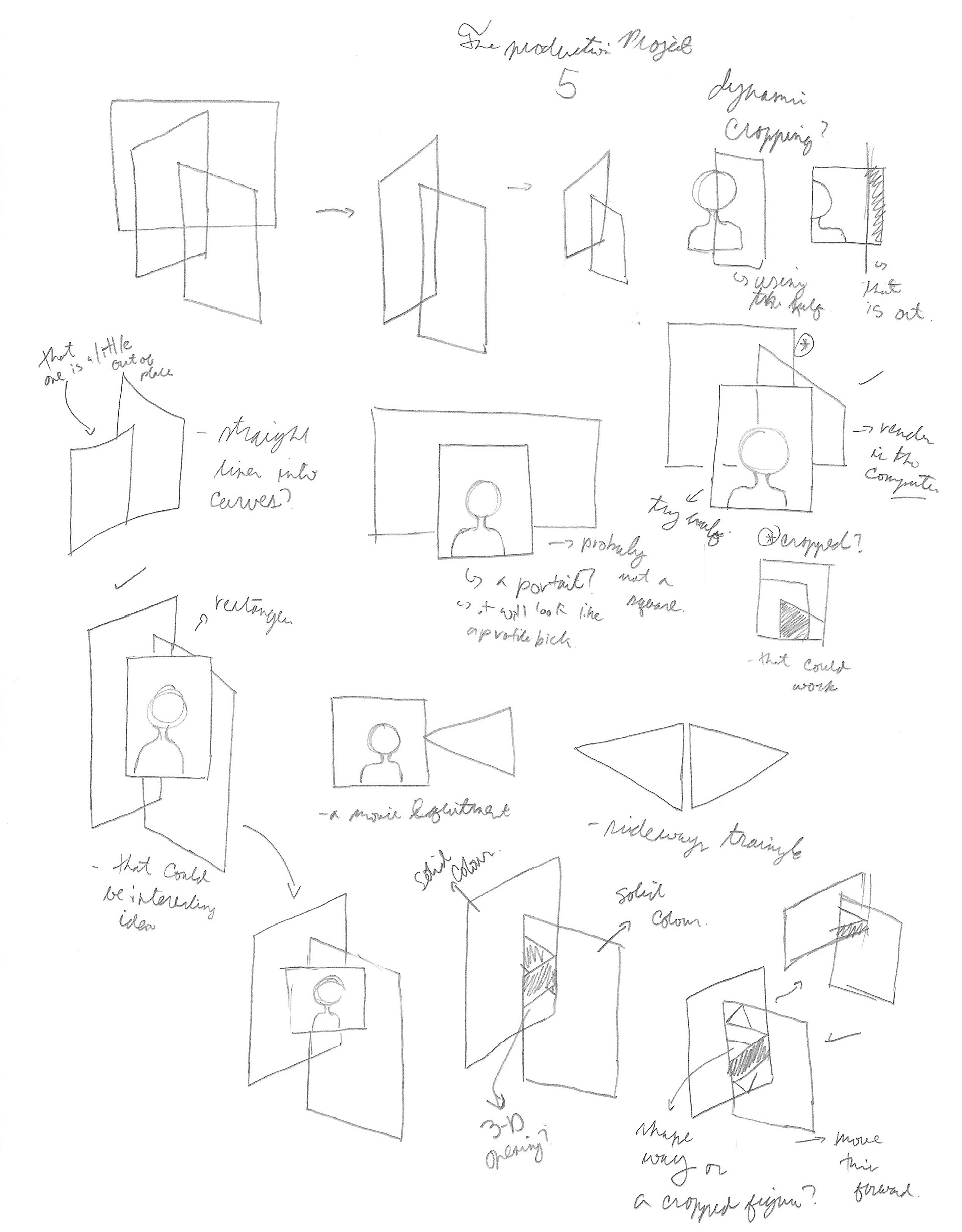
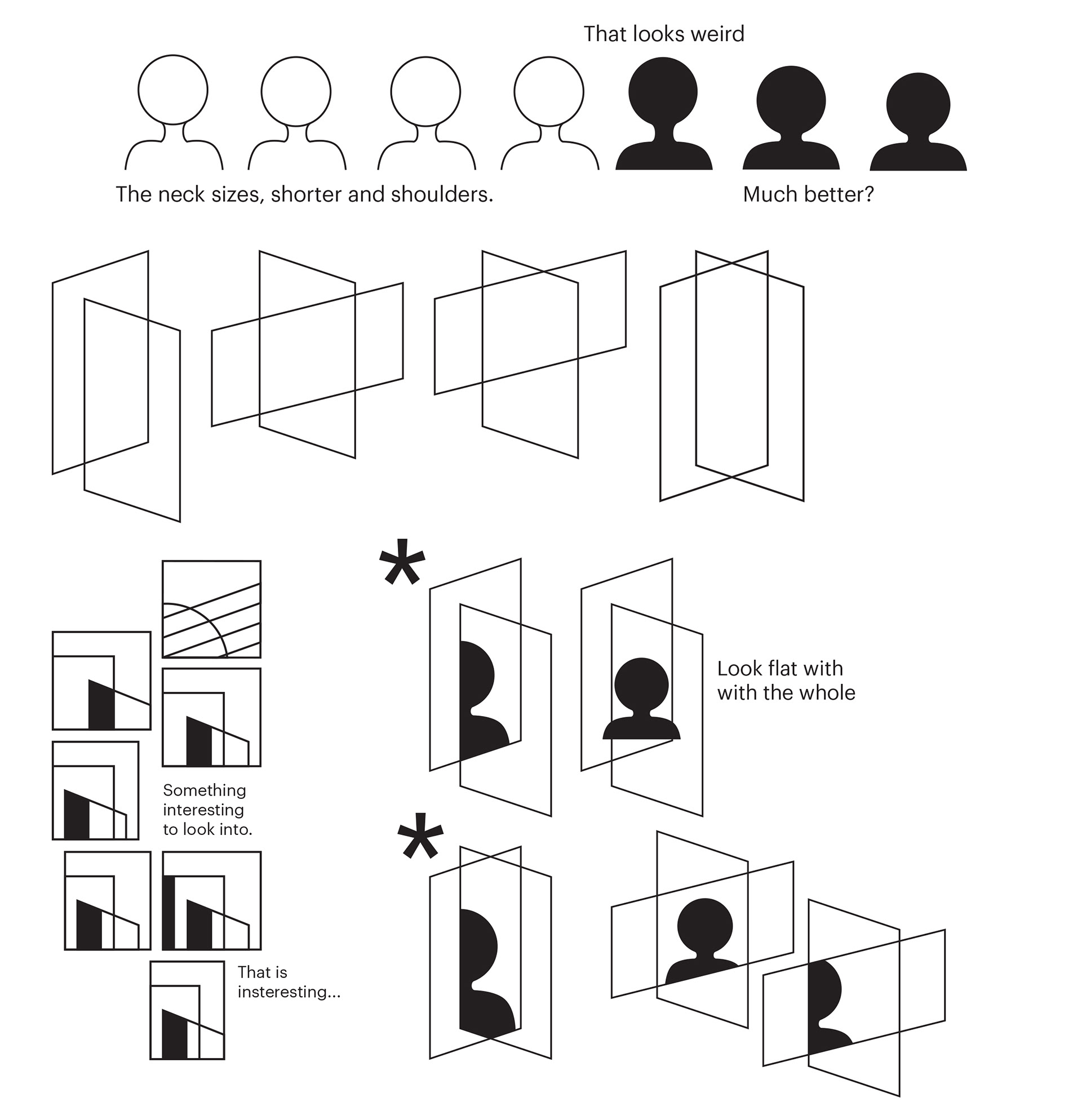
In this stage, I further refined to the original ideas with some additional ideas that carried over to the previous project. Some of the logos that I created in this stage are further exploration of other solutions than the original ideas that I created in the sketches. This designs are more abstract direction rather the association of movie elements. But the original logo from the sketches are explores as well such as the placement of the rectangular elements in relations to the figure in the logo.
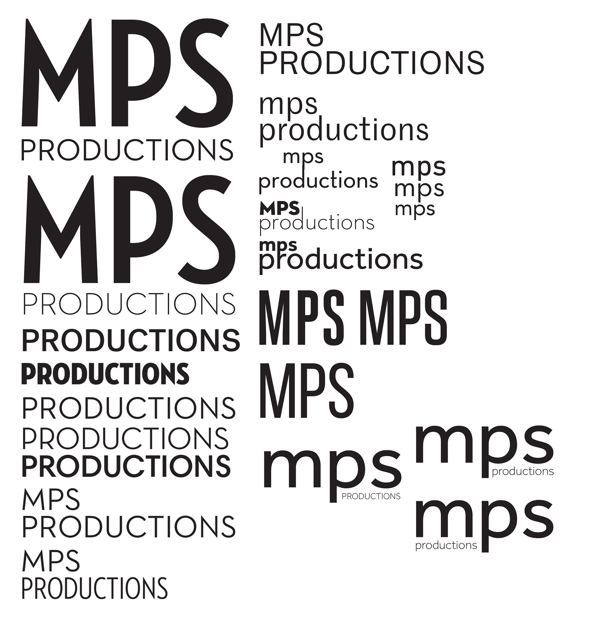
This process, which I try many typefaces to help further communicate the company and get the sense of what am I building for the company since this is their first logo.
This is are the renders from the sketches and some old ideas from previous process to be used during this digital process and further explore the possibilities.

This grayscale testing was to see the different effects and styles of the logo and better communicate the idea of the company.
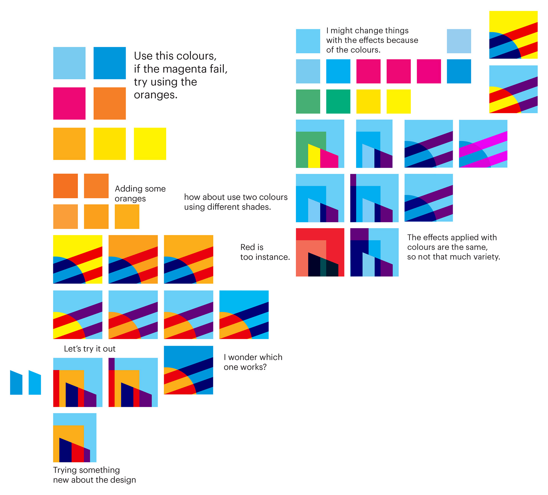
This is the initial colour scheme which is directly inspired by the TV colour bars and bright colour scheme that come along and branched to try different colours.
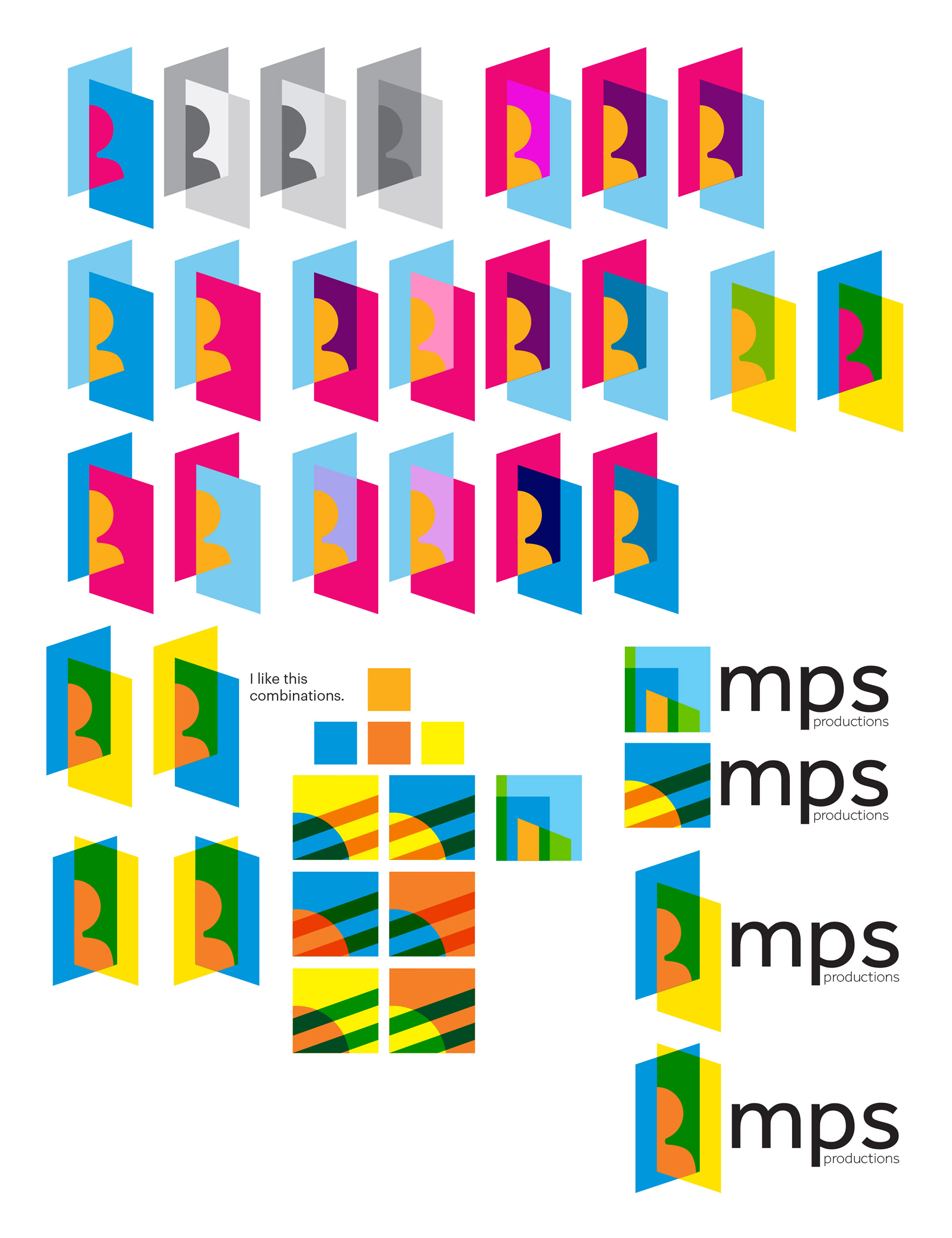
This is the semi-final logos that I design for the logo. I felt like the company need to more refreshing and lighter since the colours of the logo is fairly saturated and I want the company to feel fresh and modern.
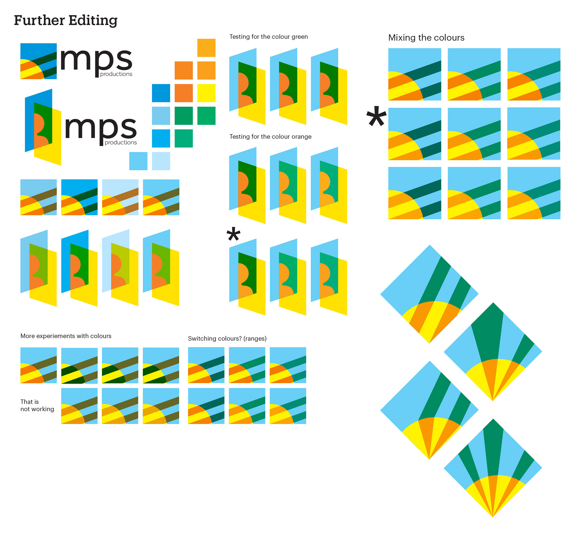
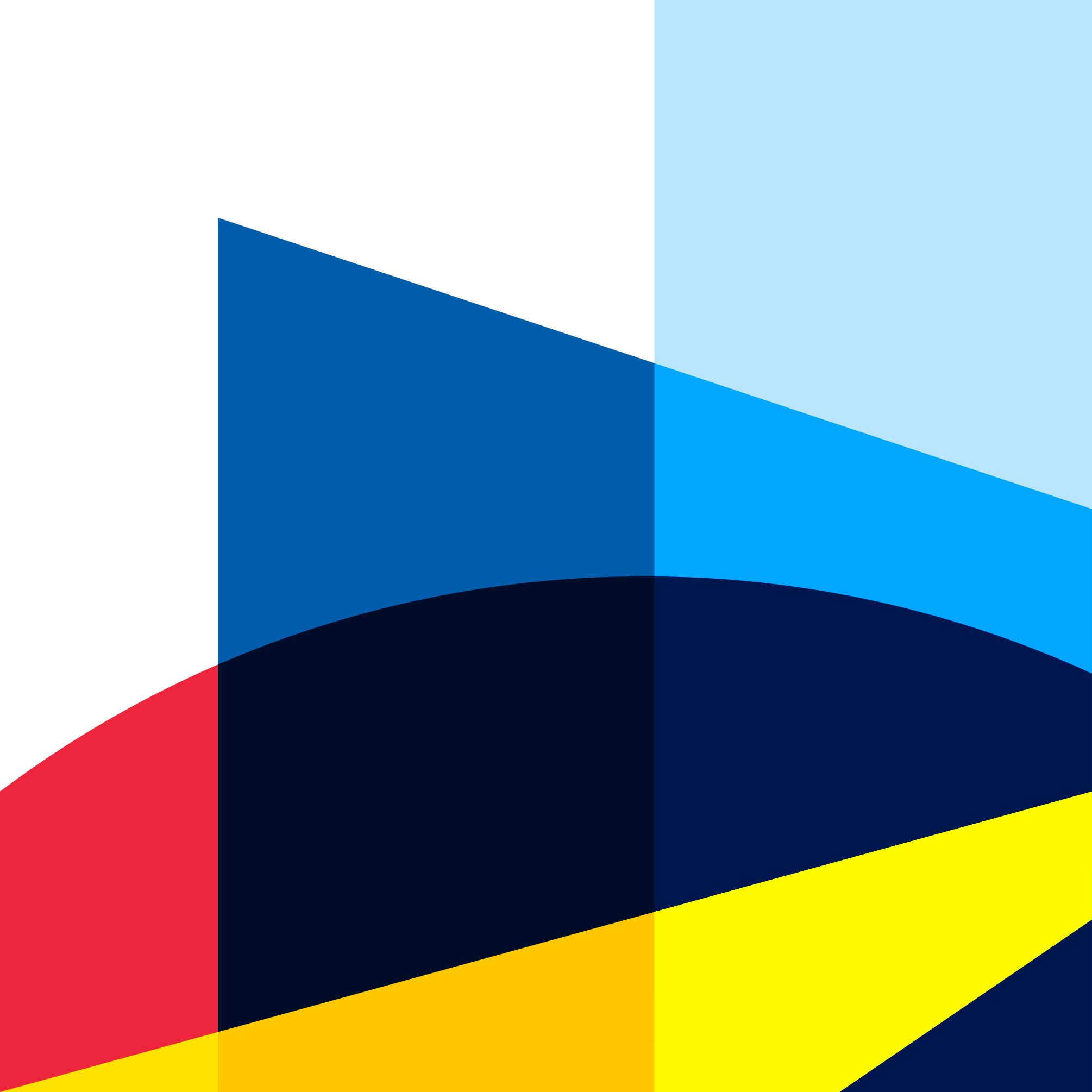
This new colour scheme which further illustrate the company's role as a film production company in a new and different way. This method here represents new beginning much more refreshing design of transparent and open to new ideas for the company.
FINAL DESIGNS
At the end, I choose this designs because it has a close association with company as a film production and has a clear connection to the company and representation with the element of three dimensionality, this reference how movies are created and narrate to the viewers. I also prefer this logo than the one that I created in the digital exploration, the square version logo because they are more of an abstracted versions which it doesn’t fully represent the company. At the end of the day, I wanted the logo to represent the company that is direct and easy to recognized logo with the ability to be adapted in many situation for motion graphics. In other words, the logo is modular and can be easily adapt to many movie genre.
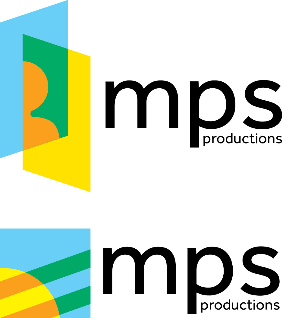

This is are the prototype logos that I have to choose from. But, I really want the company's to communicate clearly about what the company do and service that they offer and one of the most important ideas was modular design that is really build and design in the first logo that I initially design in a primary design of sketches. In conclusion, the logo that I chosen for the company is this design which is in the left side. I choose this composition because this initial idea of the company is clearly communicated and demonstrated to young company. The colour scheme really demonstrates about the company that is fresh and modern. Plus, I want the added benefit of a flexible design in two dimensional design to motion based design so, the logo becomes a deep integral part of the company.


On the right side — This colour scheme has a vivid and yet refreshing look to the company. It has the sense of it's cool and warm at the same time which describes the company's new take in movies.
On the left side — After many typefaces, this typeface reflect the modern look and feel of the many companies today and I want to relate the design of geometric typeface design and a little bit of humanist to reflect the time and give the company a primary typeface for the company.
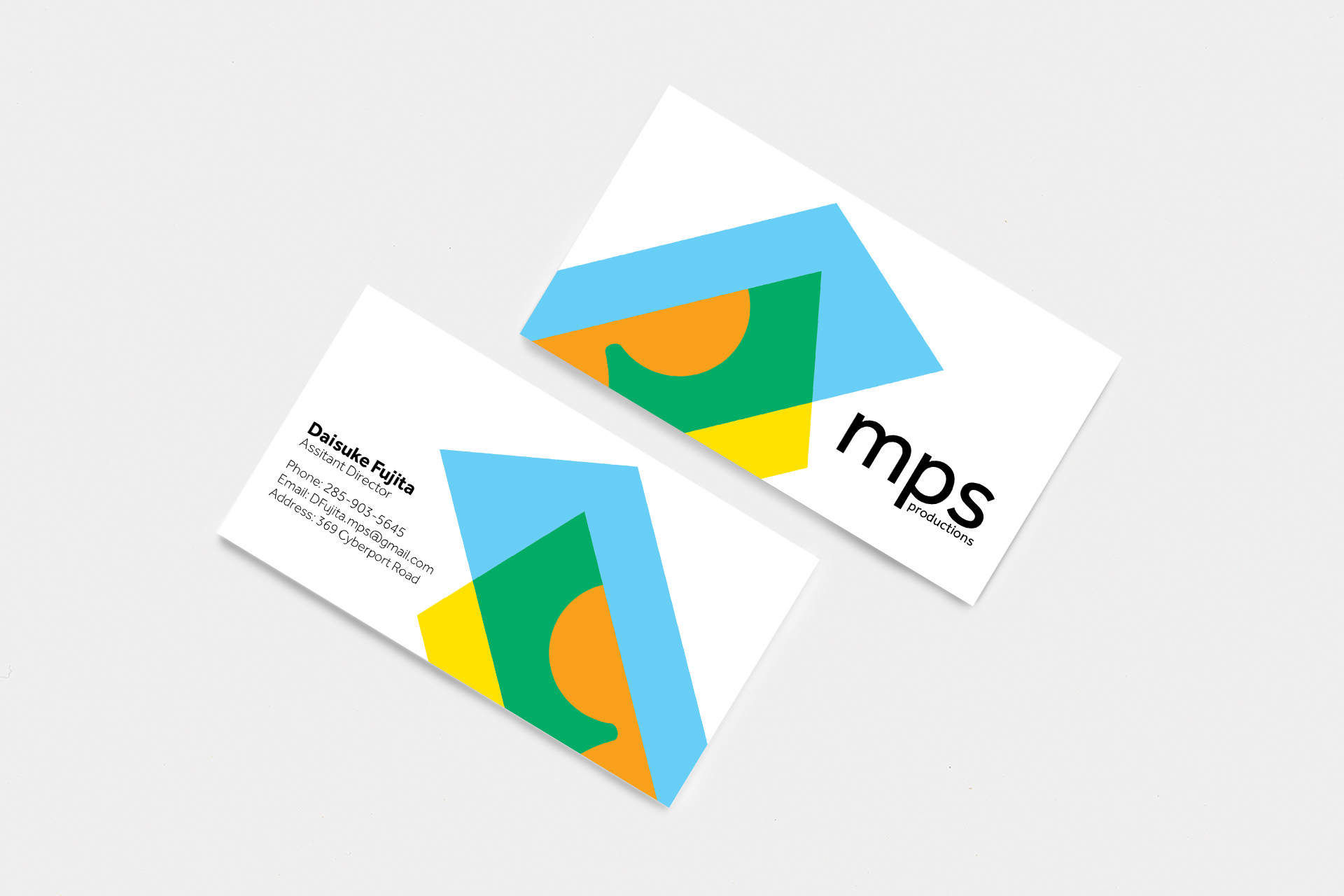
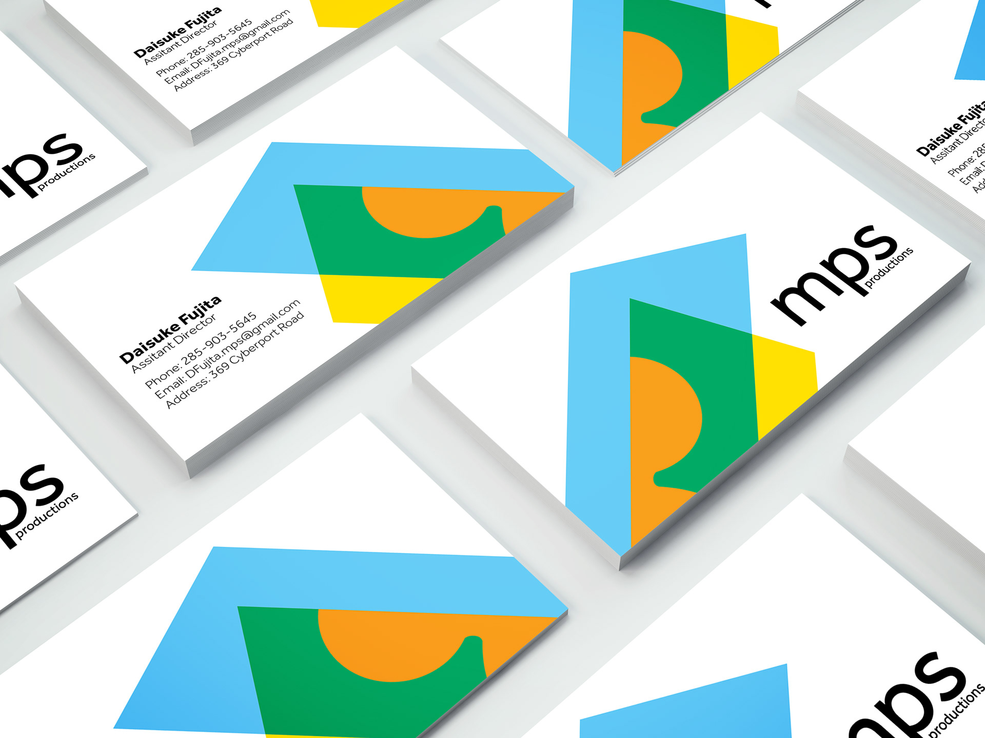
This is are the possible business card design for the company in many angles and perspectives.