

This project came out of an idea of an album cover that needed to rethink of how his music reflect the feelings of nostalgia and reminiscing the past. The originally the project would be consist of fixing the typography chosen in the original album cover. But, this project grown into the whole album cover redesign which I really thought about his music to the choice of colours/imagery to get an idea about the vibe and overall aesthetics of the music genre.
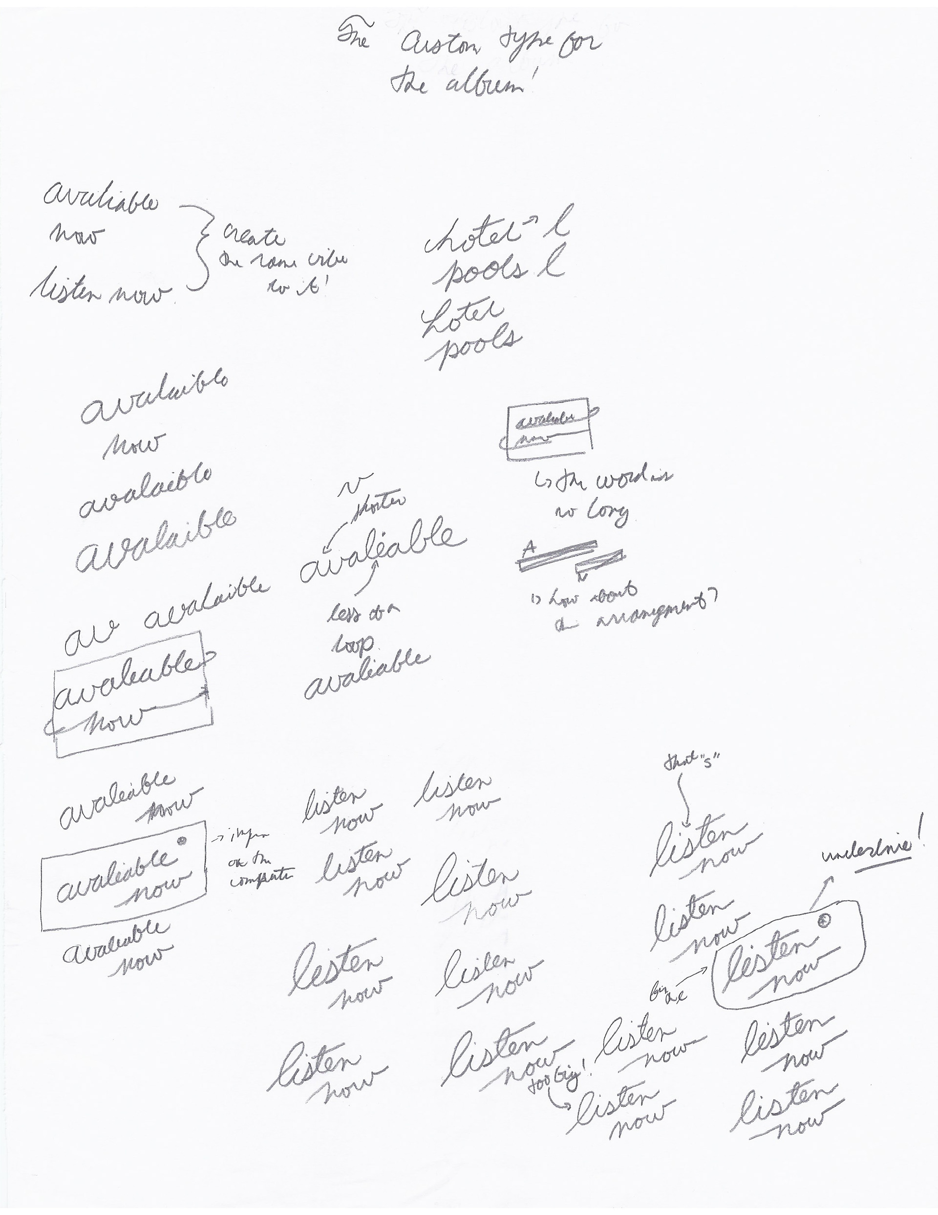
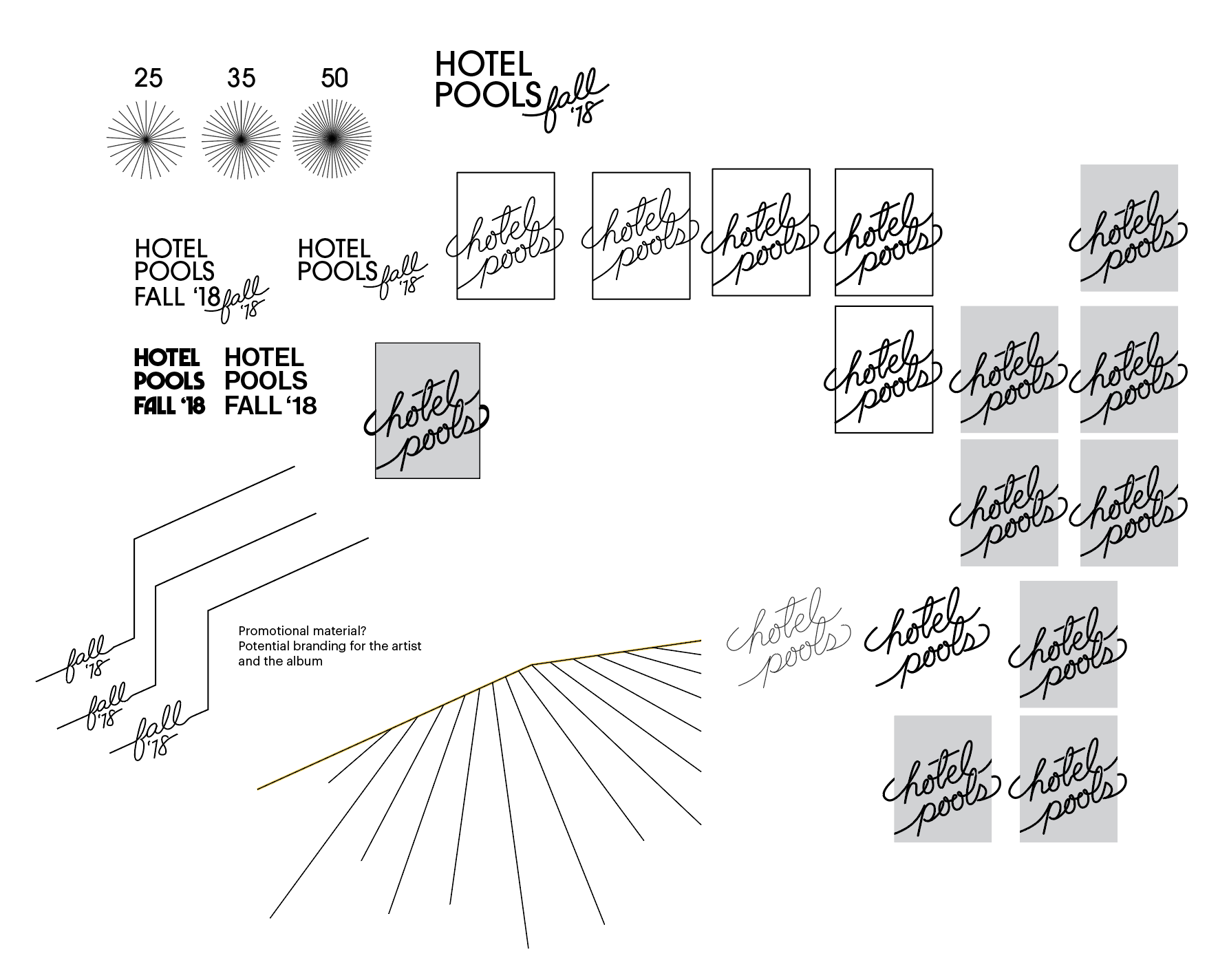
The new album cover is consist of a new design for the artist insignia to represent himself and to differentiate from artist. The idea of this logo is the connection to the artist's name which created a solid base to explore and what ideas come from the name. The whole notion of the design is how hotels used door hangers with some type of script type to demonstrate the function/progress of the room is. Plus, the shape resembles a shape of a pool. This design can work in multiple occasions and colour palettes.
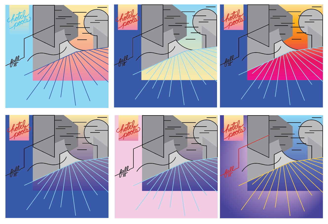
The hardest part of the project is what type of imagery would be used in the album cover. As shown below, I went from the idea of showing directly connecting to the notions of other worldly theme illustrations to expressing abstract feeling of that moment in our lives that we reminisce. Originally, the prime influence of the project was referencing the 80's style of design with the use of elements such as gradients. But, it is a modern interpretation of the decade and it is connecting that feeling of nostalgia and longing with the hazing, blurring effect of the album. It is more abstract in nature than a specific reference. I think the artist is expressing our connection to the past through nostalgia with the added idea of the specific moments that lingers which it doesn't have to be direct reference of a long lost decade. But what it creates is the idea that enables a connection to the album that is beyond what his music is intended to do.
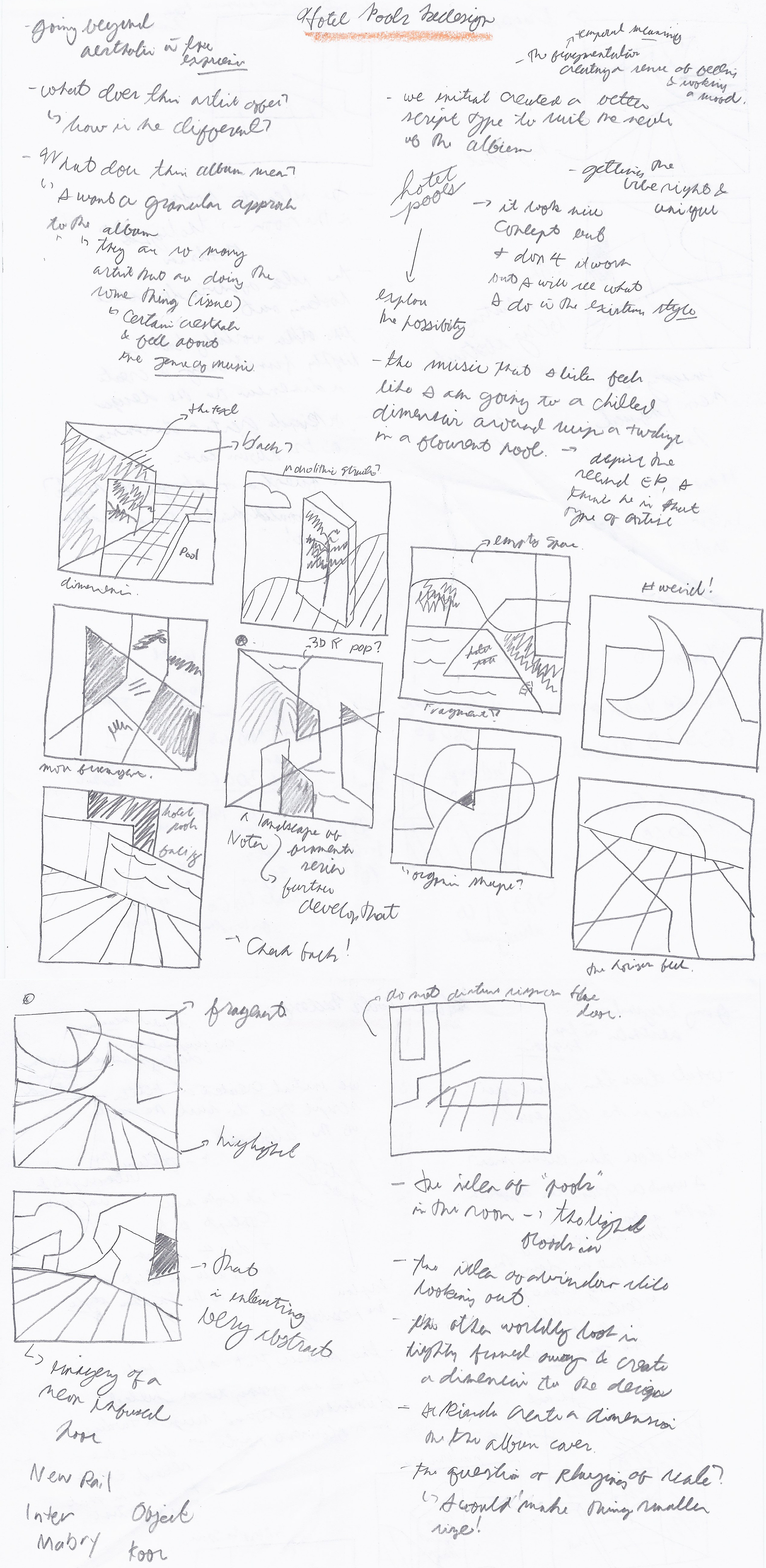
The process started with questions about how his album differentiate from other artist and what is my listening experiencing of the album. The "Hotel Pools" logo was created by an idea and simply wrote it down in the edges of the my notes and I wanted further refined the design. Plus, the initial project was a simply typographic design which would wrap around in the existing design of the album. The image elements of the album is around the notion of entering into an another world which the idea of a window being the portal arises in the concept. This contributed to the ideas of adding depth to the composition to adding a narrative element of being in a hotel room looking out and seeing the changing world. Also, thinking about the name in which I tried adding some pools in the elements of the designs.
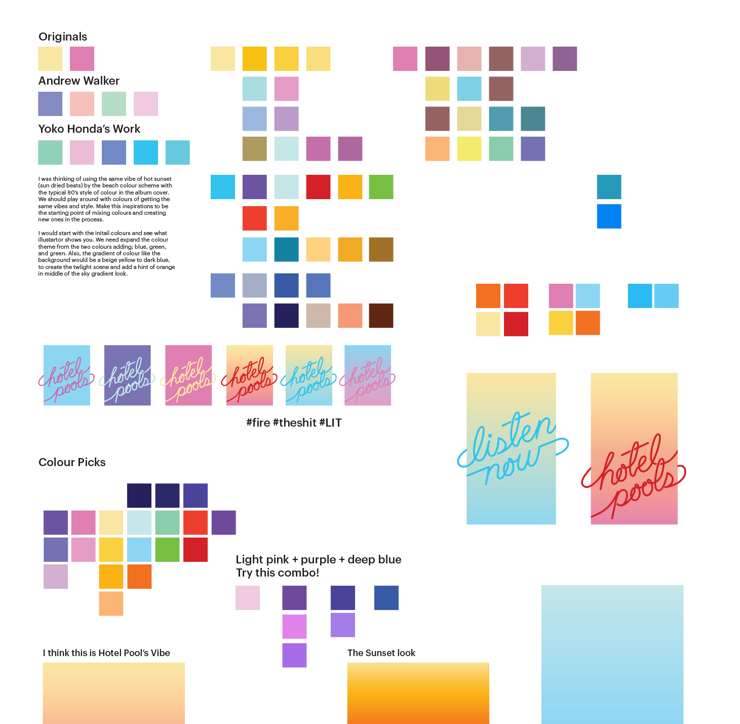

In this stage of process, I research the vibe and the aesthetic of album. Many other artist in the same genre portrait the 80's colour scheme and summer dusk feeling chilling in a park or a beach. But for this album, I would like to keep with the same colour scheme but to expand the set because I want to explore the possible colours with the same vibe as of the original album to create depth and interest with the colour scheme. Also, I refined the type and though of an idea that the type would be wrapping around a rectangular shape which looks like a pool and a door hanger as well.
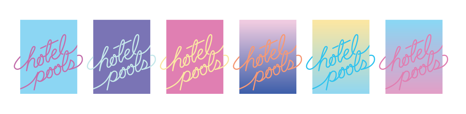
This shows the multiple possibility of design to match what the artist desire in changing in the vibe and aesthetic to represent what projects he could be working on to how he is represent in public with the use of this insignia. Also, this shows the final design of the logo and later finalized the final colours as well. The colours that I used in the final album colour design for the insignia is based from his first album colour scheme because it sets the tone of the artist first album cover and his music in the track.
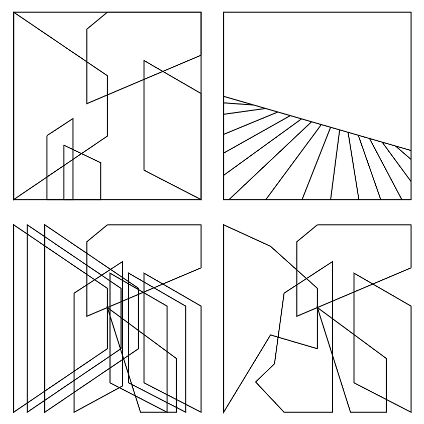


This is the early stages of the design that are based in the sketches and implementing the narrative element of the window idea in the later compositions. The colours are used from the colour scheme research.
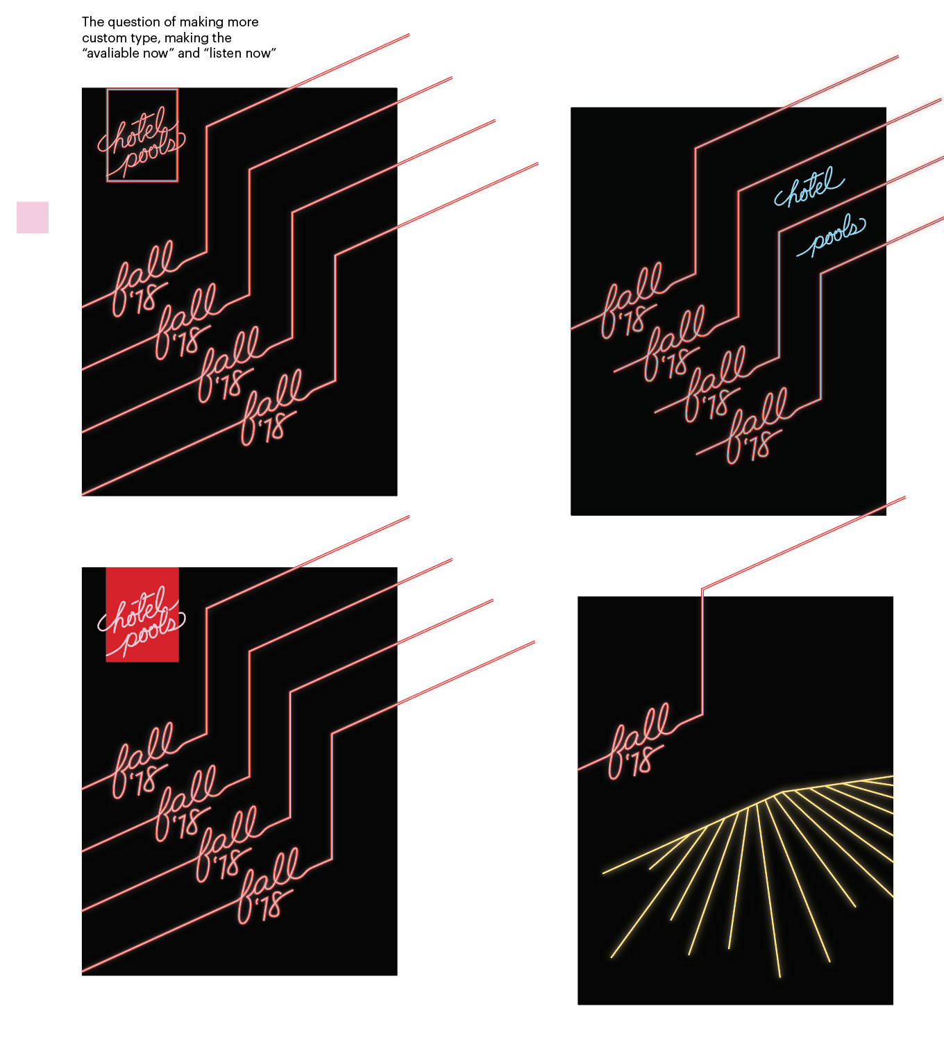
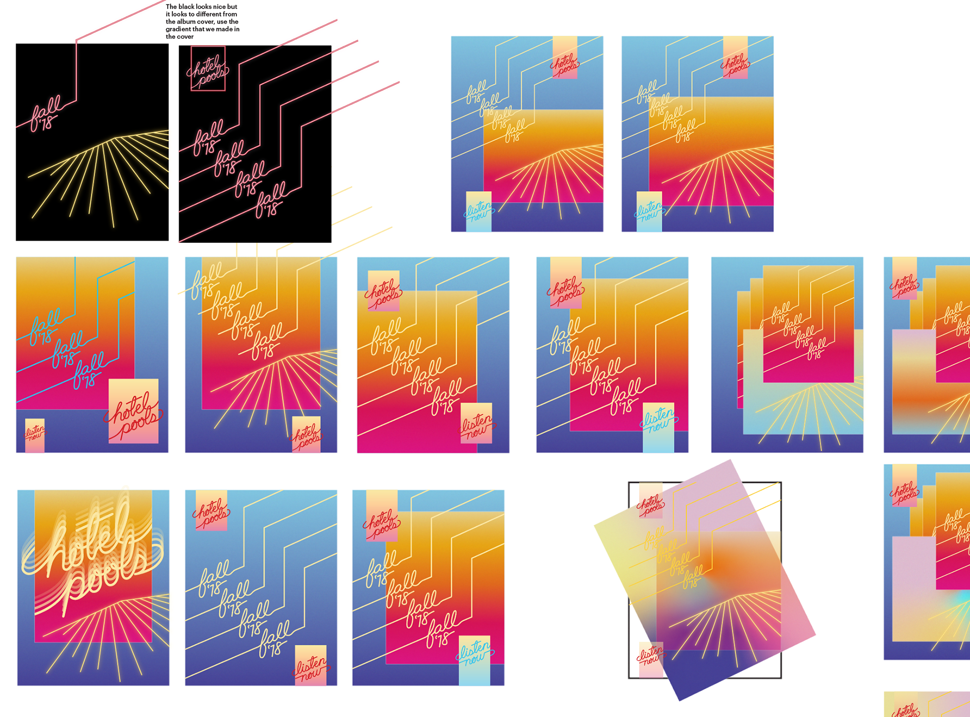
The idea of making a poster with the album design is based on the idea of how should this album be advertise and spread the around. At the same time, it helps to demonstrate the design to be able to adapt and still be part of the whole design.
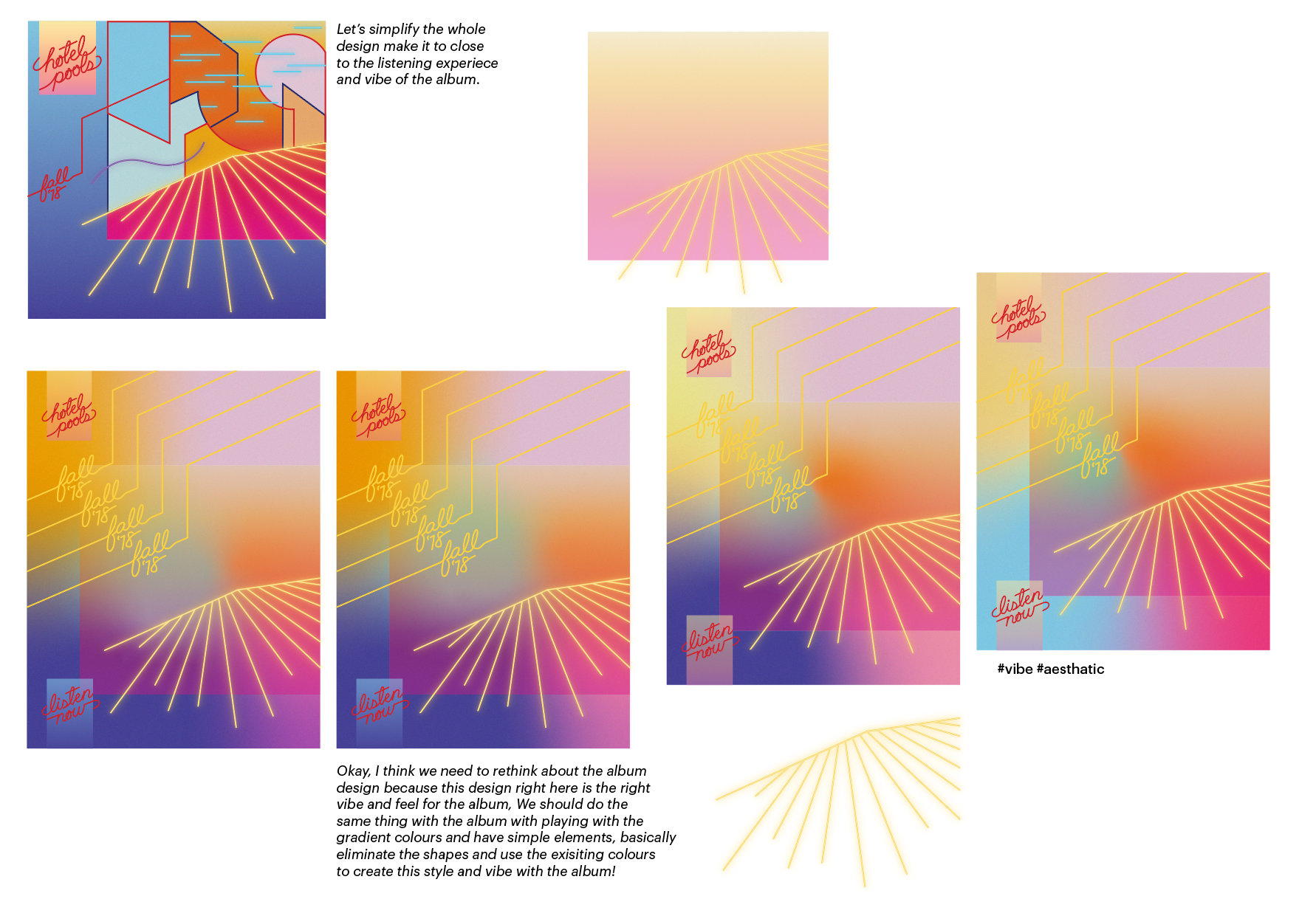

In this stage of the project, there is a turning point that changed the whole design. I wanted to further explore the gradient and making a poster for the previous album design lead to a dead end. Also, the problem of the original design showing not a lot of depth in the whole composition. As a compromised to the original design of the album, I am made a heavily based gradient and abstract poster. This jumpstarted a new design and ideas of making the album cover that would pair nicely in the new poster design.
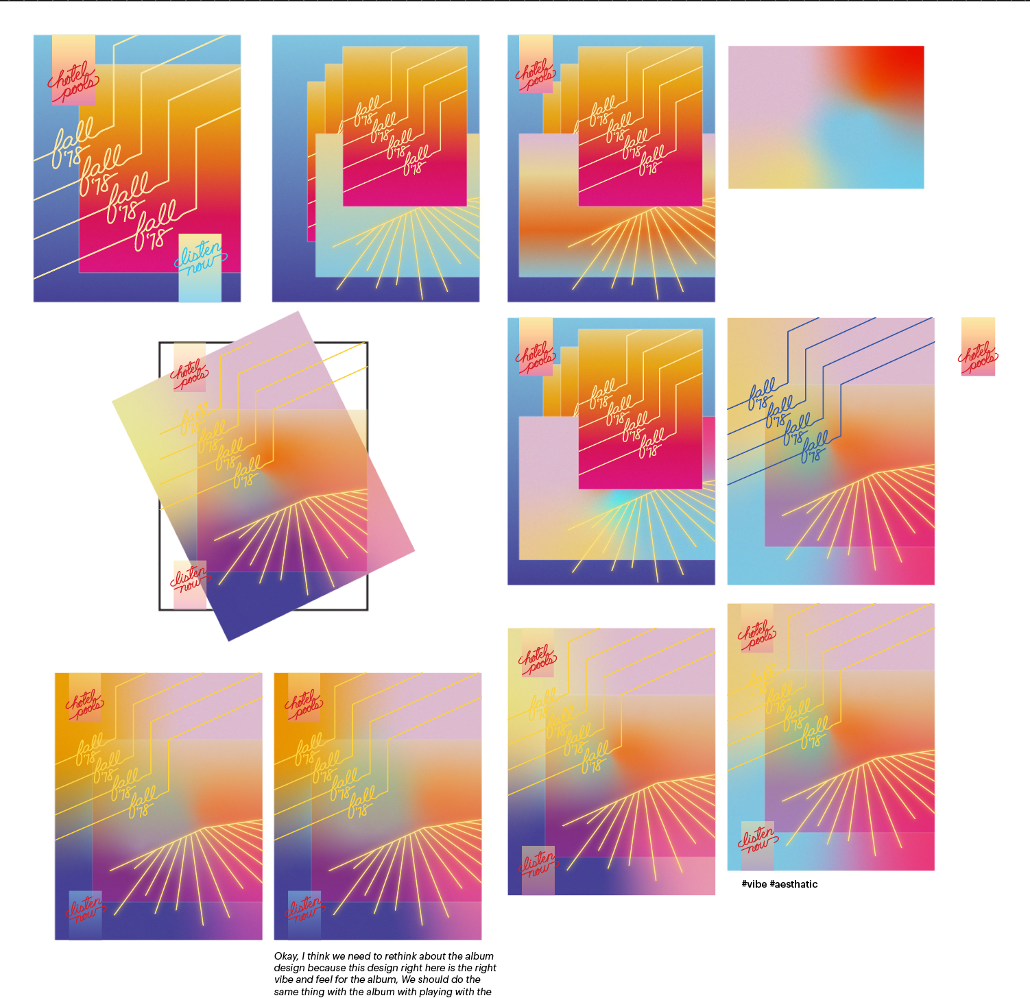
Some of the process work figuring out the orientation of the where the colours should be and picking the right colours of the album cover. Since, it is new design of the album the elements in the album have to be moved around and re-incorporated in the new design. I played around where to put the album name in composition. The new album design is still based from the original design instead of shapes, I used gradients to create the some premise and idea but more depth and abstraction through the experience of listening to the album.

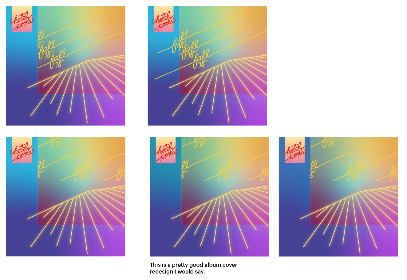
This is the final design of the new album cover design and the poster design
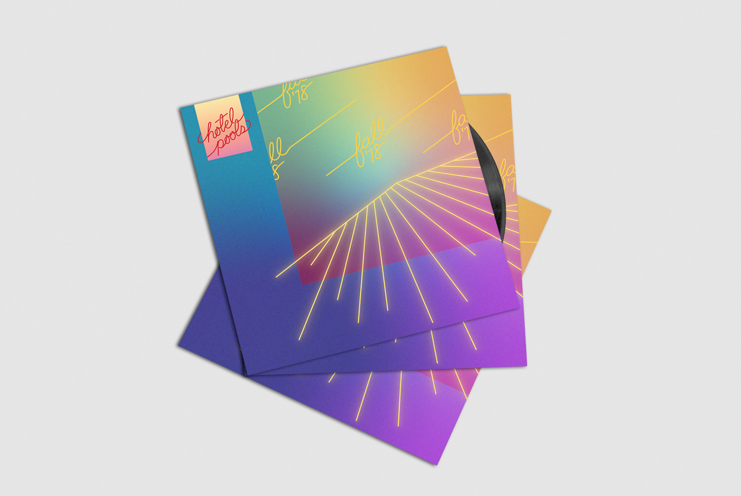
This is how the design would look like in a vinyl release of the album
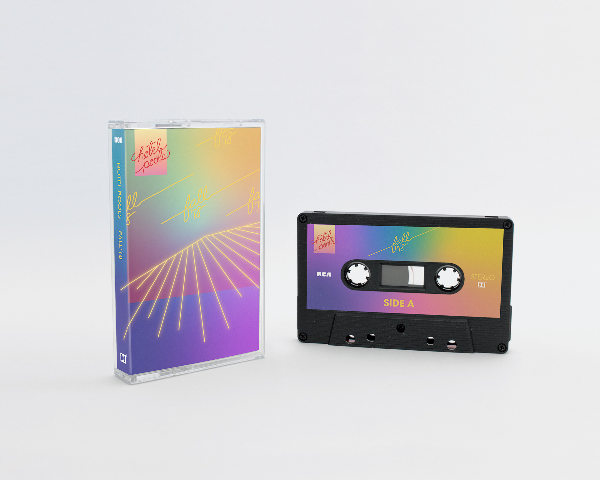
The design for the cassette tape edition have some slight changes and optimization for the medium.
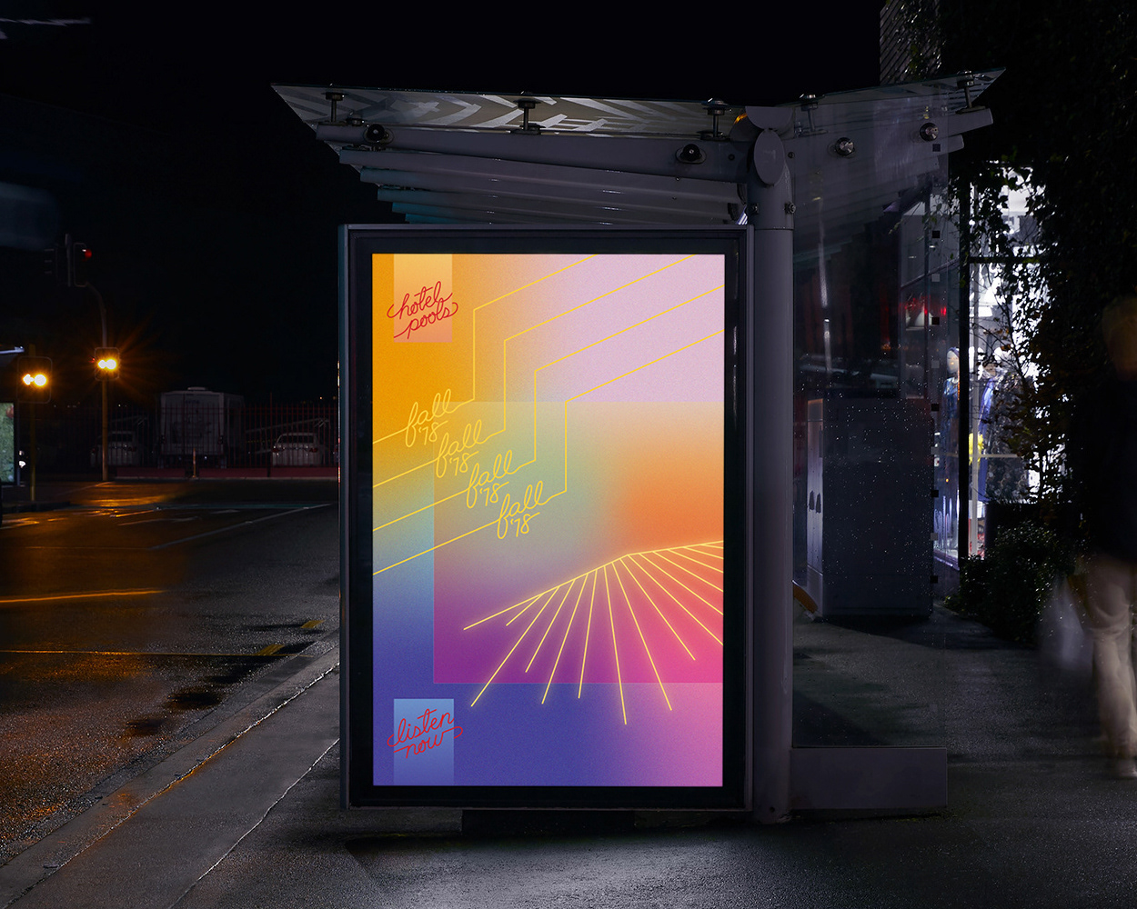
This poster is slightly modified to fill the space for the bus shelter poster size.