The project started with the competition in my early years in university. The contest was to design a logo for the AIDS 2018 conference in Amsterdam. The issue with the logo design is never realized in a full branding system. In other words, the logo design is the first to be created but never considered to be applied in multiple mediums that comprises a conference being held. The design of the logo is effective but never show how the design of language of the concept and how it will be used, evoke the feeling of the event.
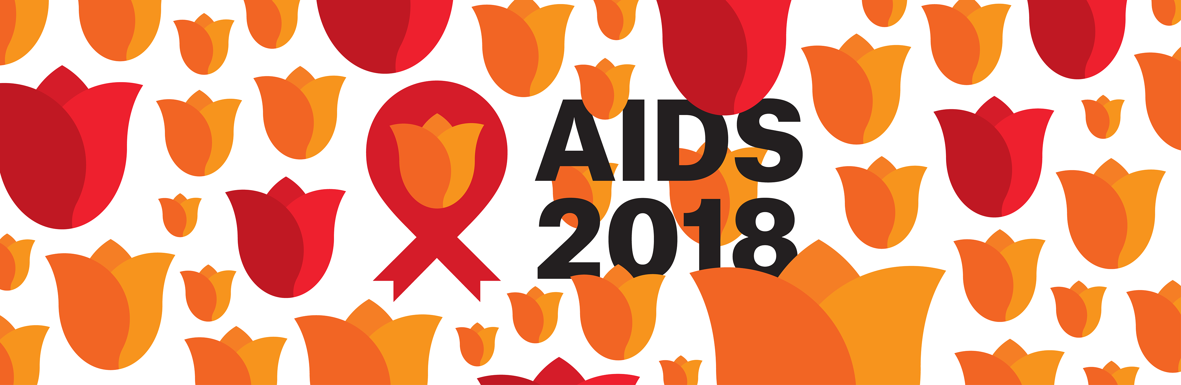
The idea behind the logo creation is incorporating the cultural and themes of the host city, Amsterdam and the country of the Netherlands. The creation of the tulips is around the shape of circular wheels of the bicycle which is a common site in the city and iconic fixture of the city and culture. Creating this type of system help to create a cohesive design of the tulips. Using the colours of orange to signify a unique characteristic of the Netherlands and red being the representation of the AIDS awareness to build the colours scheme of the whole design. This help me in the process to colour the tulips and shades of the colour in the final designs. The idea of the tulips and other elements in the page being spread out around the many mediums of the designs is the represent the idea of gathering to sharing new ideas, research and etc about AIDS. This is a conference event and I think this design represents the concepts of event in a visual aspect and language.
In the end, the design that I made for this event was never chosen but I fully flushed out the idea being able apply to a wide variety of mediums and systems of design for this conference event.
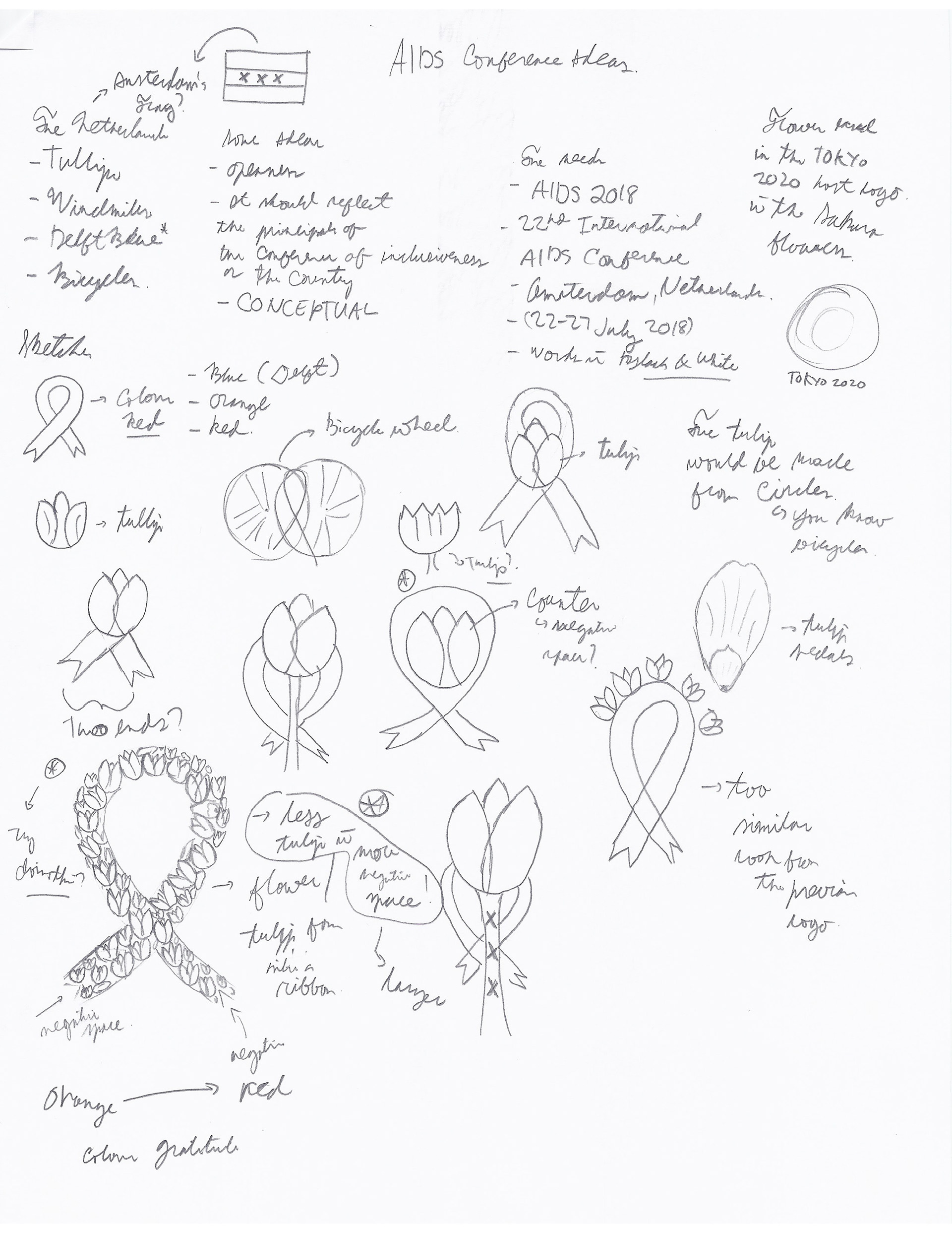
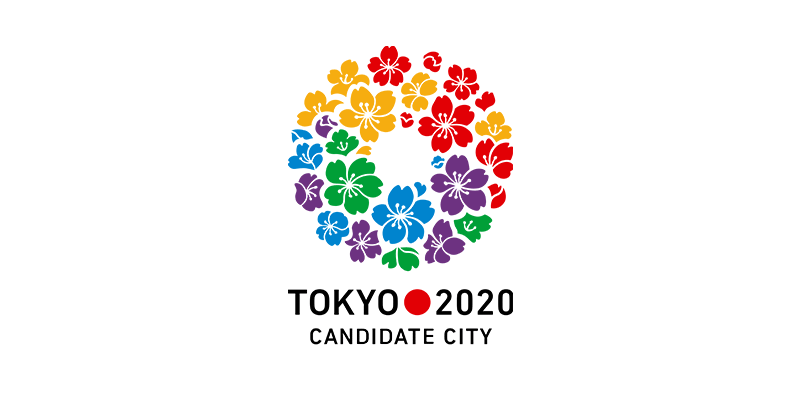
During the process, I explore many ideas about the city, country and the culture. Also, how to represent the host city to be recognizable at the same time not stereotypical representation of the city. It should be well known and not too narrow of the idea about the host city. I eventually came up with the idea of the famous tulips in the country of tulips which are well known and iconic orange which is used in sports teams. Considering this is a conference, the act of gathering and sharing ideas across the wider community made me think how to capture that concept in a logo. I was also inspired by a design of Japanese student who made the Tokyo 2020 Candidate City logo and try to apply in my process.
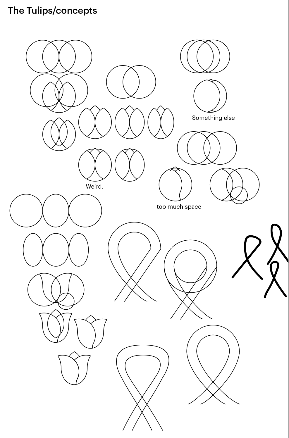
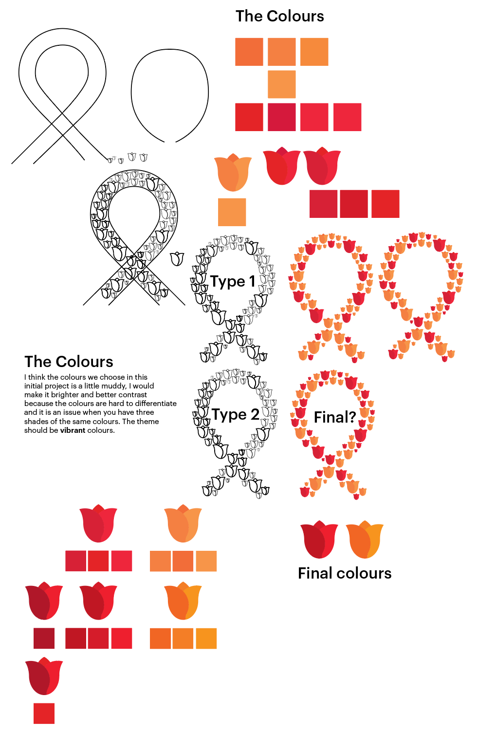
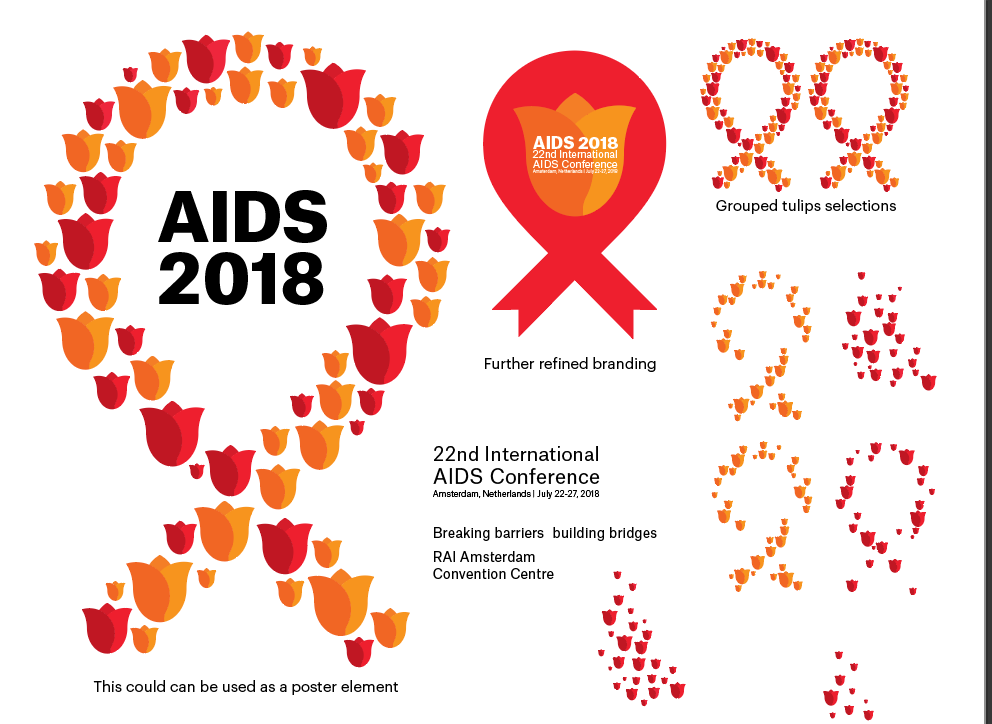

This lead to creating a systematic approach to creating the elements such as the tulips. The circular element idea came from the famous aspect of being in Amsterdam which is bicycle as one of the majority of traveling in the city. Creating around the ideas and making the logo more vibrant and unique approach to the design. The images shown above show the process of further refining the design and colour palette of the logo. The typeface idea behind the whole project is that I want to have a clean and direct message about the event. At the same time I want the typeface to be bold and be able to stand out against the complex element arrangement of the tulip design.

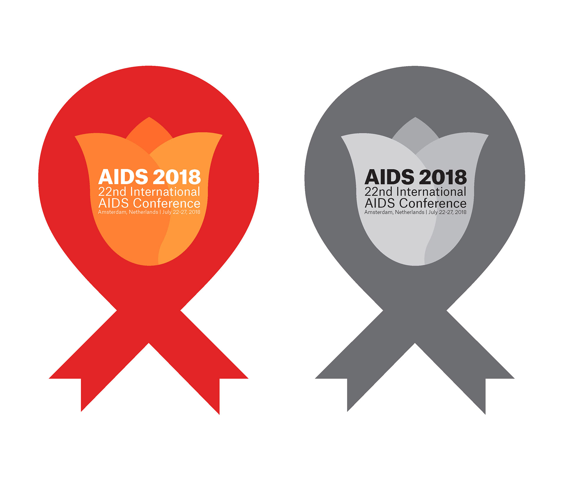
Essentially, this is the final design of logo that is eventually submitted to the contest. After no response to the competition, I decide to flush out the whole idea and making a systematic branding of the logo as if they choose the logo and be used throughout the event. Also, I send two design for the event. The second send of logos are simpler design but I crammed the typography in the design. This made me to consider about the multiple use of the logo which caused to reconsider the overall design of the logo.
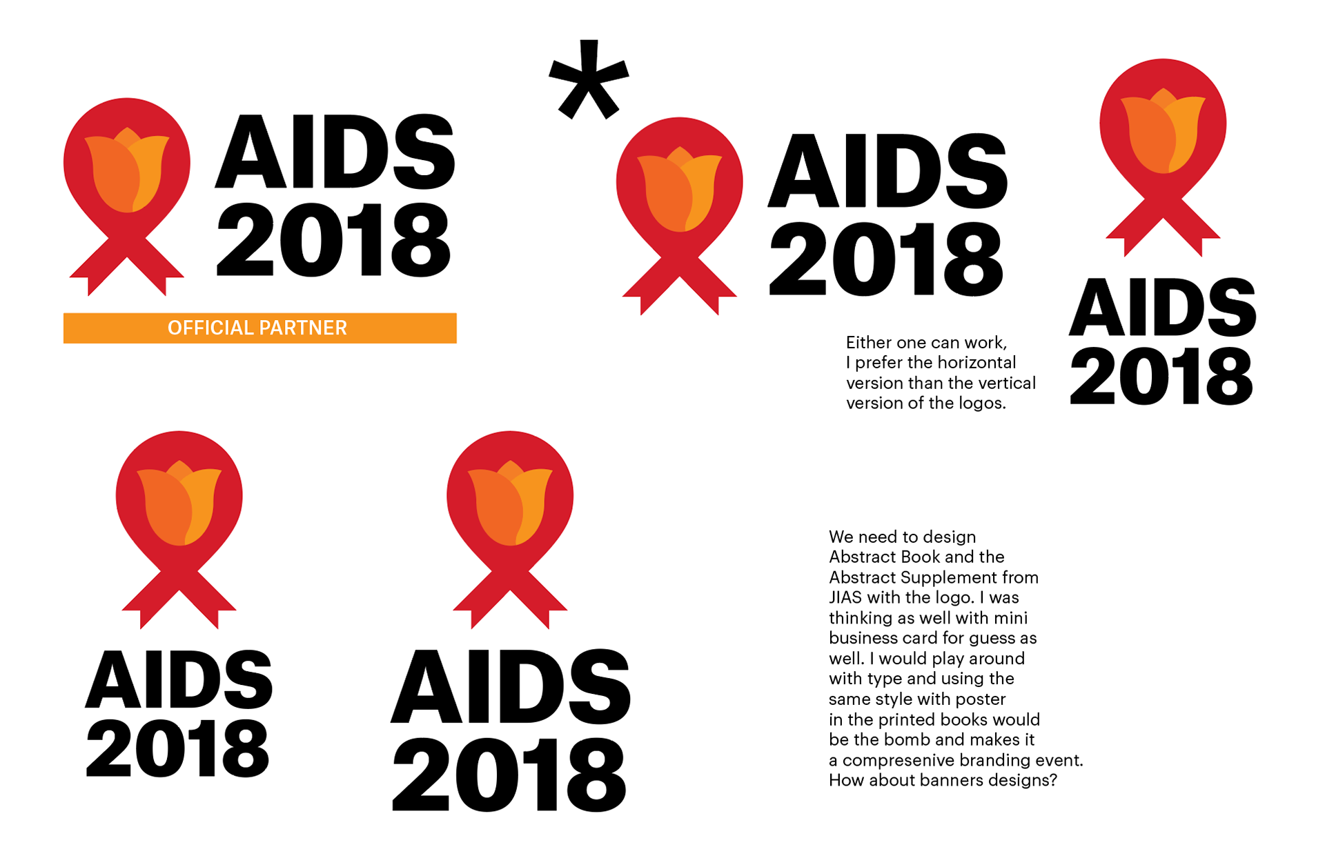
This lead to reorganize the logo and typography to more cohesive to be used in multiple mediums. The original design have many issues for being used in the many mediums which is important in this project since the brand need to used so people would know where is the event to what is the event.
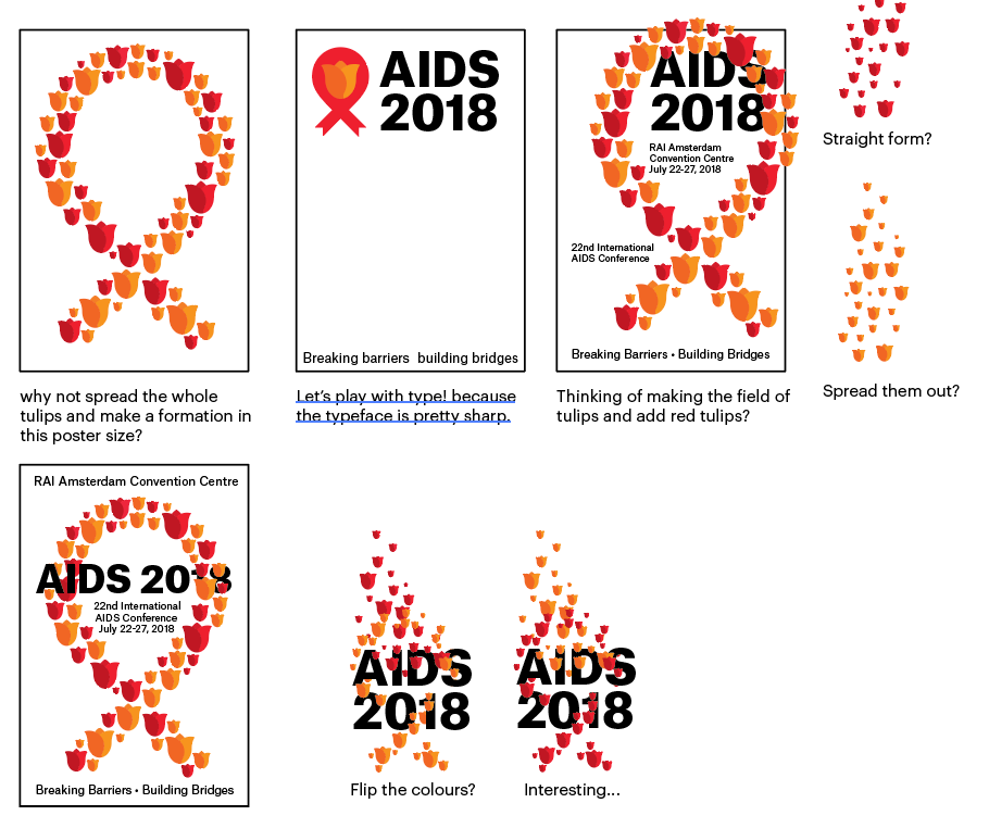
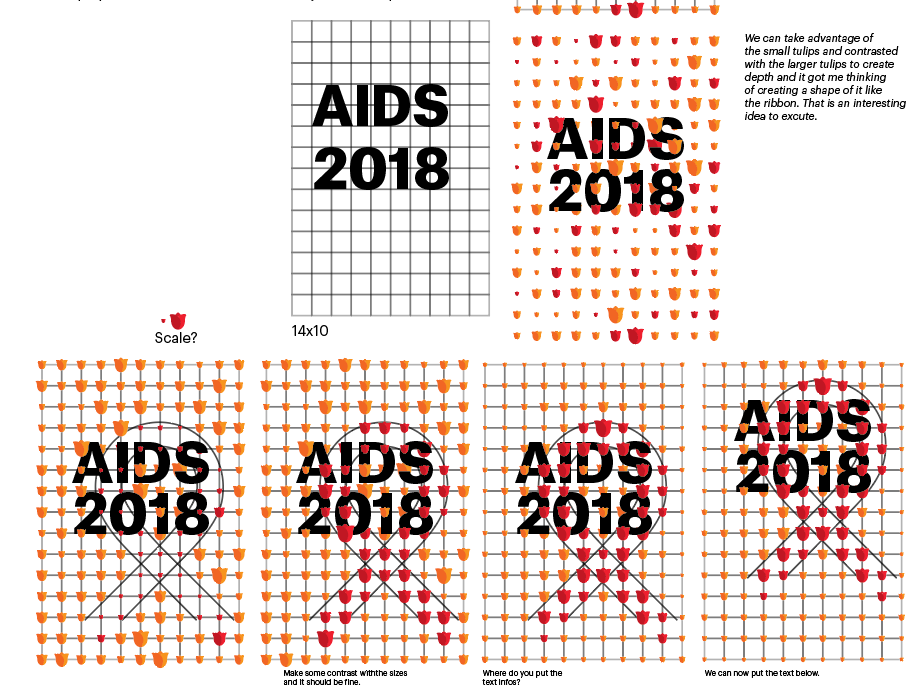
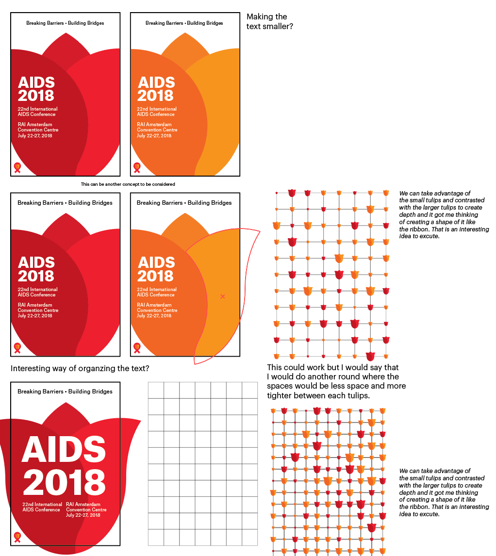
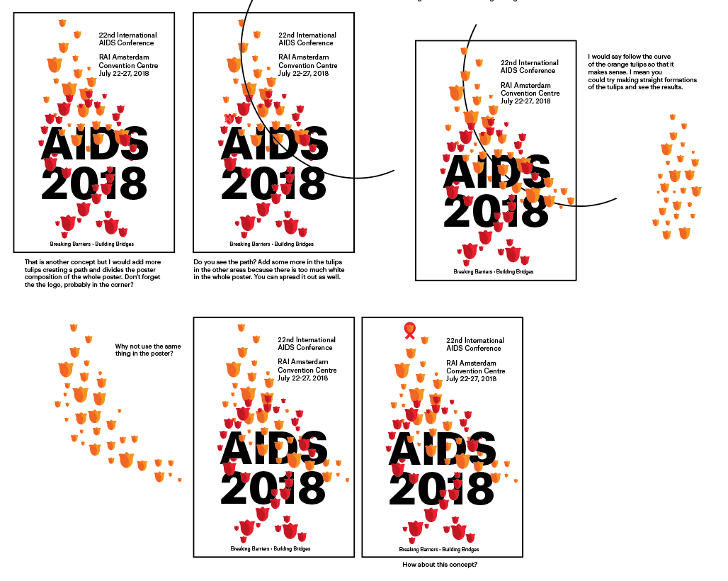
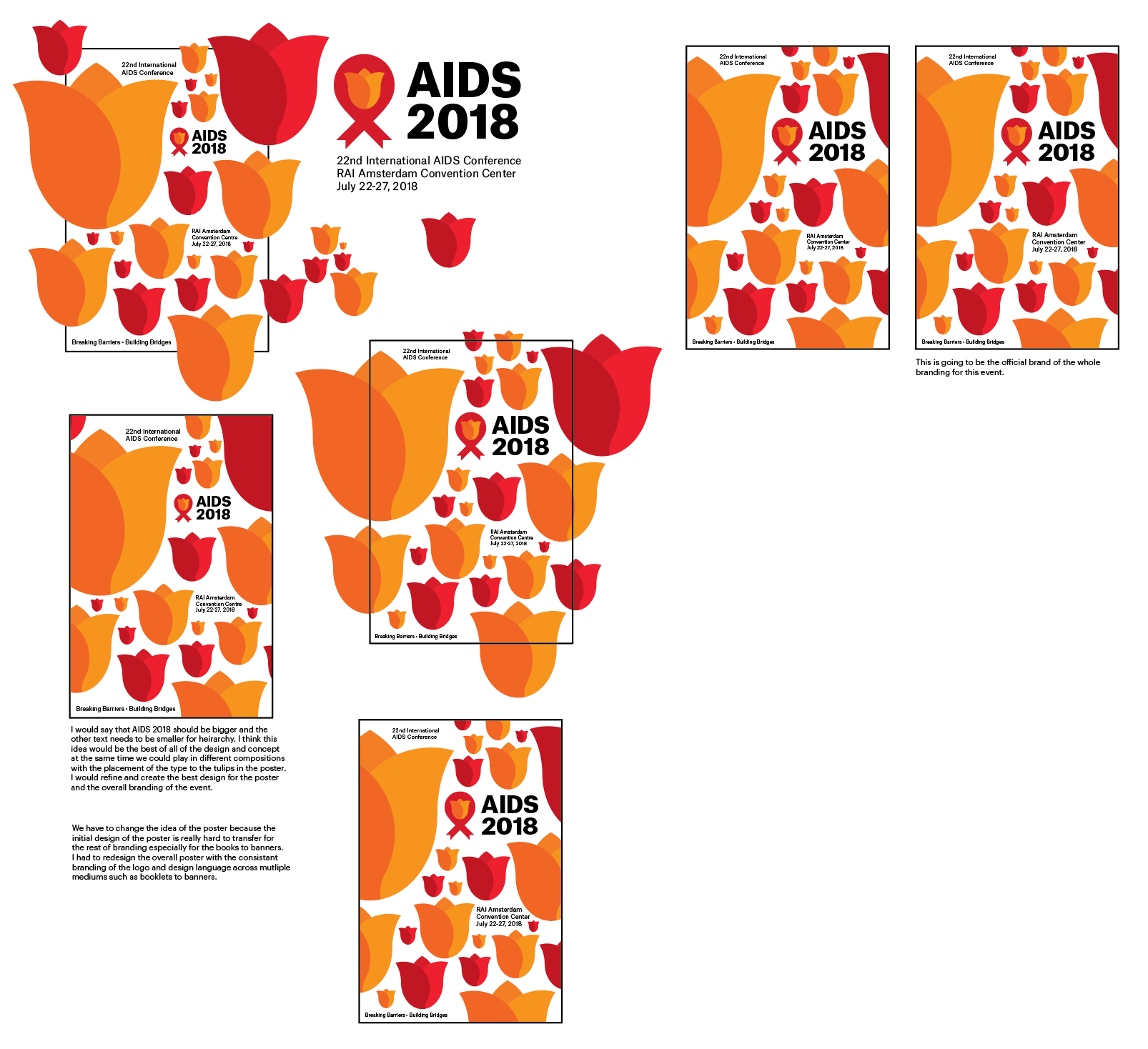
In this stage of the process, this is where the design needs to be tested and considered carefully. A simple poster design should deliver the idea and design language from the start. Reconsidering the design of the logo to fit in this aspect would help me apply the logo from any medium and creating a cohesive design language to propel what is the even is all about. They are many process work that I struggled during this process because of the lack of consideration of the logo design make it default to design a poster. After tinkering the logo design, this made a huge difference to whole project as a whole.
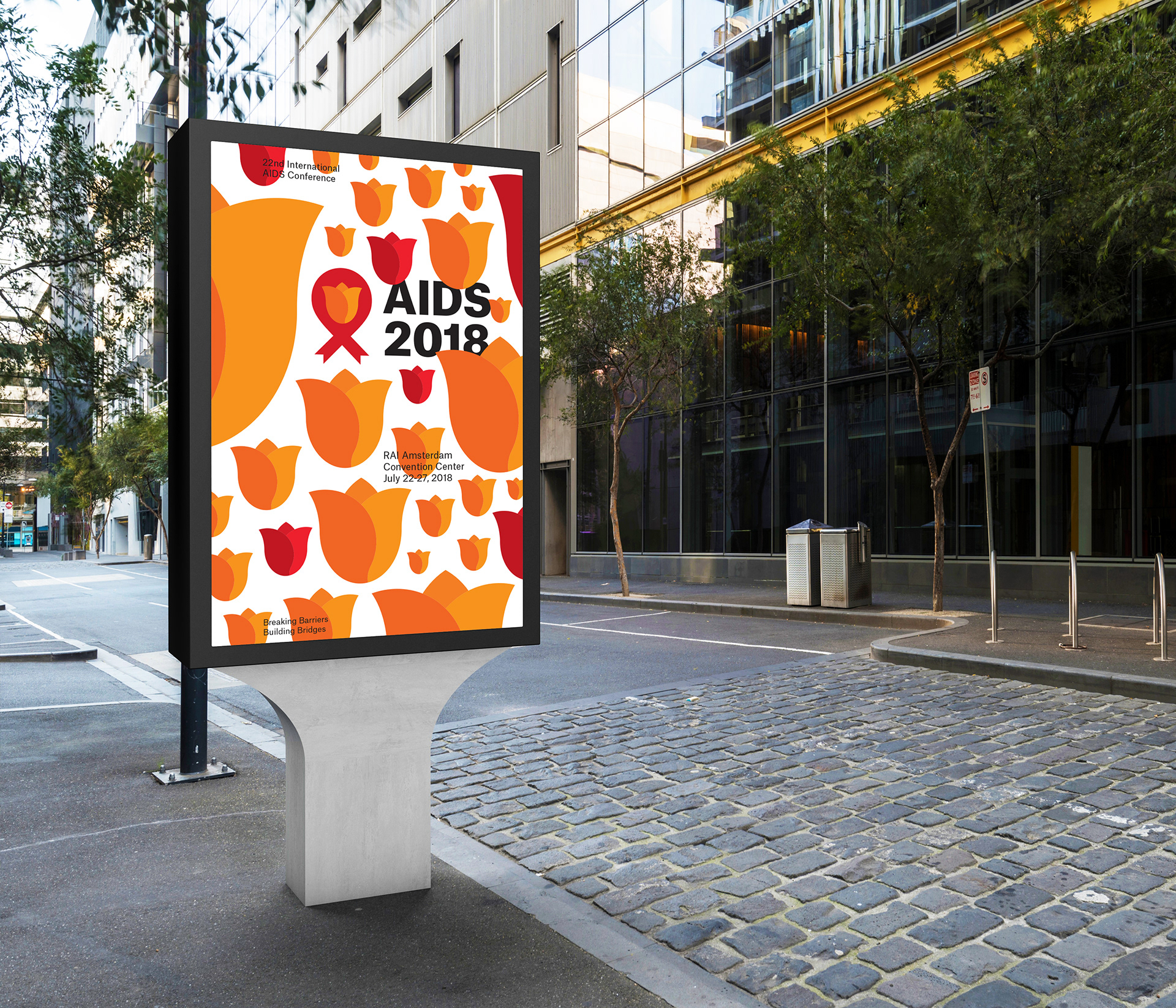

This is example of the final poster being used outside and how is presented in the public.
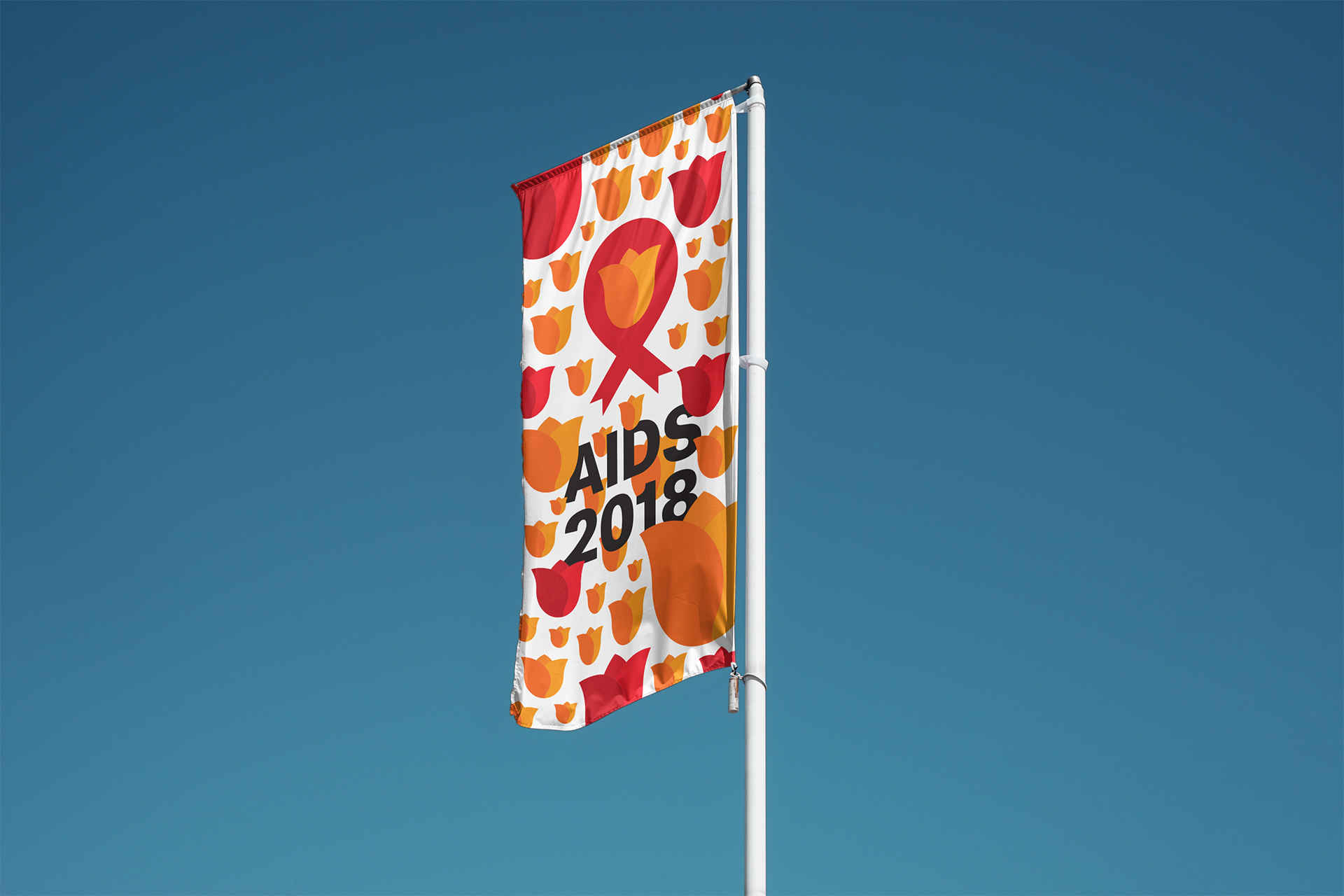
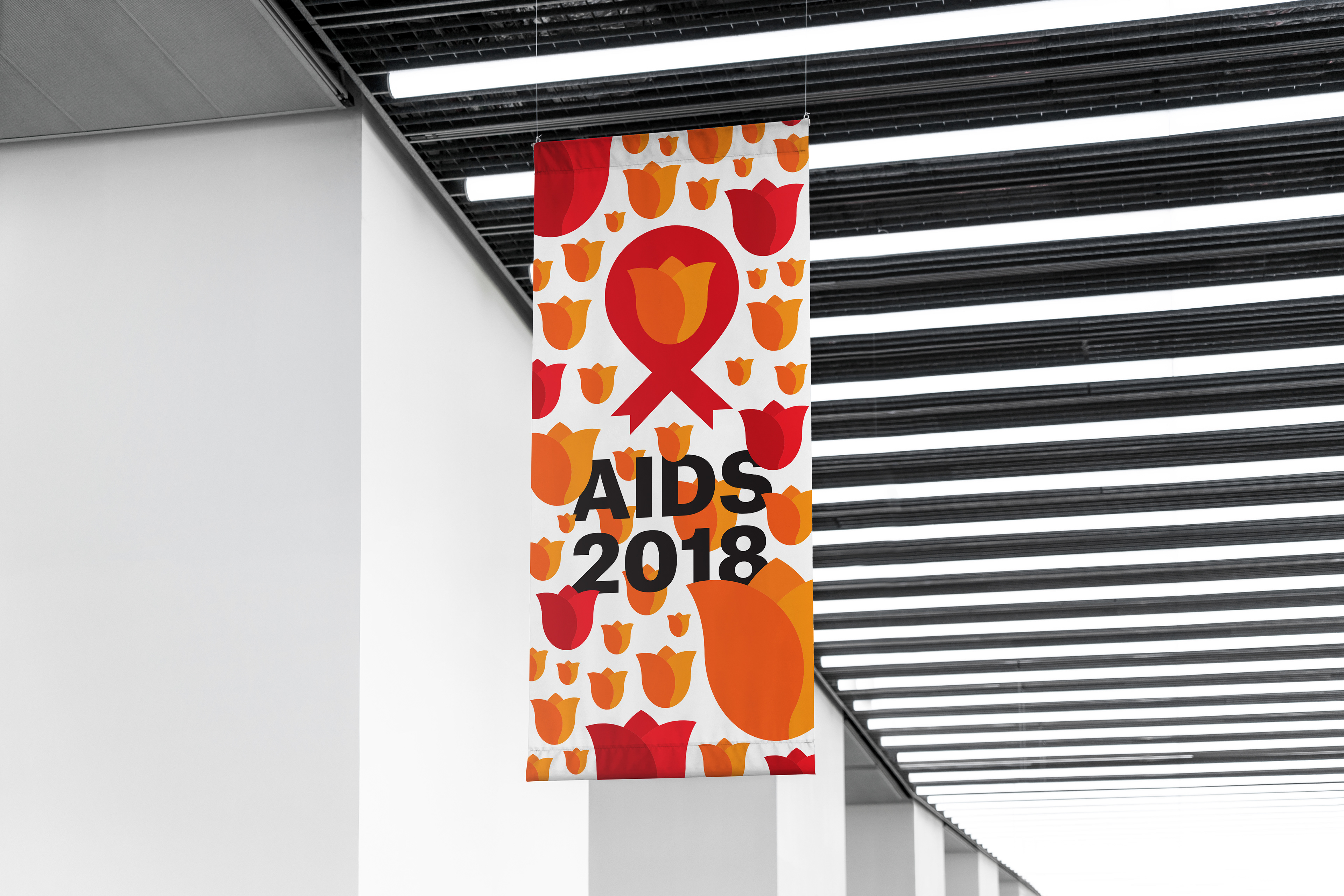
I considered how the design would be used in the conference such as banners used in other examples of event like this. Which help me conceptualize how this design can be carried across in multiple ways.
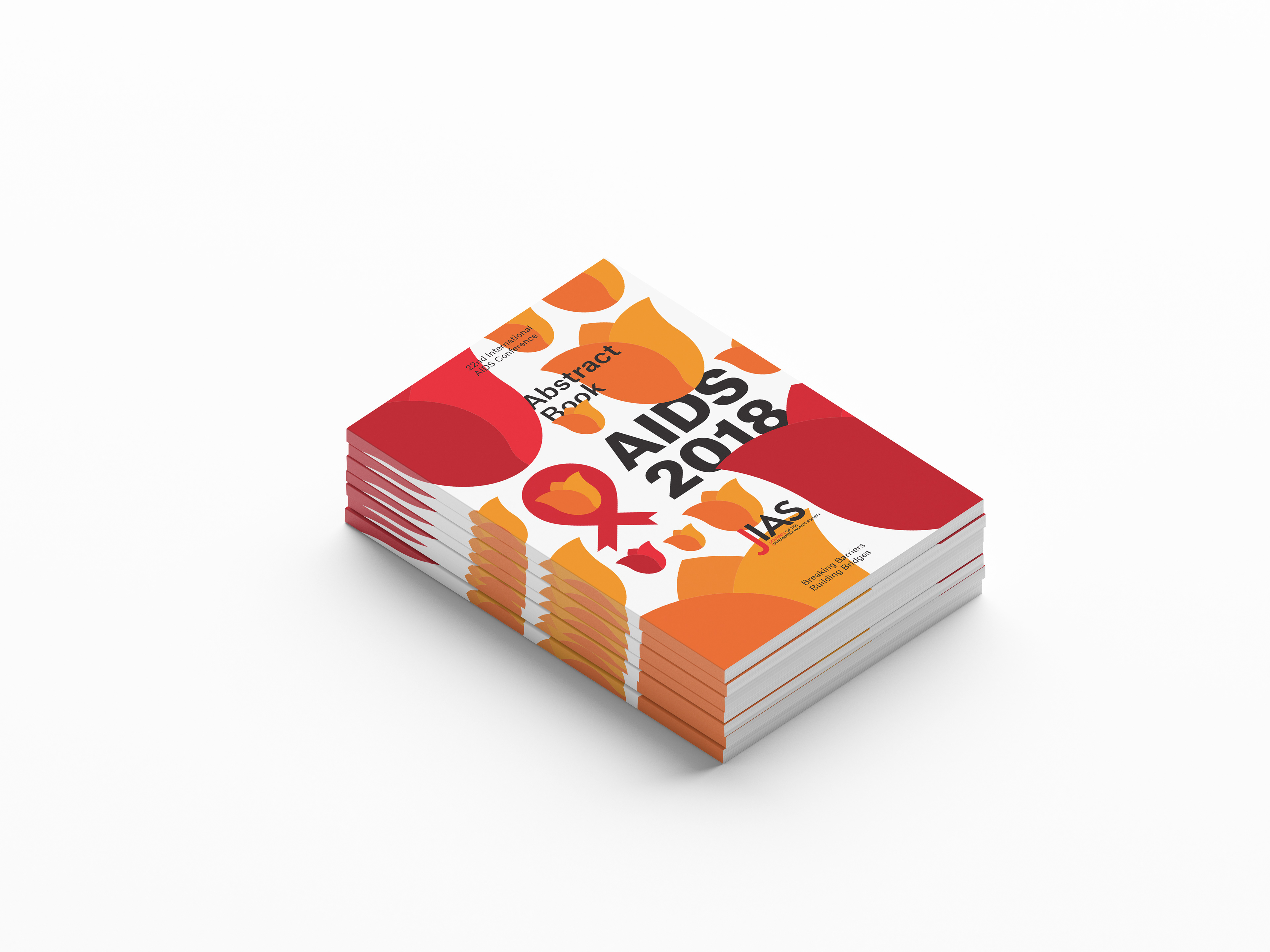
Researching into the actual event, I notice that they have books and other written records about the conference and I considered how this design would translate in a book or a booklet. This is one of the example design.
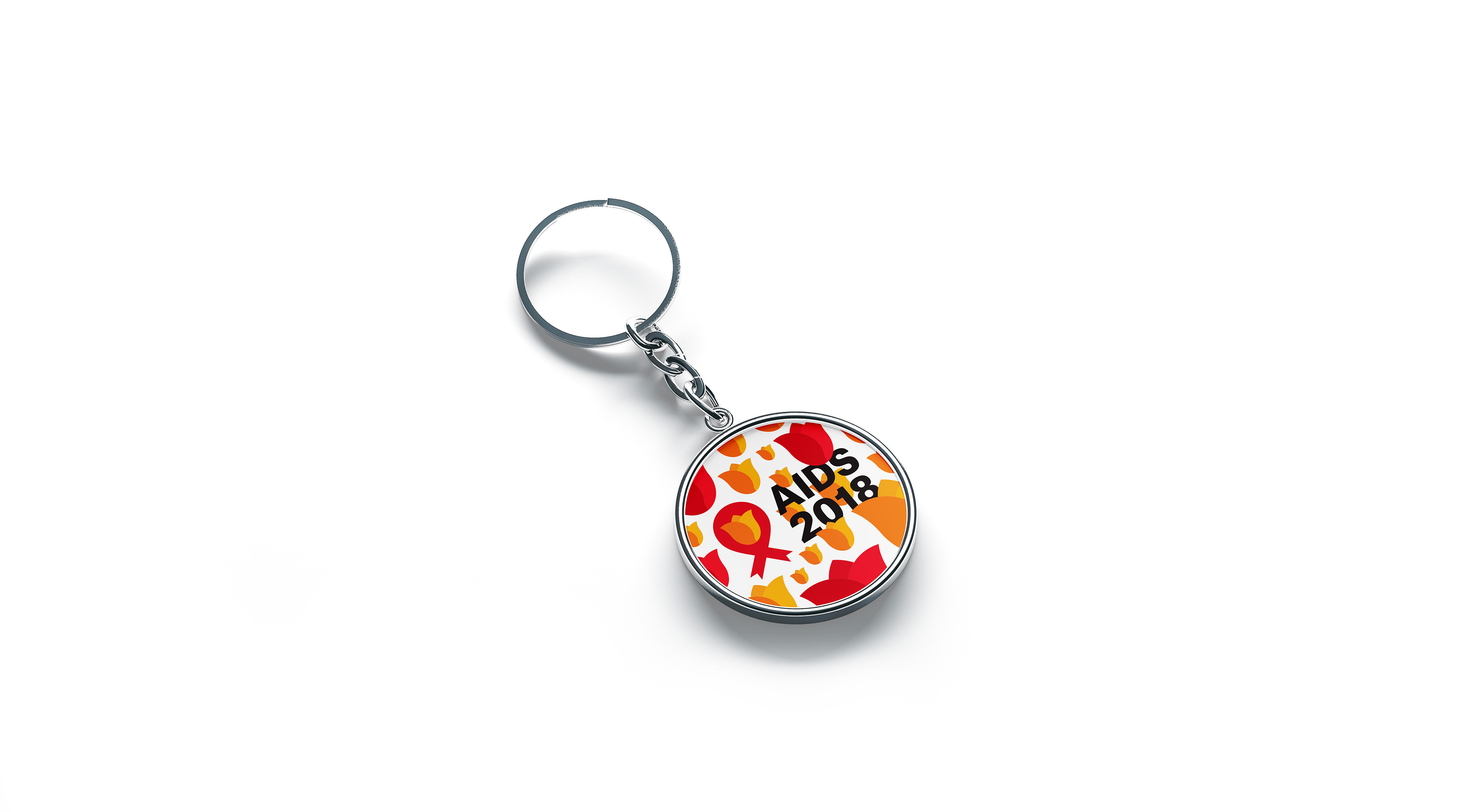
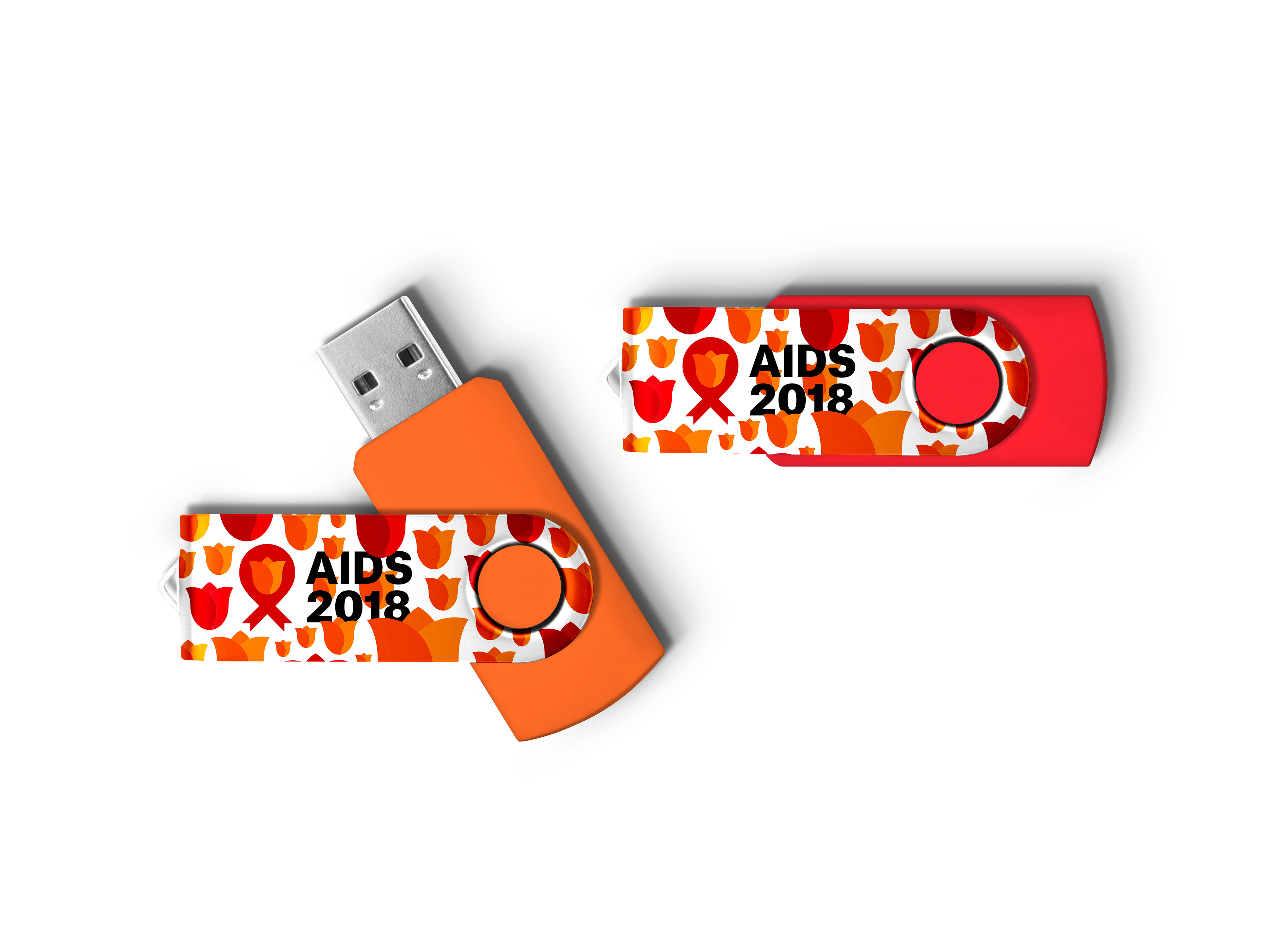
Of course in a conference, there will be merchandise be handed out as a souvenir about the event and this is one of the examples that I made for this conference.
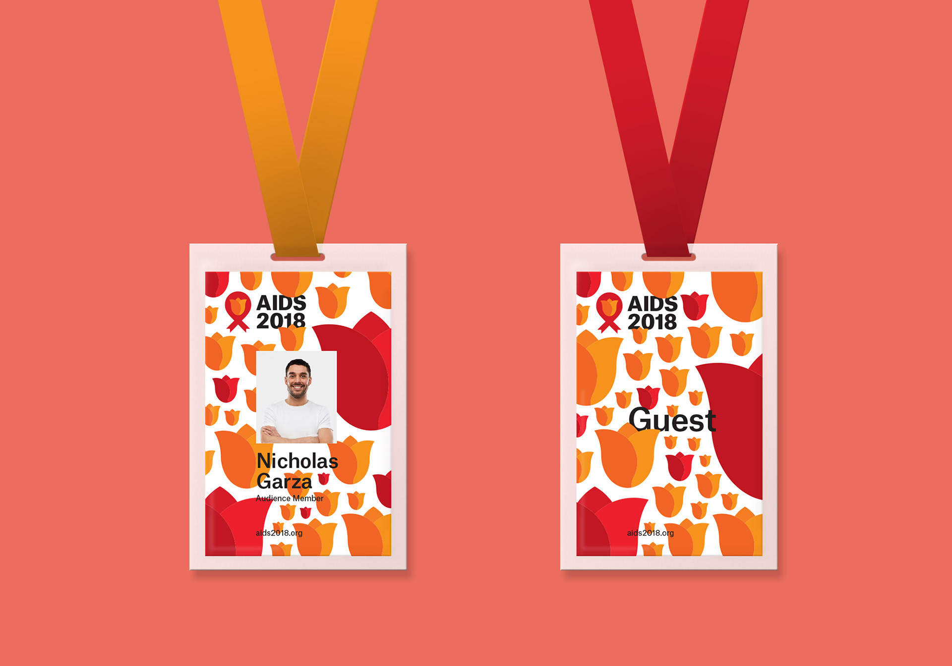
This design is example of how the ID design for the event for everybody attending the event. The left side would be the back and right side would be the front of the ID.
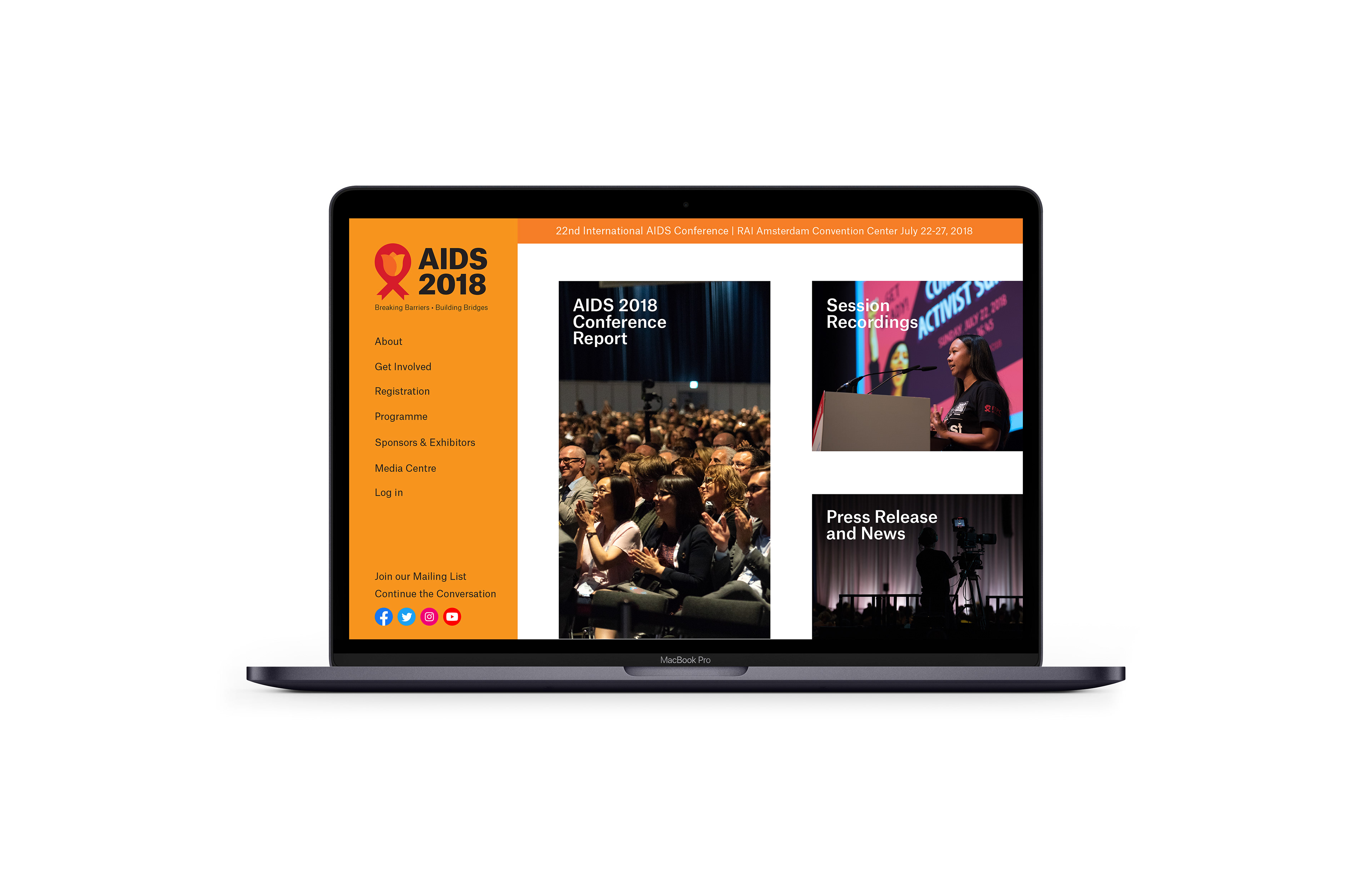
During the process, I discovered which of the design was chosen to be used in the actual conference event by the used of their official website. This made me think, "how can my design to be used in this platform?". Also, I notice that they have two separate website for the media to gatherings photographs and information about the event which is very odd. My idea is that combining the two websites into one. This is the website would have look like using my designs. The image above is the homepage.
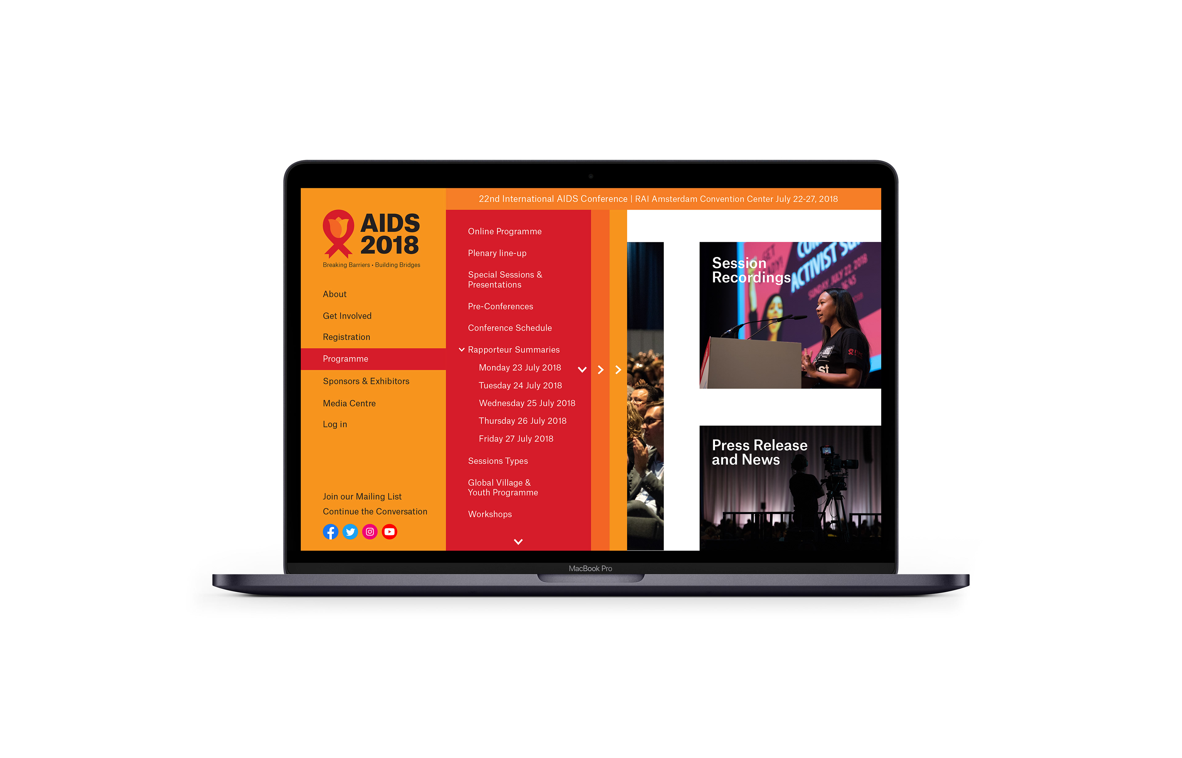
The design above show the navigation of the website with a multi-layered design to show many section about the conference.
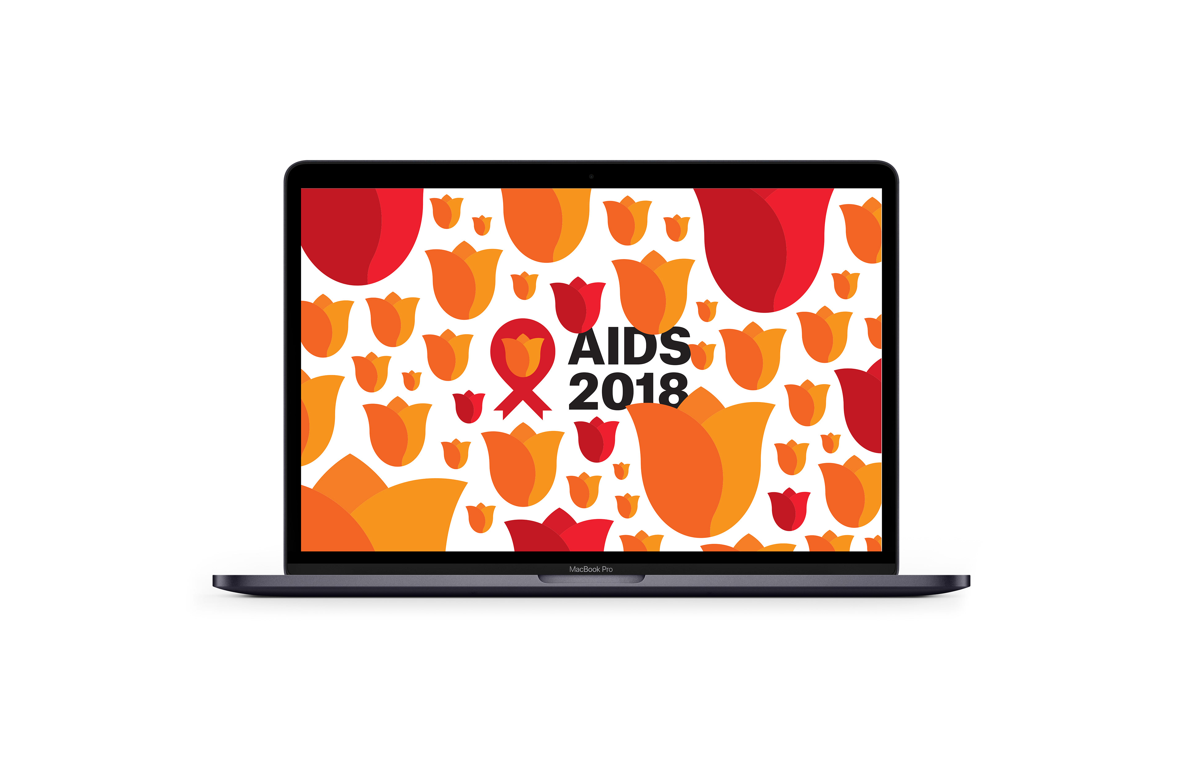
This design shows a possible idea of using a splash screen when loading into the homepage of the website.